The Appearance Of the Website As a Promotion Tool
July 17, 2023 - Reading time: 3 minutes
A website is an important resource for any system, institution, brand, and even an individual. Websites and landing pages have several important functions. Firstly, creating the image. The site really forms an image of a business or personality from the first seconds. Corporate colors, logos, slogans, even the convenience of the location of buttons on the site – all this plays a huge role for a potential client or an interested user. Secondly, the website is a way to communicate with the public. Thanks to the built-in messengers, you can sell, communicate, keep in touch with the customer base and earn new ones. The site really has a lot of advantages, but the site can become one big disadvantage if it is poorly made and visually repels users.

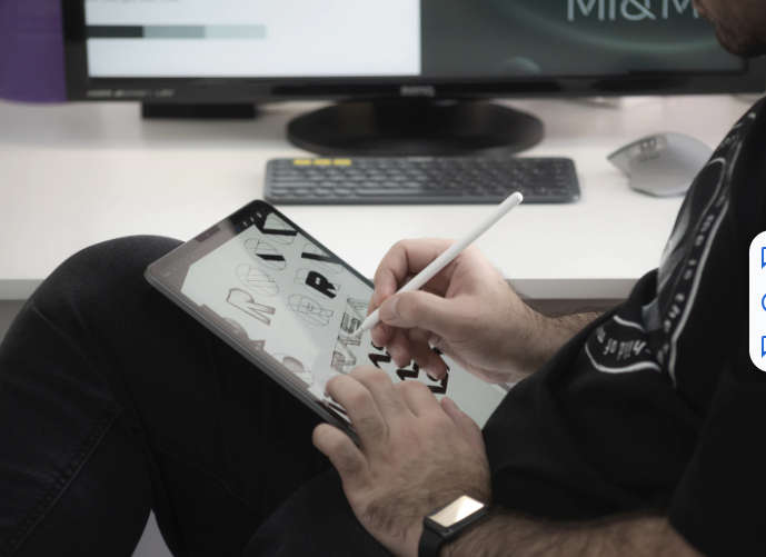
by D.Tamkova https://unsplash.com
In order for the site to help in the development of your business, it definitely needs to catch and attract customers not only with content, but also with appearance! Of course, for the most productive work, you should hire a specialist who is familiar with the concepts of palettes, fonts, knows what a poster mockup is, balance and hierarchy. However, if you already have a website or you are going to make it yourself, here are some tips.
Text
The most important content of the site is text material. Therefore, maximum attention should be paid here. Of course, if your case involves the presence of textual information. In this case, the written material should occupy a central place on the page, and the background is made in calm colors.
Also in this case, the font is important. It is desirable that it be large enough and traditional. But the title of the article, the title of the section, you can write so as to immediately attract attention. Not the best solution is to choose a dark background for the text. Even the specifics of the subject matter do not justify such an approach, it is difficult to read such articles and visitors are unlikely to appreciate such delights.
Navigation and user comfort
If everything is quite easy and transparent with the text, then business owners think less about site navigation. It is very important to arrange the menu and other navigation elements in a way that is comfortable for the user when designing the site. As for the menu, it should immediately catch the eye and be structured so that the visitor can find any page with no more than three clicks.
The same applies to buttons for navigating to another page, they should be visible and functional. If the site contains many pages, create a sitemap and display it as a separate menu item. The list of all materials, rest assured, will soon become one of the most visited sections.
How easy and comfortable the user can move around the site directly affects your business growth indicators. The modern user has too wide a choice and a large number of analogues due to the high competition in the market. If it is difficult for a user to fill out a long questionnaire, enter bank details, or he simply cannot find the button, consider that your potential client was bought out by your competitor with a convenient website.
Color selection
Choosing a color palette for a website is one of the main tasks of a web designer. You've probably heard that each color carries a psychological burden and is inextricably linked with certain associations, and by working on this aspect of the design, you can achieve a positive effect or, conversely, by making serious mistakes, scare away visitors.
Of course, do not forget about corporate colors. If your business or your personal social networks have corporate recognizable colors, it would be a huge mistake not to use them on the site! Such colors can become an identifier for the buyer.
Few people will argue that the website is the engine of modern businesses. We hope that this article has strengthened your opinion about this or generated motivation to dive into the topic of the importance of websites. Create cool, easy websites and get customers passively!
by D.Davis