File:WTI crude oil prices in recent 10 years.svg

Original file (SVG file, nominally 512 × 293 pixels, file size: 16 KB)
Summary
| Description |
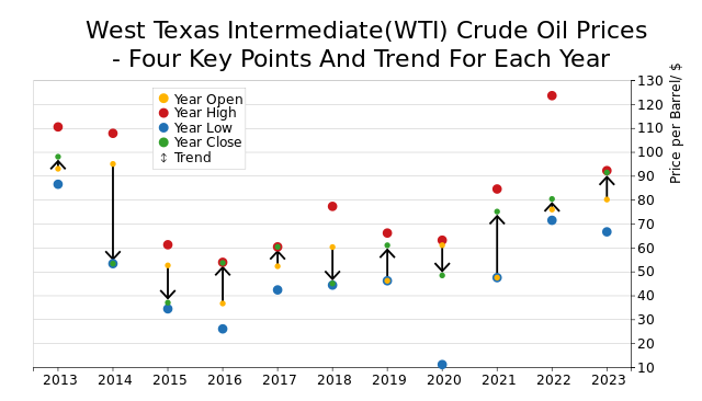
English: The chart in the figure shows the change in WTI oil prices between 2013 and 2023 (data availability by CNBC).
The x-axis of the graph shows dots of different colours for each year, representing the start price, end price, and the highest and lowest prices for each year. y-axis represents the price of oil in US dollars per barrel. Each year is accompanied by an arrow representing the trend in oil prices for that year. Analysing the graph, you can see that the price of oil has slowly returned to the level of a decade ago after a rapid decline. You can also see that oil prices reach a stage low in 2020 due to COVID-19. The chart was created by analysing WTI Crude data provided by CNBC. The chart was generated via charticulator production and then exported as SVG. Legend was then added to the inside of the chart in Illustrator and the size and legend were adjusted to optimise readability. Data source: https://www.cnbc.com/quotes/@CL.1 |
| Date | |
| Source | Own work |
| Author | Zhanghuajie |
Licensing
- You are free:
- to share – to copy, distribute and transmit the work
- to remix – to adapt the work
- Under the following conditions:
- attribution – You must give appropriate credit, provide a link to the license, and indicate if changes were made. You may do so in any reasonable manner, but not in any way that suggests the licensor endorses you or your use.
- share alike – If you remix, transform, or build upon the material, you must distribute your contributions under the same or compatible license as the original.
File history
Click on a date/time to view the file as it appeared at that time.
| Date/Time | Thumbnail | Dimensions | User | Comment | |
|---|---|---|---|---|---|
| current | 05:59, 2 October 2023 | | 512 × 293 (16 KB) | imagescommonswiki>Zhanghuajie | West Texas Intermediate (WTI) crude oil prices in recent 10 years.svg |
File usage
The following file is a duplicate of this file (more details):
- File:WTI crude oil prices in recent 10 years.svg from Wikimedia Commons
The following page uses this file:

