Pareto analysis
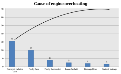
Pareto analysis is a formal technique useful where many possible courses of action are competing for attention. In essence, the problem-solver estimates the benefit delivered by each action, then selects a number of the most effective actions that deliver a total benefit reasonably close to the maximal possible one.
Pareto analysis is a creative way of looking at causes of problems because it helps stimulate thinking and organize thoughts. However, it can be limited by its exclusion of possibly important problems which may be small initially, but will grow with time. It should be combined with other analytical tools such as failure mode and effects analysis and fault tree analysis for example.[citation needed]
This technique helps to identify the top portion of causes that need to be addressed to resolve the majority of problems. Once the predominant causes are identified, then tools like the Ishikawa diagram or Fish-bone Analysis can be used to identify the root causes of the problems. While it is common to refer to pareto as "80/20" rule, under the assumption that, in all situations, 20% of causes determine 80% of problems, this ratio is merely a convenient rule of thumb and is not, nor should it be considered, an immutable law of nature.
The application of the Pareto analysis in risk management allows management to focus on those risks that have the most impact on the project.[1]
Steps to identify the important causes using 80/20 rule
- Form a frequency of occurrences as a percentage
- Arrange the rows in decreasing order of importance of the causes (i.e., the most important cause first)
- Add a cumulative percentage column to the table, then plot the information
- Plot (#1) a curve with causes on x- and cumulative percentage on y-axis
- Plot (#2) a bar graph with causes on x- and percent frequency on y-axis
- Draw a horizontal dotted line at 80% from the y-axis to intersect the curve. Then draw a vertical dotted line from the point of intersection to the x-axis. The vertical dotted line separates the important causes (on the left) and trivial causes (on the right)
- Explicitly review the chart to ensure that causes for at least 80% of the problems are captured
See also
References
- ↑ David Litten, Project Risk and Risk Management, Retrieved May 16, 2010
- ↑ "Pareto Analysis". Archived from the original on 8 February 2012. https://web.archive.org/web/20120208180732/http://erc.msh.org/quality/pstools/pspareto.cfm. Retrieved 12 January 2012.
 |


