Organization:Organizational chart
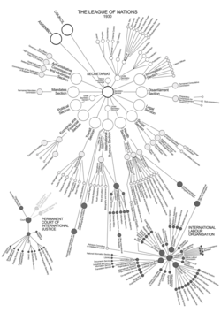
An organizational chart, also called organigram, organogram, or organizational breakdown structure (OBS), is a diagram that shows the structure of an organization and the relationships and relative ranks of its parts and positions/jobs. The term is also used for similar diagrams, for example ones showing the different elements of a field of knowledge or a group of languages.
Overview


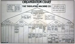
The organization chart is a diagram showing graphically the relation of one official to another, or others, of a company. It is also used to show the relation of one department to another, or others, or of one function of an organization to another, or others. This chart is valuable in that it enables one to visualize a complete organization, by means of the picture it presents.[3]
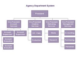
A company's organizational chart typically illustrates relations between people within an organization. Such relations might include managers to sub-workers, directors to managing directors, chief executive officer to various departments, and so forth. When an organization chart grows too large it can be split into smaller charts for separate departments within the organization. The different types of organization charts include:
- Hierarchical
- Matrix
- Flat (also known as Horizontal)
There is no accepted form for making organization charts other than putting the principal official, department or function first, or at the head of the sheet, and the others below, in the order of their rank. The titles of officials and sometimes their names are enclosed in boxes or circles. Lines are generally drawn from one box or circle to another to show the relation of one official or department to the others.[3]
History
The Scottish-American engineer Daniel McCallum (1815–1878) is credited for creating the first organizational charts of American business[4] around 1854.[5][6] This chart was drawn by George Holt Henshaw.[7]
The term "organization chart" came into use in the early twentieth century. In 1914 Brinton[8] declared "organization charts are not nearly so widely used as they should be. As organization charts are an excellent example of the division of a total into its components, a number of examples are given here in the hope that the presentation of organization charts in convenient form will lead to their more widespread use." In those years industrial engineers promoted the use of organization charts.
In the 1920s a survey revealed that organizational charts were still not common among ordinary business concerns, but they were beginning to find their way into administrative and business enterprises.[9]
The term "organigram" originated in the 1960s.[10]
Limitations
There are several limitations of organizational charts:
- If updated manually, organizational charts can very quickly become out-of-date, especially in large organizations that change their staff regularly.
- They only show "formal relationships" and tell nothing of the pattern of human (social) relationships which develop. They also often do not show horizontal relationships.
- They provide little information about the managerial style adopted (e.g. "autocratic", "democratic" or an intermediate style).
- In some cases, an organigraph may be more appropriate, particularly if one wants to show non-linear, non-hierarchical relationships in an organization.
- They often do not include customers.
An organogram is more flexible and adaptable to changes in the organization, such as new products, services, or partnerships. An organizational chart is more rigid and stable, and may not reflect the current reality of the organization
Examples
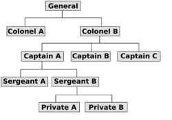
The example on the right shows a simple hierarchical organizational chart.
An example of a "line relationship" (or chain of command in military relationships) in this chart would be between the general and the two colonels—the colonels are directly responsible to the general.
An example of a "lateral relationship" in this chart would be between "Captain A", and "Captain B" who both work on level and both report to the "Colonel B".
Various shapes such as rectangles, squares, triangles, circles can be used to indicate different roles. Color can be used both for shape borders and connection lines to indicate differences in authority and responsibility, and possibly formal, advisory and informal links between people. A department or position yet to be created or currently vacant might be shown as a shape with a dotted outline. Importance of the position may be shown both with a change in size of the shape in addition to its vertical placement on the chart.
See also
- Boxology
- Figurative system of human knowledge – Taxonomy of human knowledge
- Organizational structure
- Work breakdown structure
References
- ↑ Crowther, Samuel (undated). John H. Paterson – The Romance of Business, Geoffrey Bliss
- ↑ Grandjean, Martin (2017). "Analisi e visualizzazioni delle reti in storia. L'esempio della cooperazione intellettuale della Società delle Nazioni". Memoria e Ricerca (2): 371–393. doi:10.14647/87204. https://www.rivisteweb.it/doi/10.14647/87204. See also: French version (PDF) and English summary.
- ↑ 3.0 3.1 Allan Cecil Haskell, Joseph G. Breaznell (1922) Graphic charts in business: how to make and use them. p. 78
- ↑ Alfred D. Chandler, Jr. (1962). Strategy and Structure: Chapters in the History of the American Industrial Enterprise. Cambridge, MA: MIT Press.
- ↑ Burton S. Kaliski (2001). Encyclopedia of business and finance. p.669.
- ↑ For years people believed no copy of this chart survived, see for example: Sidney Pollard, Richard S. Tedlow (2002) Economic History. p. 18
- ↑ Caitlin Rosenthal (2012) "Big data in the age of the telegraph" in McKinsey Quarterly, March 2013.
- ↑ Brinton, Willard Cope. Graphic methods for presenting facts. The Engineering magazine company, 1914.
- ↑ Alexander Hamilton institute (1923) Organization charts. p. 6
- ↑ Angus Stevenson (2010) Oxford Dictionary of English. p. 1252
External links
 |


