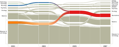
Alluvial diagram

Alluvial diagrams are a type of flow diagram originally developed to represent changes in network structure over time. In allusion to both their visual appearance and their emphasis on flow, alluvial diagrams are named after alluvial fans that are naturally formed by the soil deposited from streaming water.
Interpretation
In an alluvial diagram, blocks represent clusters of nodes, and stream fields between the blocks represent changes in the composition of these clusters over time. The height of a block represents the size of the cluster and the height of a stream field represents the size of the components contained in both blocks connected by the stream field.
Application
Alluvial diagrams were originally developed to visualize structural change in large complex networks. They can be used to visualize any type of change in group composition between states or over time and include statistical information to reveal significant change. Alluvial diagrams highlight important structural changes that can be further emphasized by color, and make identification of major transitions easy.
Alluvial diagrams can also be used to illustrate patterns of flow on a fixed network over time.[1] The Users Flow feature of Google Analytics uses alluvial diagrams to graphically represent how visitors move among the nodes (individual pages) on a website.[2]
See also
References
- ↑ Rosvall, Martin; Bergstrom, Carl T. (2010). "Mapping Change in Large Networks". PLOS ONE 5 (1): e8694. doi:10.1371/journal.pone.0008694. ISSN 1932-6203. PMID 20111700. Bibcode: 2010PLoSO...5.8694R.
- ↑ Sankey Diagram - google charts
External links
- Alluvial generator implemented in Javascript - Create alluvial diagrams from network data and export to SVG
- RAWGraphs: an open source data visualization tool - Create alluvial diagrams from dataset and export to SVG or PNG
- Users Flow for Google Analytics
 |
