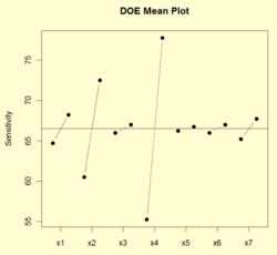
DOE mean plot
In statistics, specifically the analysis of data in the design of experiments, a DOE mean plot is a graphical tool used to analyze data from an experiment. In it, it demonstrates the relative importance of all the factors in an experiment with respect to a chosen location statistic, in this case the mean. Each factor is plotted and all mean levels of the factor (two or more) are connected with straight lines. The plot is meant to complement other analyses, such as the typical analysis of variance.
Example

Shown below is an example from Box, Hunter, and Hunter (1978).[1] In it, several factors to chosen to determine their effect(s) on bike speed. These factors are: seat height, dynamo engaged (yes/no), angle of the handlebar, chosen gear, raincoat (on/off), breakfast (yes/no), and tire pressure (low/high), each at two levels. The plot shows the mean response level for each variable (vertical) versus the factor (horizontal).
To interpret the graph, all that is needed is to determine the ordering of the factors by length of the line connecting the two dots. The longer the line, the more significant the factor. Therefore, this plot clearly demonstrates that factor 4 (chosen gear) is the most important factor in determining bike speed, factor 2 (dynamo engaged or not) is the second most important factor, and so on.
References
- ↑ Box, George E. P.; Hunter, William Gordon; Hunter, John Stuart (1978). Statistics for experimenters: an introduction to design, data analysis, and model building. Wiley series in probability and mathematical statistics. New York: Wiley. ISBN 978-0-471-09315-2.
 |
