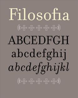
Filosofia
 | |
| Category | Serif |
|---|---|
| Classification | Didone (typography) |
| Designer(s) | Zuzana Licko Giambattista Bodoni |
| Foundry | Emigre |
| Variations | Filosfia Parma |
Filosofia is a serif typeface designed by Zuzana Licko and released by Emigre Fonts in 1996. It is a revival of Italian type designer Giambattista Bodoni's late eighteenth century typeface, Bodoni.
Description
Giambattista Bodoni created several variations of his type, and there are many Bodoni revivals. Filosofia is Licko's unique interpretation, referencing "her personal preference for a geometric Bodoni and incorporating such features as the slightly bulging round serif endings which often appeared in printed samples of Bodoni’s work and reflect Bodoni’s origins in letterpress technology."[1]
Licko studied various versions of Bodoni in her research, everything from the original drawings to digital revivals like ITC Bodoni, but drew her typeface from memory rather than from a specific specimen. In selecting the name Filosofia (the Italian word for philosophy), Licko had been looking for something Italian to reflect Bodoni's origins.[2] Licko's design also most closely resembles Bodoni's Filosofia 3 (Siena)—one of his many versions, as each size was cut with slight adjustments to accommodate the effects of the letterpress printing process.[1]
In a 2002 interview with Rhonda Rubenstein for Eye Magazine, Licko explains her interest in traditional typefaces after becoming known for designing radical fonts:
My interest in reviving the classics (which began in 1995) was sparked by two factors: the sophistication of personal computer technology, and Emigre magazine’s shift towards theory and the subsequent need for text faces to set large bodies of text. Each design gives me the opportunity to study details of classic faces that I’d never fully appreciate or notice through casual observation or usage. For example, working on my Bodoni revival, Filosofia, allowed me to better understand this long-time classic. This kind of scrutiny, in turn, has given me ideas for faces that are not strict revivals, such as Tarzana and Solex.[3]
Filosofia's release in 1996 did not only signify a new chapter in Zuzana's experimentation (turning toward traditional typefaces); it also generated an unexpected collaboration. Filosofia's announcement poster, "It's their Bodoni" designed by Massimo Vignelli,[4] marked the end of the legibility wars that had divided the design community for much of the 1990s.[1] The war was sparked by an interview in a 1991 issue of Print magazine, in which Vignelli criticized Emigre Font's Postmodern designs.[5][6][7] The collaboration was a welcome surprise to Licko and VanderLans and was almost unbelievable to the design community.[1]
In 2019, a Filosofia spin-off was created as part of the branding program for Parma, Italy—the city where Bodoni established his private press in 1791.[8] Edenspiekermann, the agency in charge of the branding, performed the transformation by increasing Filosofia's x-height. Due to the tall x-height, they dropped the original design's small caps. The Filosofia Parma family has two roman styles of regular and bold weight, and can be used comfortably in combination with all other Filosofia fonts.[9]
Identifying characteristics
- Rounded terminals of the lower case s[2]
- Slightly bulging round serif endings
- Reduced contrast
Prominent uses
- Book cover for Toni Morrison's The Source of Self-Regard designed by Kelly Blair for Alfred A. Knopf, 2019.
- City of Parma branding by Edenspiekermann, 2019.[10]
- Book cover for Emma Donoghue's Frog Music designed by Keith Hayes for Little Brown & Company, 2014.
References
- ↑ 1.0 1.1 1.2 1.3 Licko, Zuzana. "Notes on Filosofia". https://www.emigre.com/PDF/FilosofiaXtra.pdf.
- ↑ 2.0 2.1 "Emigre: Essays - Zuzana Licko Answers Frequently Asked Questions". https://www.emigre.com/Essays/ZuzanaLicko/FAQ.
- ↑ "Eye Magazine | Feature | Reputations: Zuzana Licko". http://www.eyemagazine.com/feature/article/reputations-zuzana-licko.
- ↑ "Emigre "It's Their Bodoni"" (in en-US). https://museobodoniano.com/bodoniinuse/emigre-its-their-bodoni/.
- ↑ PrintMag (2014-05-28). "Massimo Vignelli: Creator of Timeless Design and Fearless Critic of "Junk"" (in en). https://www.printmag.com/post/massimo-vignelli-fearless-critic-of-junk.
- ↑ "Emigre: Essays - Critical Conditions:Zuzana Licko, Rudy V...". https://www.emigre.com/Essays/Emigre/CriticalConditionsandtheEmigreSpirit.
- ↑ PrintMag (2016-12-05). "The Legibility Wars of the '80s and '90s" (in en). https://www.printmag.com/post/legibility-wars-translation-typography.
- ↑ "Biography" (in en-US). https://museobodoniano.com/biography/.
- ↑ "The City of Parma — Edenspiekermann" (in en). https://www.edenspiekermann.com/case-studies/the-city-of-parma/.
- ↑ "The City of Parma - Edenspiekermann". https://www.edenspiekermann.com/case-studies/the-city-of-parma/.
External links
- Filosofia on Emigre.com
- Filosofia Parma on Emigre.com
- Filosofia type specimen
- Filosofia on Adobe Fonts
- Fonts In Use
 |
