Finance:Harrod–Johnson diagram
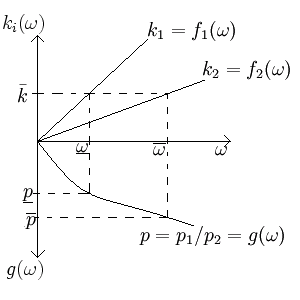
In two-sector macroeconomic models, the Harrod–Johnson diagram, occasionally referred to as the Samuelson-Harrod-Johnson diagram, is a way of visualizing the relationship between the output price ratios, the input price ratios, and the endowment ratio of the two goods.[1][2] Often the goods are a consumption and investment good, and this diagram shows what will happen to the price ratio if the endowment changes. The diagram juxtaposes a graph which has input price ratios as its horizontal axis, endowment ratios as its positive vertical axis, and output price ratios as its negative vertical axis. The diagram is named after economists Roy F. Harrod and Harry G. Johnson; the Samuelson-Harrod-Johnson name is in reference to economist Paul Samuelson.[3] Economist Hirofumi Uzawa, comparing the Harrod-Johnson diagram to Abba P. Lerner's earlier factor-price equalization theorem, considered Lerner's to be more accurate, as well as more beautiful.[4]
Derivation
If good 1 is an investment good governed by the equation
- [math]\displaystyle{ Y_1=F_1(K,L)\, }[/math]
and good 2 be a consumption good governed by the equation
- [math]\displaystyle{ Y_s=F_s(K,L)\, }[/math],
then rental and wage rates can be calculated by optimizing a representative firm's profit function, giving
- [math]\displaystyle{ p_1 D_K[F_1(K,L)]=r=p_2 D_K[F_2(K,L)]\, }[/math]
for the rental rate of capital, r, and
- [math]\displaystyle{ p_1 D_L[F_1(K,L)]=w=p_2 D_L[F_2(K,L)]\, }[/math]
for the wage rate of labor, w, so the input price ratio, [math]\displaystyle{ \omega }[/math], is
- [math]\displaystyle{ \omega=w/r=\frac{p_i D_L[F_i(K,L)],p_i D_K[F_i(K,L)]}\, }[/math] for [math]\displaystyle{ i=\{1,2\}. }[/math]
Normalizing this equation by letting [math]\displaystyle{ k_i = K_i/L_i }[/math], and solving for [math]\displaystyle{ k_i, }[/math] provides the formulas to be graphed in the first quadrant.
On the other hand, normalizing the equation
- [math]\displaystyle{ p_1 D_K[F_1(K,L)]=p_2 D_K[F_2(K,L)] }[/math]
- (or [math]\displaystyle{ p_1 D_L[F_1(K,L)]=p_2 D_L[F_2(K,L)]\, }[/math], which is presumably equivalent),
and solving for the price ratio, [math]\displaystyle{ p_1/P_2, }[/math] provides the formula which is to be graphed in the fourth quadrant. Graphing these three functions together shows the relationship.
References
- ↑ Viaene, Jean-Marie (1993-03-01). "The International Equilibrium and the Harrod-Johnson Diagram". International Economic Journal 7 (1): 83–93. doi:10.1080/10168739300000023. ISSN 1016-8737. https://www.tandfonline.com/doi/abs/10.1080/10168739300000023.
- ↑ Jehle, Geoffrey (April 1989). "A Note on Some Theorems in the Theory of International Trade". Eastern Economic Journal 15: 141–145. https://web.holycross.edu/RePEc/eej/Archive/Volume15/V15N2P141_145.pdf.
- ↑ Dumas, Bernard (1980-11-01). "The theorems of international trade under generalized uncertainty" (in en). Journal of International Economics 10 (4): 481–498. doi:10.1016/0022-1996(80)90002-1. ISSN 0022-1996. https://dx.doi.org/10.1016/0022-1996%2880%2990002-1.
- ↑ Shell, Karl (29 June 1998). [karlshell.com/wp-content/uploads/2015/03/interview_uzawa.pdf "An Interview with Hirofumi Uzawa"]. Macroeconomic Dynamics 13: 390–420. karlshell.com/wp-content/uploads/2015/03/interview_uzawa.pdf.
 |


