Multiple master fonts

Multiple master fonts (or MM fonts) are an extension to Adobe Systems' Type 1 PostScript fonts, now superseded by the advent of OpenType and, in particular, the introduction of OpenType Font Variations in OpenType 1.8, also called variable fonts.[1][2]
Multiple master fonts contain two or more "masters"—that is, original font styles—and enable a user to interpolate between these masters along a continuous range of "axes." With proper application support, these axes could be adjusted on demand.
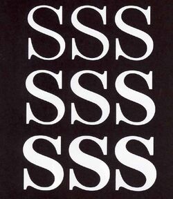
The intention was that using multiple master fonts, a designer can generate a style of the exact width, thickness and optical size wanted, without losing the integrity or readability of the character glyphs. The effect is similar to morphing, as a designer can choose an intermediate between two styles, for example generating a semibold font by compromising between a bold and regular style, or perhaps extend a trend to create an ultra-light or ultra-bold. This idea was not new, having been used by companies such as URW++, but Adobe hoped to develop the technology to a greater extent.
Adobe's goal in multiple master font technology was to allow end-users of fonts to create the exact font they needed for a situation, by adjusting parameters such as boldness or width.[3][4][5] However, multiple master fonts proved unpopular in consumer-facing use due to the difficulty of writing (or rewriting) consumer desktop publishing applications to support them, and because font designers have generally preferred to release fonts in specific weights and styles, as font files that have been individually fine-tuned. However, the multiple master concept remains heavily used at font design studios, allowing designers to generate a range of weights and styles quickly and then optimise them individually.[6][7] 'Multiple master' may therefore often be seen as a generic term describing interpolated font design generally, not necessarily using Adobe technology.[8][9]
In 2016, Adobe, Google, Apple and Microsoft announced a new update to the OpenType specification, allowing variable fonts. Similar to the multiple master concept, this will allow custom styles to be generated from a single font file programatically.[10][2]
Aspects of multiple master fonts

Where available, most MM fonts support one or two (and occasionally three) of the following variables:
- Weight allows the character weight to be modified, typically from light, through regular, to extra bold.
- Width allows the character width to be extended or compressed. Although any font can be compressed or expanded by software, the results from a multiple master font are superior. When a font is artificially expanded, all the features are expanded, including the line weight. This means that vertical strokes will be proportionally thicker than the horizontal strokes, giving an uneven appearance. Multiple master fonts with a width axis are designed to scale appropriately.
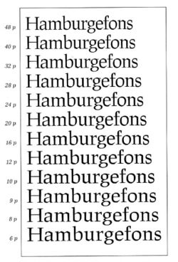
- Optical size allows the character shape to be modified based on how large it will appear to the reader. At small sizes, small details such as serifs and thin lines such as stems are typically bolder. The "x-height" (the height of a lower case "x") is also a larger proportion of the total font height, and the characters may be extended slightly. These changes are designed to make small type easier to read. At larger sizes, these details can be finer and the lines more delicate. Note that the optical size is independent from the actual size of the type. It is up to the user to pick the appropriate optical size for the application and viewing environment (for example, a billboard would want to use small optical size even for extremely large text).
- Style, the least used of the multiple master axes, allows any other font property to be continuously modified. One such example is changing the serif style from wedge (triangular) to slab (rectangular).
For example, the Myriad multiple master font had two axes: "weight" and "width." This font therefore included four separate "master designs" of each character: light compressed, light extended, bold compressed, and bold extended. Any weight or width font in between these endpoints could be produced by interpolating between the character outlines of these master designs.[11][12] The addition of italics requires another four master designs.
Another example is Adobe Jenson, which supports "weight" and "optical size" axes. This font uses three masters to represent the optical-size axis, designed for 6, 12, and 72 point type, respectively. This allows the common size of 12 points to be optimized, but requires 6 master designs for roman, and another 6 for italic.
Application support

Current application support for these fonts is sparse, if not entirely absent. However, font design tools such as FontLab and FontForge can edit MM fonts, and can export into other font formats as needed. Adobe Type Manager (ATM) is required for MM support on Windows and the "Classic" Mac OS (9 and below).
Describing why the technology failed, a retrospective by Tamye Riggs, written for Adobe, noted: "Users were forced to generate instances for each variation of a font they wanted to try, resulting in a hard drive littered with font files bearing such arcane names as MinioMM_578 BD 465 CN 11 OP." Prominent Adobe font designer Carol Twombly cited the frustrations of the failed project as one of several reasons behind her decision to leave font design around 1999, and Adobe's Christopher Slye would later relate that he had been concerned that Adobe's principal type designer Robert Slimbach had damaged his health struggling to apply multiple master technology to Adobe Jenson in the late 1990s.[4][13]
Free software
Free-software support for multiple master fonts is offered by the program mminstance, which generates standard PostScript fonts from multiple master fonts. These can then be used in any application that is compatible with standard PostScript type 1 fonts.
The FreeType font rendering engine also provides rendering support for multiple master (and GX) fonts.
Legacy of multiple master fonts


The multiple master font format has mostly been superseded by OpenType, which provides more support for different languages and glyphs, but does not offer the unique continuous controls for character shape. Typically the OpenType versions of old multiple master fonts include a selection of the most commonly used combinations of axis positions.
Multiple master fonts still serve two purposes:
- As the fallback font format of Adobe Acrobat, multiple master fonts are used as a substitute in place of original fonts in the case of missing fonts. Two such substitution fonts are buried amongst the data resources for Acrobat: Adobe Serif MM and Adobe Sans MM. CourierStd is another fallback font family in Acrobat. Other PDF editors such as Foxit PhantomPDF also use multiple master fonts for this purpose.
- As a design tool for creating families of fonts; a font designer can create a multiple master font from a base font design and then offer customers a wide number of font variations by building them from the multiple axes of an MM font. E.g. by creating a light version and a heavy version of their font design someone could create a multiple master font with a weight axis and then offer clients any custom weight they wanted. Adobe and others continue to use multiple master technology in font design.
Since in modern multiple master design the norm is to release to the user a curated collection of weights, a key question is which sizes to interpolate to. In the Thesis typeface, developed by Lucas de Groot, de Groot's choice of weights to release was developed using an "interpolation theory". The optical interpolation b, in the three stems a (thinnest), b (interpolation) and c (thickest), is set to the geometric mean of a and c, i.e. b² = ac (as opposed to the linear arithmetic mean).[14][15]
List of multiple master fonts
Commercial
All known commercial MM fonts were released by Adobe, unless otherwise specified. While these faces are discontinued, all have since been converted to OpenType standard or "Pro" formats.
- ITC Avant Garde MM
- Bickham Script MM
- Briem Akademi MM
- Briem Script MM
- Caflisch Script MM
- Chaparral MM
- Conga Brava MM
- Cronos MM
- Ex Ponto MM
- Foxit Serif MM (by Foxit Software)
- ITC Garamond MM
- Graphite MM
- Adobe Jenson MM
- Jimbo MM
- Kepler MM
- Kinesis MM
- Mezz MM
- Minion MM
- ITC Motter Corpus MM
- Myriad MM
- Nueva MM
- Ocean Sans MM
- Penumbra MM
- Reliq MM
- Sanvito MM
- Adobe Serif MM
- Adobe Sans MM
- Tekton MM
- Verve MM
- Viva MM
- Waters Titling MM
Free
- So MM (Apostrophic Labs)
- Booter MM (Apostrophic Labs)
- Impossible MM (Apostrophic Labs)
- MoveMe MM (Luc(as) de Groot)
- Path 101 (Graham Meade)
- Snott MM (Graham Meade)
- Staid MM (Graham Meade)
- Stub MM (Ray Buetens)
Further reading
- Adobe Developer Resources – Multiple Master Fonts (archived)
- Adobe – Multiple Master to OpenType Cross Reference (previously Moving from Multiple Master to OpenType)
- Myriad Specimen Book, Adobe Systems Incorporated, 1992.
- Adobe Jenson Specimen Book, Adobe Systems Incorporated, 1996.
- Creating bold weights in FontForge - blog post on using interpolation to create bold weights for a revival of the Centaur typeface.
See also
- METAFONT
- OpenType
References
- ↑ "OpenType Font Variations Overview". Microsoft. https://www.microsoft.com/typography/otspec180/otvaroverview.htm. Retrieved 14 September 2016.
- ↑ 2.0 2.1 Hudson, John. "Introducing OpenType Variable Fonts". Tiro Typeworks. https://medium.com/@tiro/https-medium-com-tiro-introducing-opentype-variable-fonts-12ba6cd2369#.josnafajq. Retrieved 31 October 2016.
- ↑ Designing Multiple Master Typefaces. San José: Adobe Systems. 1997. https://partners.adobe.com/public/developer/en/font/5091.Design_MM_Fonts.pdf. Retrieved 20 September 2017.
- ↑ 4.0 4.1 Riggs, Tamye (30 July 2014). "The Adobe Originals Silver Anniversary Story". Adobe Systems. http://blog.typekit.com/2014/07/30/the-adobe-originals-silver-anniversary-story-how-the-originals-endured-in-an-ever-changing-industry/.
- ↑ Riggs, Tamye (30 June 2014). "The Adobe Originals Silver Anniversary Story: Expanding the Originals". Adobe Systems. http://blog.typekit.com/2014/06/30/the-adobe-originals-silver-anniversary-story-expanding-the-originals/.
- ↑ Phinney, Thomas (18 March 2010). "Font Remix Tools (RMX) and Multiple Master Fonts in type design". Phinney. http://www.thomasphinney.com/2010/03/font-remix-tools-rmx-and-multiple-master-fonts-in-type-design/.
- ↑ Phinney, Thomas. "TrueType, PostScript Type 1, & OpenType: What's the Difference?". Adobe. http://blogs.adobe.com/typblography/files/typblography/TT%20PS%20OpenType.pdf.
- ↑ "Multiple Masters, Part 1: Setting Up Masters". https://glyphsapp.com/tutorials/multiple-masters-part-1-setting-up-masters. Retrieved 8 January 2016.
- ↑ Griscti, Jessica. "Jess Loves Interpolation". http://www.alphabettes.org/jess-loves-interpolation/. Retrieved 15 May 2016.
- ↑ Nieskens, Roel. "Variable Fonts: the Future of (Web) Type". http://typographica.org/on-typography/variable-fonts/. Retrieved 31 October 2016.
- ↑ McClelland, Deke (July 1992). "Review: Myriad". Macworld 9 (7): 188–9. https://archive.org/details/MacWorld_9207_July_1992/page/n197/mode/1up. Retrieved 22 September 2018.
- ↑ "Derek van Alstyne Rising Star: Robert Slimbach and Carol Twombly". MacUser 9 (3): 95. March 1993. https://archive.org/details/MacUser9303March1993. Retrieved 22 September 2018.
- ↑ "SOTA Typography Award Honors Robert Slimbach". SOTA. http://www.typesociety.org/typography/2015/. Retrieved 8 January 2016.
- ↑ "Interpolation Theory". LucasFonts. http://www.lucasfonts.com/about/interpolation-theory/. Retrieved 7 July 2015.
- ↑ Impallari, Pablo. "Family Steps". Impallari Type. http://www.impallari.com/familysteps/. Retrieved 7 July 2015.
 |
