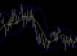
Open-high-low-close chart
An open-high-low-close chart (also OHLC) is a type of chart typically used to illustrate movements in the price of a financial instrument over time. Each vertical line on the chart shows the price range (the highest and lowest prices) over one unit of time, e.g., one day or one hour. Tick marks project from each side of the line indicating the opening price (e.g., for a daily bar chart this would be the starting price for that day) on the left, and the closing price for that time period on the right. The bars may be shown in different hues depending on whether prices rose or fell in that period.
The Japanese candlestick chart and OHLC charts show exactly the same data, i.e., the opening, high, low, and closing prices during a particular time frame.[1] Day traders, who by default have to watch the price movements on a chart, prefer to use the Japanese candlesticks, because they show the "live action" price movements by expanding and contracting the candlestick's body, which is easier to grasp (and trade upon) than the standard OHLC bar.[dubious ] Therefore, for dynamic real-time chart analysis, Japanese candlesticks offer advantages over standard OHLC bars.[1] However, for technical analysis of static charts, such as after-market analysis of historical data, the OHLC bars have very clear advantages over the Japanese candlesticks: the OHLC bars do not require color or fill pattern to show the Open and Close levels, and they do not create confusion in cases when, for example, the Open price is lower than the Close price (a bullish sign), but the Close price for the studied bar is lower than the Close price for the previous bar, i.e. the bar to the left on the same chart (a bearish sign).[1]
A simple variant on the OHLC chart is the HLC high-low-close chart that identifies the range of the time unit's price action (high - low) and the end result of the time unit's price action (the close).
In technical analysis OHLC charts are often combined with charts of other types such as line charts (showing moving average), column charts (trading volume), and range areas (Bollinger Bands).[2]
References
- ↑ 1.0 1.1 1.2 Rockefeller, Barbara (Feb. 6 2014). Technical Analysis for Dummies, 3rd Edition. Wiley Publishing, Inc.
- ↑ Open High Low Close (OHLC) Chart, AnyChart JavaScript Chart Documentation
External links
Other Languages
Visit the main overall explanation for Technical analysis that is translated into many languages.
 |


