Finance:Poverty map
From HandWiki

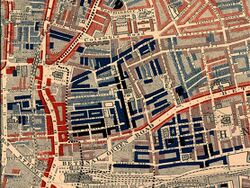
Part of Charles Booth's poverty map showing the Old Nichol, a slum in the East End of London, which was demolished and replaced by the Boundary Estate eleven years after publishing. Published 1889 in Life and Labour of the People in London. The red areas are "middle class, well-to-do", light blue areas are "poor, 18s to 21s a week for a moderate family", dark blue areas are "very poor, casual, chronic want", and black areas are the "lowest class...occasional labourers, street sellers, loafers, criminals and semi-criminals".
A poverty map is a map which provides a detailed description of the spatial distribution of poverty and inequality within a country. It combines individual and household (micro) survey data and population (macro) census data with the objective of estimating welfare indicators for specific geographic area as small as village or hamlet. [1]
Recent advances in geographic information systems (GIS), databases and computer aided software engineering make poverty mapping possible, where data can be presented in the form of maps and overlaying interfaces for cross-comparisons. Spatial analysis and benchmarking are also applied to assess the relationships between the two sets of micro and macro data according to their geographic location.
See also
- Life and Labour of the People in London
References
- ↑ Nawar, Abdel-Hameed (2007) "From Marina to Kom-Ombo: A Note on Poverty in Egypt," Cairo University, manuscript, August
External links
 |

