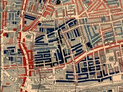
Finance:Poverty map

A poverty map is a map which provides a detailed description of the spatial distribution of poverty and inequality within a country. It combines individual and household (micro) survey data and population (macro) census data with the objective of estimating welfare indicators for specific geographic area as small as village, hamlet or other administrative division. [1] Efforts to eradicate poverty— prioritized as the first Millennium Development Goal (MDGs) and later continued in the Sustainable Development Goals (SDGs)—depend on understanding the geographic distribution of poor populations. Poverty maps are often combined with additional data sources, including local knowledge and socioeconomic indicators, to enhance their effectiveness in policymaking.[2] This helps identify geographic disparities, highlight lagging regions, visualize multiple dimensions of welfare simultaneously, and analyze the underlying factors contributing to poverty. Insights from poverty maps support targeted interventions and resource allocation strategies to address regional inequalities.
Recent advances in geographic information systems (GIS), databases and computer aided software engineering make poverty mapping possible, where data can be presented in the form of maps and overlaying interfaces for cross-comparisons. Spatial analysis and benchmarking are also applied to assess the relationships between the two sets of micro and macro data according to their geographic location.
See also
- Geography and Wealth
- Life and Labour of the People in London
- Spatial Inequality
References
- ↑ Nawar, Abdel-Hameed (2007) "From Marina to Kom-Ombo: A Note on Poverty in Egypt," Cairo University, manuscript, August
- ↑ "Poverty Map of Serbia: Understanding Welfare at the Local Level to Make Better Policies" (in en). https://www.worldbank.org/en/country/serbia/publication/poverty-map-of-serbia.
External links
 |
