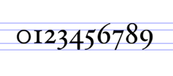
Arabic numeral variations
There are various stylistic and typographic variations to the Arabic numeral system.
Old-style numerals
The numerals used by Western countries have two forms: lining ("in-line" or "full-height") figures as seen on a typewriter and taught in North America, and old-style figures, in which numerals 0, 1 and 2 are at x-height; numerals 6 and 8 have bowls within x-height, and ascenders; numerals 3, 5, 7 and 9 have descenders from x-height; and the numeral 4 rests along the baseline. Lining figures are generally designed all the same setting width, as this makes the printing of mathematical and trigonometrical tables simpler to do and clearer to read. Non-lining figures tend to be preferred where numbers occur within sentences, for instance when a date is given in figures in a line of text.
United Kingdom presses have been partial to "old-style" numerals,[citation needed] even though typewriters cannot print them and they are not assigned separate Unicode values. The old-style numeral one can resemble a capital "I" reduced to x-height, and this can lead to confusion e.g. of the number 11 (when written in old-style digits) with the Roman numeral II (meaning the number two). On the other hand, with some sans serif faces, using lining figures, there can be confusion between the figure 1, lower case l (L) and upper case I (I).
Slashed zero
A distinction exists between the Danish/Norwegian letter "Ø," the Latin letter "O," and the numeral "0".[1] Handwritten data to be typed into a computer necessitates having a distinction between the letter "O" and numeral "0". In English-speaking countries, zero was often slashed in technical writing, and was used in many computer keyboards, screens and printing methods. Some early computerized systems for managers assumed that the numeral would be entered more often than the letter, so they slashed the letter instead. In time this became a minority practice, and it is very confusing for Danish and Norwegian speaking people.
There are three ways of ticking the numeral zero to make it distinct from the letters O and Ø. A tick in the upper right corner derives from the earlier practice, a tick in the upper left corner is used to prevent confusion with all earlier practices, and the very-low-resolution typeface "Fixedsys" has an internal tick, that does not extend beyond the bowl, in both the upper right and lower left. This is the most elegant, but it would take quite a flourish to write it on hundreds of inventory tags. Scandinavian countries prefer a numeral zero with a dot in the middle, although low-resolution displays can confuse this with a numeral eight, and it takes longer to assuredly make a dot with a ballpoint pen than making a tick.
Other variations
The "Crossed Seven" is commonly used throughout Europe, but, outside of mathematics, is sporadically used in the United States , and it is not permitted to be written on some inventory tags that are optically read by computers.[citation needed]
There are two forms of the numeral one used in France, as seen on Citroën cowls:
- numeral one with a long initial stroke and an underserif; and
- numeral one with a long initial stroke that starts below the underserif and is concave upward.
Central Europe uses a 'one' that has two half-serifs so it looks somewhat like a 'Z'. The region further uses a numeral four that looks like a lightning bolt, and in some areas of Eastern Europe, as seen on Romanian tanks, there is a numeral four that does not have a closed loop, but has a Greek cross form of strokes. Usually the numeral two is not slashed, whereas the letter Z is, because the handwritten form could be confused with the numeral two.
See also
- Regional handwriting variation#Arabic numerals
References
- ↑ Cajori, Florian (1928–1929). A History of Mathematical Notations. Chicago: Open Court Pub. Co. ISBN 0-486-67766-4. https://archive.org/details/historyofmathema00cajo_0.
External links
 |


