Trajan (typeface)
 | |
| Category | Serif |
|---|---|
| Classification | Incised |
| Designer(s) | Carol Twombly and Robert Slimbach[1] |
| Foundry | Adobe Type |
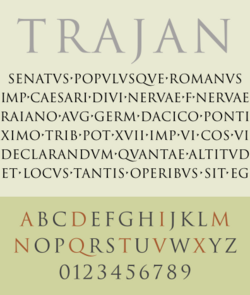
Trajan is a serif typeface designed in 1989 by Carol Twombly for Adobe.[2][1]
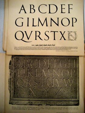
The design is based on the letterforms of capitalis monumentalis or Roman square capitals, as used for the inscription at the base of Trajan's Column from which the typeface takes its name. Trajan is an all-capitals typeface, as the Romans did not use lowercase letters. Twombly created the design taking inspiration from a full-size picture of a rubbing of the inscription.[3] It is well known for appearing on many film posters.[4]
Background
The capitals on Trajan's Column have long been an inspiration to many artists and students of lettering.[5][6] The calligrapher and type designer Edward Johnston in his book Writing & Illuminating & Lettering (1906) wrote that "the Roman capitals have held the supreme place among letters for readableness and beauty. They are the best forms for the grandest and most important inscriptions."[7][8] Trajan letterforms were used for many years for signs in British public buildings, including government offices.[9][10]
Twombly's translation of the Trajan inscription into type is quite crisp and faithful. Many looser interpretations (often with an invented lowercase) predate Twombly's, particularly Emil Rudolf Weiss' "Weiss" of 1926, Frederic Goudy's Forum Title, Hadriano and "Goudy Trajan", and Diotima by Gudrun Zapf-von Hesse, while Warren Chappell's "Trajanus" of 1939, while having similar forms for capitals has a markedly medieval lowercase.[11] Many other examples of lettering and typefaces are based on Roman capitals, for instance lettering made under the influence of the Arts and Crafts movement in the nineteenth and twentieth centuries.[6] Alastair Johnston's 1990 review of Trajan noted this heritage, saying that it "outdoes anything old Fred Goudy ever produced."[12]
Trajan was designed for display instead of printed text – specifically for use in large sizes.[1]
Twombly's digitisation of Trajan has become very popular, as seen in its widespread presence on movie posters, television shows, and book covers.[4] A bold weight was added to Trajan when it was made digital.[1]
Twombly retired from Adobe and type design in 1999,[13] but Adobe has continued to release versions in consultation with her. Trajan Pro was the initial OpenType version, which added central European language support and added small caps in the lowercase slots. In 2012 the existing OpenType version was significantly revised as "Trajan Pro 3," with Robert Slimbach adding four additional weights as well as Cyrillic and Greek glyphs.[2][1][14] Adobe has also released a "Trajan Sans" companion face, forming a font superfamily.[15] Neither version supports the archaic Latin vowels long I or apex-V.
References
- ↑ 1.0 1.1 1.2 1.3 1.4 McNeil, Paul (2017). The Visual History of Type. London: Laurence King. pp. 478–479. ISBN 978-1-78067-976-1.
- ↑ 2.0 2.1 Berry, John. "Trajan 3 Pro specimen". Adobe Systems. http://www.adobe.com/content/dam/acom/en/products/type/pdfs/Trajan-Pro-3-Online-Specimen.pdf. Retrieved 18 October 2016.
- ↑ Riggs, Tamye (12 June 2014). "The Adobe Originals Silver Anniversary Story: Stone, Slimbach, and Twombly launch the first Originals". http://blog.typekit.com/2014/06/12/the-adobe-originals-silver-anniversary-story-stone-slimbach-and-twombly-launch-the-first-originals/.
- ↑ 4.0 4.1 "TYPO Talks » Blog Archiv » Yves Peters: Trajan in Movie Posters". https://www.typotalks.com/news/2012/04/07/yves-peters-trajan-in-movie-posters/.
- ↑ Zhukov, Maxim. "The Trajan Letter in Russia and America". http://typejournal.ru/en/articles/The-Trajan-Letter-in-Russia-and-America. Retrieved 4 March 2017.
- ↑ 6.0 6.1 Nash, John. "In Defence of the Roman Letter". Journal of the Edward Johnston Foundation. http://www.ejf.org.uk/Resources/JRNarticle.pdf. Retrieved 13 October 2016.
- ↑ Tam, Keith (2002). Calligraphic tendencies in the development of sanserif types in the twentieth century. Reading: University of Reading (MA thesis). http://keithtam.net/documents/sanserif.pdf. Retrieved 2016-10-18.
- ↑ Johnston, Edward (1906). Writing & Illuminating & Lettering. Macmillan. pp. 268–269, 384, 391. https://archive.org/details/writingilluminat00johnrich.
- ↑ Mosley, James (1964). "Trajan Revived". Alphabet 1: 17–48.
- ↑ Mosley, James. "Number Ten". http://typefoundry.blogspot.co.uk/2010/10/number-ten.html. Retrieved 14 July 2015.
- ↑ Shaw, Paul (2017). Revival Type: Digital Typefaces Inspired by the Past. Yale University Press. pp. 18–24. ISBN 978-0-300-21929-6. https://books.google.com/books?id=n7e0DgAAQBAJ&pg=PA18.
- ↑ Riggs, Tamye. "The Adobe Originals Silver Anniversary Story: A community perspective on the Originals program". Adobe Systems. https://blog.typekit.com/2014/08/20/the-adobe-originals-silver-anniversary-story-a-community-perspective-on-the-originals-program/. Retrieved 4 March 2017.
- ↑ Riggs, Tamye. "The Adobe Originals Silver Anniversary Story: How the Originals endured in an ever-changing industry". Adobe. http://blog.typekit.com/2014/07/30/the-adobe-originals-silver-anniversary-story-how-the-originals-endured-in-an-ever-changing-industry/. Retrieved 2 July 2015.
- ↑ Brown, Tim (15 November 2012). "Trajan Pro replaced by new, improved Trajan Pro 3". http://blog.typekit.com/2012/11/15/trajan-pro-replaced-by-new-improved-trajan-pro-3/.
- ↑ Brown, Tim (21 March 2012). "Inscriptional faces from Adobe Type". http://blog.typekit.com/2012/03/21/inscriptional-faces-from-adobe-type/.
External links
- Trajan Pro 3 and Trajan Sans on Fontspring, Adobe's current font licensor
- Fonts in Use
- Trajan's Column, including detail of the capitalis monumentalis inscription.
- Etched in Stone, a humorous animation regarding the use (or overuse) of Trajan in film titles.
- Trajan is the movie font, a satirical video poking fun at the omnipresence of Trajan in the movie world.
 |


