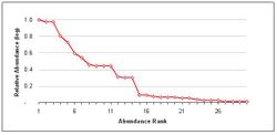
Rank abundance curve
A rank abundance curve or Whittaker plot is a chart used by ecologists to display relative species abundance, a component of biodiversity. It can also be used to visualize species richness and species evenness. It overcomes the shortcomings of biodiversity indices that cannot display the relative role different variables played in their calculation.
The curve is a 2D chart with relative abundance on the Y-axis and the abundance rank on the X-axis.
- X-axis: The abundance rank. The most abundant species is given rank 1, the second most abundant is 2 and so on.
- Y-axis: The relative abundance. Usually measured on a log scale, this is a measure of a species abundance (e.g., the number of individuals) relative to the abundance of other species.
Interpreting a rank abundance curve
The rank abundance curve visually depicts both species richness and species evenness. Species richness can be viewed as the number of different species on the chart i.e., how many species were ranked. Species evenness is reflected in the slope of the line that fits the graph (assuming a linear, i.e. logarithmic series, relationship). A steep gradient indicates low evenness as the high-ranking species have much higher abundances than the low-ranking species. A shallow gradient indicates high evenness as the abundances of different species are similar.
Quantitative comparison of rank abundance curves
Quantitative comparison of rank abundance curves of different communities can be done using RADanalysis package in R. This package uses the max rank normalization method[1] in which a rank abundance distribution is made by normalization of rank abundance curves of communities to the same number of ranks and then normalize the relative abundances to one.
References
- Magurran, Anne E. (2004). Measuring biological diversity. Oxford: Blackwell. ISBN 0-632-05633-9.
- Whittaker, R. H. (1965). "Dominance and Diversity in Land Plant Communities: Numerical relations of species express the importance of competition in community function and evolution". Science 147 (3655): 250–260. doi:10.1126/science.147.3655.250. PMID 17788203.
- Specific
- ↑ Saeedghalati, M. (2017). "Quantitative Comparison of Abundance Structures of Generalized Communities: From B-Cell Receptor Repertoires to Microbiomes". PLOS Comput. Biol. 13 (1): e1005362. doi:10.1371/journal.pcbi.1005362. PMID 28114391. Bibcode: 2017PLSCB..13E5362S.
External links
- Whittaker Diagram, Procedural Content Generation Wiki - use of Whittaker diagrams in procedural content generation
- RADanalysis package in R, Package in CRAN contain functions for quantitative comparison of rank abundance curves
 |


