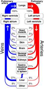
Flow map
A flow map is a type of thematic map that uses linear symbols to represent movement. It may thus be considered a hybrid of a map and a flow diagram. The movement being mapped may be that of anything, including people, highway traffic, trade goods, water, ideas, telecommunications data, etc.[1] The wide variety of moving material, and the variety of geographic networks through they move, has led to many different design strategies. Some cartographers have expanded this term to any thematic map of a linear network, while others restrict its use to maps that specifically show movement of some kind.
Many flow maps use line width proportional to the amount of flow, making them similar to other maps that use proportional size, including cartograms (altering region area), and proportional point symbols.
History
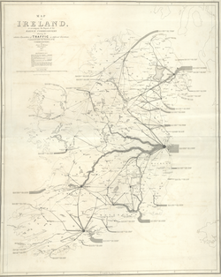
The earliest known map to visually represent the volume of flow were two maps by engineer Henry Drury Harness, published in 1838 as part of a report on the potential for railroad construction in Ireland, showing the quantity of cargo traffic by road and canal.[2][3] In subsequent years, others experimented with the technique in Europe, until it was mastered by Charles Joseph Minard.[4]
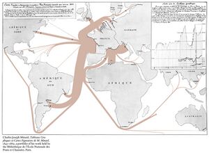
During the 1850s and 1860s, Minard published forty-two flow maps on a wide variety of topics among his cartes figuratives. Among these is his 1869 map of the French invasion of Russia in 1812-1813, which has been called "the best statistical graphic ever drawn."[5][6] Many of Minard's maps use design techniques that have yet to be improved upon, even in the age of computer graphics.
During the 1980s, Waldo Tobler conducted experiments to create flow maps by computer.[7][8] Early computer-generated maps were not up to Minard standards, but Geographic information system (GIS) and graphics software has improved in the ability to design flow maps.
Flow phenomena
A wide variety of flow maps have been created since the 1830s, showing movement in many forms. According to Eduard Imhof, a flow map may represent several different aspects of the phenomena that are moving and the networks along which they move; he listed the following:[9]:94–95
- Origin and Destination: "from where and to where is something moving?"
- Route: "Along which line does the movement take place?" This may be represented precisely, generalized, or only in the schematic form of straight lines[10]
- Type of movement: "what is moved?" This nominal category could include variables such as the product being shipped from one point to another, the vehicular mode of transport, or the water temperature in an ocean current.
- Amount of movement: "how much is moved? Is the quantity of the transported item changing steadily (gradually) or in stages?" This will be a non-negative ratio variable, such as vehicles per day, the total number of migrants, or water flow in cubic feet per second. Some flow maps represent flow capacity rather than actual movement volume, such as telecommunications bandwidth.
- Direction of movement: "in which direction, or in both directions, is something moved?" This is often shown by arrows.[11]
- Flow velocity: "At what speed or in how much time is something moved?" This is a ratio variable that is similar to, but distinct from the amount of movement. An example would be representing highway traffic levels using mean vehicle speed, or wind velocity.
These are not distinct types of maps; a flow map may portray any of all of these aspects simultaneously.
The types of phenomena that have been the subject of flow maps are varied. Topics relating to human geography include: migration, travel, international trade, logistics, public utilities (water, sewer, electricity, telecommunications), and traffic, among others. Others relate to physical geography: streamflow, wind, wildlife migration, etc.
Types of flow maps
The variance of flow maps in subject matter, and the relative importance of Imhof's aspects of flow, has led to a number of design strategies. In a 1987 thesis, Mary Parks identified several distinct types of flow maps,[12] which has been widely cited although her list was not comprehensive and more are included here. These types are prototypical; actual maps can combine some aspects of several types.
Origin-destination map
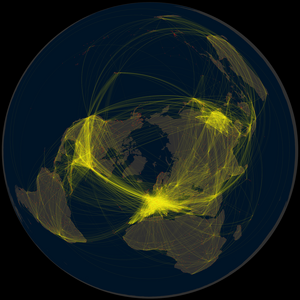
In this type, the primary intent is to show the existence of a connection between two places, often accompanied by a representation of the volume of flow and/or direction.[11] The route is generally not important to the audience, so connecting lines are often straight or slightly curved. A common example of this form is the airline route map. Parks distinguished radial maps (emanating from a single origin or destination) from network maps (interconnecting a number of nodes), but this is a difference in the geographic pattern; the design is very similar for both types.
Origin-destination maps have a unique design focus on the schematic shape of the connecting lines. Straight lines are easy to draw, but can cause issues, especially when longer lines and shorter lines are collinear, obscuring each other and their destinations. They can also have a haphazard look. For these reasons, curved lines, typically circular arcs, are preferred as more aesthetically pleasing. They also have the ability to be adjusted to avoid intervening lines and points.[13] Early automated line generation algorithms were typically straight lines,[8] but recent algorithms have been successful at creating curved lines.[14]
Distribution map
This type is exemplified by a balanced focus on origin-destination nodes, the routes of travel between them (usually highly generalized), and the volume of flow. The most common example, dating back to Minard, is a map showing shipping between a set of node regions or port cities, along common sea lanes. In a distribution map, paths leave the origin with a width proportional to the total of several destinations, then divide as routes "distribute" toward each destination.
Designing distribution maps requires some care and craft in drafting the flow lines so they divide with proper widths, and at smooth curving angles. Computation experiments have shown the potential for generating these automatically,[1] but today most are drawn semi-manually using GIS and graphics software.[11]
Network route map
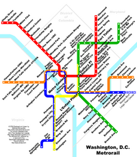
This type of flow map originally dates back to the Harness map of Ireland.[3] It focuses more on the routes of the network than its origin/destination nodes. The routes may be precise or highly generalized (as in many transit maps), and may or may not represent amount or speed of flow. A common example is a map of highway traffic.
Continuous/Mass flow map
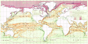
Not all flow occurs along linear networks; two- and three-dimensional masses can also flow, especially water (e.g., ocean current) and air (wind). Their movement can be modeled as a vector field, in which the magnitude and direction of movement could be measured at any point in space.[9]:149 In Imhof's list above, a map that visualizes this, often called a mass flow map or continuous flow map,[15] focuses on direction and speed of flow, while other aspects such as origin/destination and route of travel are largely meaningless.
In 1688, Edmund Halley mapped the trade winds using an array of short line segments oriented in the direction of air flow.[4]:69 In early 20th Century weather maps, this technique was elaborated into wind barbs, complex symbols used to indicate wind speed as well as direction. Unit vectors and streamlets have been proposed as a general term for point-based flow symbols, but neither is in wide usage.[16] These can be readily generated by computer algorithms, especially using raster GIS data or sample point data (e.g., weather stations).[17] This approach is more akin to proportional point symbols than a typical flow map.
Another visualization option for vector fields is to draw streamlines, which connect points that would flow into each other; this has been commonly used to represent ocean currents since the early 19th Century.[4]:82 Among Tobler's 1981 computer algorithms were models of vector fields to generate "streaklines," and subsequent work has improved results.[7][16]
Weight scaling
The most common technique to visualize the amount or speed of flow is through the visual variable of size, specifically line weight (usually measured in points or millimeters). That said, size is much more intuitive for total amount, so other visual variables (such as color hue or color value) may also be considered for speed. The following methods for determining line weights is very similar to the scaling methods for proportional symbol maps.[11]
The most common method is to calculate the weight of a given line w in direct proportion to amount value v, based on an arbitrarily selected weight w0 for a selected base value v0 (often but not necessarily the minimum value):
[math]\displaystyle{ \frac{w}{w_0} = \frac{v}{v_0} }[/math]
This helps readers make intuitive judgements about relative value ratios based on relative weights; a line that is twice as thick as another represents twice the value. However, when there is a very high level of variation between the highest and lowest values (generally, more than 25:1, although this depends on the geography of the flow network and the design), the resultant map can be problematic, with overwhelming thick lines and almost invisible thin lines. An alternative in this case is to set the minimum and maximum weights (wmax and wmin) and perform linear interpolation between them, even though this eliminates the ability to intuitively judge weight ratios: [math]\displaystyle{ \frac{w - w_{min}}{w_{max} - w_{min}} = \frac{v - v_{min}}{v_{max} - v_{min}} }[/math]
A third alternative is to simply use ordinal weights (thick, medium, thin, etc.) to represent an ordinal variable or a quantitative variable that has been classified (often called range grading in this context). This also loses the ability of readers to intuitively judge value differences, but has the advantage of overall simplicity.
For all of these types of scaling, the legend typically shows a sample set of line weights with their respective values, in a fashion similar to the legend of a proportional symbol map.
Other types of flow diagrams
Beside the flow maps in cartography there are several other methods for visualizing non-geographic flow:
- Baker flow map of fluid flows
- Blood flow maps, see history of neuroimaging
- Flow map or solution operator, see random dynamical system
- Process flow map of a manufacturing process
- Sankey diagram
- XSL flow maps, see XSL Formatting Objects
See also
- Flow diagram (disambiguation)
- Thematic map
References
- ↑ 1.0 1.1 Phan, Doantam; Xiao, Ling; Yeh, Ron; Hanrahan, Pat; Winograd, Terry (2005). "Flow map layout". IEEE Symposium on Information Visualization, 2005. INFOVIS 2005. pp. 219–224. doi:10.1109/INFVIS.2005.1532150. ISBN 0-7803-9464-X. http://graphics.stanford.edu/papers/flow_map_layout/.
- ↑ Robinson, Arthur H. (Dec 1955). "The 1837 Maps of Henry Drury Harness". The Geographical Journal 121 (4): 440–450. doi:10.2307/1791753. https://www.jstor.org/stable/1791753.
- ↑ 3.0 3.1 Griffith, Richard John; Harness, Henry Drury (1838). Atlas to Accompany 2nd Report of the Railway Commissioners. Ireland. http://digital.ucd.ie/view/ivrla:45724.
- ↑ 4.0 4.1 4.2 Robinson, Arthur H. (1982). Early Thematic Mapping in the History of Cartography. University of Chicago Press. pp. 147–154.
- ↑ Tufte, Edward (2006). Beautiful Evidence. Graphics Press. Bibcode: 2006beev.book.....T.
- ↑ Jacobs, Frank (23 July 2010). "The Minard Map - "The best statistical graphic ever drawn"". https://bigthink.com/strange-maps/229-vital-statistics-of-a-deadly-campaign-the-minard-map. Retrieved 13 November 2020.
- ↑ 7.0 7.1 Tobler, Waldo R. (January 1981). "A Model of Geographic Movement". Geographical Analysis 13 (1): 1–20. doi:10.1111/j.1538-4632.1981.tb00711.x.
- ↑ 8.0 8.1 Tobler, Waldo R. (1987). "Experiments in Migration Mapping by Computer". The American Cartographer 14 (2): 155–163. doi:10.1559/152304087783875273.
- ↑ 9.0 9.1 Imhof, Eduard (1972). Thematische Kartographie. Berlin: De Gruyter.
- ↑ Robinson, Arthur H., Elements of Cartography, 2nd Edition, New York: Wiley, 1960.
- ↑ 11.0 11.1 11.2 11.3 Dent, Borden D.; Torguson, Jeffrey S.; Hodler, Thomas W. (2009). Cartography: Thematic Map Design (6th ed.). McGraw-Hill. pp. 188–201.
- ↑ Parks, Mary J. (1987). American flow mapping: A survey of the flow maps found in twentieth century geography textbooks, including a classification of the various flow map designs. Georgia State University: Unpublished M.A. thesis.
- ↑ Jenny, Bernhard; Stephen, Daniel M.; Muehlenhaus, Ian; Marston, Brook E.; Sharma, Ritesh; Zhang, Eugene; Jenny, Helen (2018). "Design principles for origin-destination flow maps". Cartography and Geographic Information Science 45 (1): 62–75. doi:10.1080/15230406.2016.1262280.
- ↑ Jenny, Bernhard; Stephen, Daniel M.; Muehlenhaus, Ian; Marston, Brooke E.; Sharma, Ritesh; Zhang, Eugene; Jenny, Helen (2017). "Force-directed layout of origin-destination flow maps". International Journal of Geographical Information Science 31 (8): 1521–1540. doi:10.1080/13658816.2017.1307378.
- ↑ T. Slocum, R. McMaster, F. Kessler, H. Howard (2009). Thematic Cartography and Geovisualization, Third Edn, page 252. Pearson Prentice Hall: Upper Saddle River, NJ., pp.360-369.
- ↑ 16.0 16.1 Turk, G.; Banks, D. (August 1996). "Image-guided streamline placement". Proceedings of the 23rd annual conference on Computer graphics and interactive techniques. pp. 453–460. doi:10.1145/237170.237285. ISBN 0897917464.
- ↑ Lavin, S.J.; Cerveny, R.S. (1987). "Unit-vector density mapping". The Cartographic Journal 24 (2): 131–141. doi:10.1179/caj.1987.24.2.131.
External links
- Flow Map Layout
- CSISS/Flow Mapper Software from Waldo R. Tobler
- Flowmap 7.3
- Flowmap.blue – Tool for visualizing data from a Google Sheets spreadsheet as a flow map in browser
- FlowMapper QGIS flowmapping plugin
- JFlowMap – Flow map visualization tool
- Power BI plugin for flow map rendering
- wiki.gis.com article on flow map
 |

