Cartogram
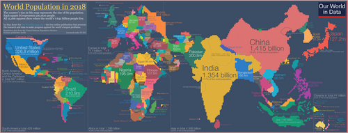
A cartogram (also called a value-area map or an anamorphic map, the latter common among German-speakers) is a thematic map of a set of features (countries, provinces, etc.), in which their geographic size is altered to be directly proportional to a selected variable, such as travel time, population, or Gross National Product. Geographic space itself is thus warped, sometimes extremely, in order to visualize the distribution of the variable. It is one of the most abstract types of map; in fact, some forms may more properly be called diagrams. They are primarily used to display emphasis and for analysis as nomographs.[1]
Cartograms leverage the fact that size is the most intuitive visual variable for representing a total amount.[2] In this, it is a strategy that is similar to proportional symbol maps, which scale point features, and many flow maps, which scale the weight of linear features. However, these two techniques only scale the map symbol, not space itself; a map that stretches the length of linear features is considered a linear cartogram (although additional flow map techniques may be added). Once constructed, cartograms are often used as a base for other thematic mapping techniques to visualize additional variables, such as choropleth mapping.
History
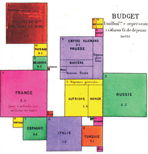
The cartogram was developed later than other types of thematic maps, but followed the same tradition of innovation in France .[3] The earliest known cartogram was published in 1876 by French statistician and geographer Pierre Émile Levasseur, who created a series of maps that represented the countries of Europe as squares, sized according to a variable and arranged in their general geographical position (with separate maps scaled by area, population, religious adherents, and national budget).[4] Later reviewers have called his figures a statistical diagram rather than a map, but Levasseur referred to it as a carte figurative, the common term then in use for any thematic map. He produced them as teaching aids, immediately recognizing the intuitive power of size as a visual variable: "It is impossible that the child is not struck by the importance of the trade of Western Europe in relation to that of Eastern Europe, that he does not notice how much England, which has a small territory but outweighs other nations by its wealth and especially by its navy, how much on the contrary Russia which, by its area and its population occupies the first rank, is still left behind by other nations in the commerce and navigation."
Levasseur's technique does not appear to have been adopted by others, and relatively few similar maps appear for many years. The next notable development was a pair of maps by Hermann Haack and Hugo Weichel of the 1898 election results for the German Reichstag in preparation for the 1903 election, the earliest known contiguous cartogram.[5] Both maps showed a similar outline of the German Empire, with one subdivided into constituencies to scale, and the other distorting the constituencies by area. The subsequent expansion of densely populated areas around Berlin, Hamburg, and Saxony was intended to visualize the controversial tendency of the mainly urban Social Democrats to win the popular vote, while the mainly rural Zentrum won more seats (thus presaging the modern popularity of cartograms for showing the same tendencies in recent elections in the United States).[6]
The continuous cartogram emerged soon after in the United States, where a variety appeared in the popular media after 1911.[7][8] Most were rather crudely drawn compared to Haack and Weichel, with the exception of the "rectangular statistical cartograms" by the American master cartographer Erwin Raisz, who claimed to have invented the technique.[9][10]
When Haack and Weichel referred to their map as a kartogramm, this term was commonly being used to refer to all thematic maps, especially in Europe.[11][12] It was not until Raisz and other academic cartographers stated their preference for a restricted use of the term in their textbooks (Raisz initially espousing value-area cartogram) that the current meaning was gradually adopted.[13][14]
The primary challenge of cartograms has always been the drafting of the distorted shapes, making them a prime target for computer automation. Waldo R. Tobler developed one of the first algorithms in 1963, based on a strategy of warping space itself rather than the distinct districts.[15] Since then, a wide variety of algorithms have been developed (see below), although it is still common to craft cartograms manually.[1]
General principles
Since the early days of the academic study of cartograms, they have been compared to map projections in many ways, in that both methods transform (and thus distort) space itself.[15] The goal of designing a cartogram or a map projection is therefore to represent one or more aspects of geographic phenomena as accurately as possible, while minimizing the collateral damage of distortion in other aspects. In the case of cartograms, by scaling features to have a size proportional to a variable other than their actual size, the danger is that the features will be distorted to the degree that they are no longer recognizable to map readers, making them less useful.
As with map projections, the tradeoffs inherent in cartograms have led to a wide variety of strategies, including manual methods and dozens of computer algorithms that produce very different results from the same source data. The quality of each type of cartogram is typically judged on how accurately it scales each feature, as well as on how (and how well) it attempts to preserve some form of recognizability in the features, usually in two aspects: shape and topological relationship (i.e., retained adjacency of neighboring features).[16][17] It is likely impossible to preserve both of these, so some cartogram methods attempt to preserve one at the expense of the other, some attempt a compromise solution of balancing the distortion of both, and other methods do not attempt to preserve either one, sacrificing all recognizability to achieve another goal.
Area cartograms
The area cartogram is by far the most common form; it scales a set of region features, usually administrative districts such as counties or countries, such that the area of each district is directly proportional to a given variable. Usually this variable represents the total count or amount of something, such as total Population, Gross domestic product, or the number of retail outlets of a given brand or type. Other strictly positive ratio variables can also be used, such as GDP per capita or Birth rate, but these can sometimes produce misleading results because of the natural tendency to interpret size as total amount.[2] Of these, total population is probably the most common variable, sometimes called an isodemographic map.
The various strategies and algorithms have been classified a number of ways, generally according to their strategies with respect to preserving shape and topology. Those that preserve shape are sometimes called equiform, although isomorphic (same-shape) or homomorphic (similar-shape) may be better terms. Three broad categories are widely accepted: contiguous (preserve topology, distort shape), non-contiguous (preserve shape, distort topology), and diagrammatic (distort both). Recently, more thorough taxonomies by Nusrat and Kobourov, Markowska, and others have built on this basic framework in an attempt to capture the variety in approaches that have been proposed and in the appearances of the results.[18][19] The various taxonomies tend to agree on the following general types of area cartograms.
Anamorphic Projection
This is a type of contiguous cartogram that uses a single parametric mathematical formula (such as a polynomial curved surface) to distort space itself to equalize the spatial distribution of the chosen variable, rather than distorting the individual features. Because of this distinction, some have preferred to call the result a pseudo-cartogram.[20] Tobler's first computer cartogram algorithm was based on this strategy,[15][21] for which he developed the general mathematical construct on which his and subsequent algorithms are based.[15] This approach first models the distribution of the chosen variable as a continuous density function (usually using a least squares fitting), then uses the inverse of that function to adjust the space such that the density is equalized. The Gastner-Newman algorithm, one of the most popular tools used today, is a more advanced version of this approach.[22][23] Because they do not directly scale the districts, there is no guarantee that the area of each district is exactly equal to its value.
Shape-warping contiguous cartograms
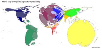
Also called irregular cartograms or deformation cartograms,[19] This is a family of very different algorithms that scale and deform the shape of each district while maintaining adjacent edges. This approach has its roots in the early 20th Century cartograms of Haack and Weichel and others, although these were rarely as mathematically precise as current computerized versions. The variety of approaches that have been proposed include cellular automata, quadtree partitions, cartographic generalization, medial axes, spring-like forces, and simulations of inflation and deflation.[18] Some attempt to preserve some semblance of the original shape (and may thus be termed homomorphic),[25] but these are often more complex and slower algorithms than those that severely distort shape.
Non-contiguous isomorphic cartograms
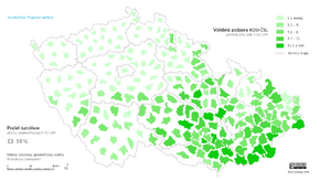
This is perhaps the simplest method for constructing a cartogram, in which each district is simply reduced or enlarged in size according to the variable without altering its shape at all.[16] In most cases, a second step adjusts the location of each shape to reduce gaps and overlaps between the shapes, but their boundaries are not actually adjacent. While the preservation of shape is a prime advantage of this approach, the results often have a haphazard appearance because the individual districts do not fit together well.
Diagrammatic (Dorling) cartograms
In this approach, each district is replaced with a simple geometric shape of proportional size. Thus, the original shape is completely eliminated, and contiguity may be retained in a limited form or not at all. Although they are usually referred to as Dorling cartograms after Daniel Dorling's 1996 algorithm first facilitated their construction,[26] these are actually the original form of cartogram, dating back to Levasseur (1876)[4] and Raisz (1934).[9] Several options are available for the geometric shapes:
- Circles (Dorling), typically brought together to be touching and arranged to retain some semblance of the overall shape of the original space.[26] These often look like proportional symbol maps, and some consider them to be a hybrid between the two types of thematic map.
- Squares (Levasseur/Demers), treated in much the same way as the circles, although they do not generally fit together as simply.
- Rectangles (Raisz), in which the height and width of each rectangular district is adjusted to fit within an overall shape. The result looks much like a treemap diagram, although the latter is generally sorted by size rather than geography. These are often contiguous, although the contiguity may be illusory because many of the districts that are adjacent in the map may not be the same as those that are adjacent in reality.
Because the districts are not at all recognizable, this approach is most useful and popular for situations in which the shapes would not be familiar to map readers anyway (e.g., U.K. parliamentary constituencies) or where the districts are so familiar to map readers that their general distribution is sufficient information to recognize them (e.g., countries of the world). Typically, this method is used when it is more important for readers to ascertain the overall geographic pattern than to identify particular districts; if identification is needed, the individual geometric shapes are often labeled.
Mosaic cartograms
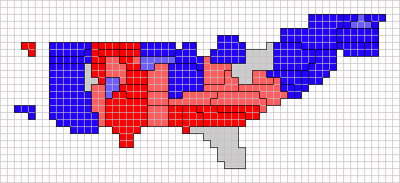
In this approach (also called block or regular cartograms), each shape is not just scaled or warped, but is reconstructed from a discrete tessellation of space, usually into squares or hexagons. Each cell of the tessellation represents a constant value of the variable (e.g., 5000 residents), so the number of whole cells to be occupied can be calculated (although rounding error often means that the final area is not exactly proportional to the variable). Then a shape is assembled from those cells, usually with some attempt to retain the original shape, including salient features such as panhandles that aid recognition (for example, Long Island and Cape Cod are often exaggerated). Thus, these cartograms are usually homomorphic and at least partially contiguous.
This method works best with variables that are already measured as a relatively low-valued integer, enabling a one-to-one match with the cells. This has made them very popular for visualizing the United States Electoral College that determines the election of the president, appearing on television coverage and numerous vote-tracking websites.[27] Several examples of block cartograms were published during the 2016 U.S. presidential election season by The Washington Post,[28] the FiveThirtyEight blog,[29] and the Wall Street Journal,[30] among others.
The major disadvantage of this type of cartogram has traditionally been that they had to be constructed manually, but recently algorithms have been developed to automatically generate both square and hexagonal mosaic cartograms.[31][32] One of these, Tilegrams, even admits that the results of their algorithm is not perfect and provides a way for users to edit the product.
Linear cartograms
While an area cartogram manipulates the area of a polygon feature, a linear cartogram manipulates linear distance on a line feature. The spatial distortion allows the map reader to easily visualize intangible concepts such as travel time and connectivity on a network. Distance cartograms are also useful for comparing such concepts among different geographic features. A distance cartogram may also be called a central-point cartogram.
A common use of distance cartograms is to show the relative travel times and directions from vertices in a network. For example, on a distance cartogram showing travel time between cities, the less time required to get from one city to another, the shorter the distance on the cartogram will be. When it takes a longer time to travel between two cities, they will be shown as further apart in the cartogram, even if they are physically close together.
Distance cartograms are also used to show connectivity. This is common on subway and metro maps, where stations and stops are shown as being the same distance apart on the map even though the true distance varies. Though the exact time and distance from one location to another is distorted, these cartograms are still useful for travel and analysis.
Multivariate cartograms
Both area and linear cartograms adjust the base geometry of the map, but neither has any requirements for how each feature is symbolized. This means that symbology can be used to represent a second variable using a different type of thematic mapping technique.[16] For linear cartograms, line width can be scaled as a flow map to represent a variable such as traffic volume. For area cartograms, it is very common to fill each district with a color as a choropleth map. For example, WorldMapper has used this technique to map topics relating to global social issues, such as poverty or malnutrition; a cartogram based on total population is combined with a choropleth of a socioeconomic variable, giving readers a clear visualization of the number of people living in underprivileged conditions.
Another option for diagrammatic cartograms is to subdivide the shapes as charts (commonly a pie chart), in the same fashion often done with proportional symbol maps. This can be very effective for showing complex variables such as population composition, but can be overwhelming if there are a large number of symbols or if the individual symbols are very small.
Production
One of the first cartographers to generate cartograms with the aid of computer visualization was Waldo Tobler of UC Santa Barbara in the 1960s. Prior to Tobler's work, cartograms were created by hand (as they occasionally still are). The National Center for Geographic Information and Analysis located on the UCSB campus maintains an online Cartogram Central with resources regarding cartograms.
A number of software packages generate cartograms. Most of the available cartogram generation tools work in conjunction with other GIS software tools as add-ons or independently produce cartographic outputs from GIS data formatted to work with commonly used GIS products. Examples of cartogram software include ScapeToad,[33][34] Cart,[35] and the Cartogram Processing Tool (an ArcScript for ESRI's ArcGIS), which all use the Gastner-Newman algorithm.[36][37] An alternative algorithm, Carto3F,[38] is also implemented as an independent program for non-commercial use on Windows platforms.[39] This program also provides an optimization to the original Dougenik rubber-sheet algorithm.[40] [41] The CRAN package recmap provides an implementation of a rectangular cartogram algorithm.[42]
Algorithms

Net contributors
| Year | Author | Algorithm | Type | Shape preservation | Topology preservation |
|---|---|---|---|---|---|
| 1973 | Tobler | Rubber map method | area contiguous | with distortion | Yes, but not guaranteed |
| 1976 | Olson | Projector method | area noncontiguous | yes | No |
| 1978 | Kadmon, Shlomi | Polyfocal projection | distance radial | Unknown | Unknown |
| 1984 | Selvin et al. | DEMP (Radial Expansion) method | area contiguous | with distortion | Unknown |
| 1985 | Dougenik et al. | Rubber Sheet Distortion method [41] | area contiguous | with distortion | Yes, but not guaranteed |
| 1986 | Tobler | Pseudo-Cartogram method | area contiguous | with distortion | Yes |
| 1987 | Snyder | Magnifying glass azimuthal map projections | distance radial | Unknown | Unknown |
| 1989 | Colette Cauvin et al. | Piezopleth maps | area contiguous | with distortion | Unknown |
| 1990 | Torguson | Interactive polygon zipping method | area contiguous | with distortion | Unknown |
| 1990 | Dorling | Cellular Automata Machine method | area contiguous | with distortion | Yes |
| 1993 | Gusein-Zade, Tikunov | Line Integral method | area contiguous | with distortion | Yes |
| 1996 | Dorling | Circular cartogram | area noncontiguous | no (circles) | No |
| 1997 | Sarkar, Brown | Graphical fisheye views | distance radial | Unknown | Unknown |
| 1997 | Edelsbrunner, Waupotitsch | Combinatorial-based approach | area contiguous | with distortion | Unknown |
| 1998 | Kocmoud, House | Constraint-based approach | area contiguous | with distortion | Yes |
| 2001 | Keim, North, Panse | CartoDraw[43] | area contiguous | with distortion | Yes, algorithmically guaranteed |
| 2004 | Gastner, Newman | Diffusion-based method[44] | area contiguous | with distortion | Yes, algorithmically guaranteed |
| 2004 | Sluga | Lastna tehnika za izdelavo anamorfoz | area contiguous | with distortion | Unknown |
| 2004 | Heilmann, Keim et al. | RecMap[42] | area noncontiguous | no (rectangles) | No |
| 2005 | Keim, North, Panse | Medial-axis-based cartograms[45] | area contiguous | with distortion | Yes, algorithmically guaranteed |
| 2009 | Heriques, Bação, Lobo | Carto-SOM | area contiguous | with distortion | Yes |
| 2013 | Shipeng Sun | Opti-DCN[40] and Carto3F[38] | area contiguous | with distortion | Yes, algorithmically guaranteed |
| 2014 | B. S. Daya Sagar | Mathematical Morphology-Based Cartograms | area contiguous | with local distortion, but no global distortion |
No |
| 2018 | Gastner, Seguy, More | Fast Flow-Based Method[22] | area contiguous | with distortion | Yes, algorithmically guaranteed |
See also
- Contour map – Curve along which a 3-D surface is at equal elevation
References
- ↑ 1.0 1.1 Tobler, Waldo (March 2022). "Thirty-Five Years of Computer Cartograms". Annals of the Association of American Geographers 94 (1): 58–73. doi:10.1111/j.1467-8306.2004.09401004.x.
- ↑ 2.0 2.1 Jacque Bertin, Sémiologie Graphique. Les diagrammes, les réseaux, les cartes. With Marc Barbut [et al.]. Paris : Gauthier-Villars. Semiology of Graphics, English Edition, Translation by William J. Berg, University of Wisconsin Press, 1983.)
- ↑ Johnson (2008-12-08). "Early cartograms". indiemaps.com/blog. http://indiemaps.com/blog/2008/12/early-cartograms/.
- ↑ 4.0 4.1 Levasseur, Pierre Émile (1876-08-29). "Memoire sur l'étude de la statistique dans l'enseignenent primaire, secondaire et superieur". Programme du Neuvieme Congrès international de Statistique, I. Section, Theorie et population: 7–32. https://babel.hathitrust.org/cgi/pt?id=uc1.c2558275.. Unfortunately, all available scans did not expand the gatefold, so only one map in the series is visible online.
- ↑ Haack, Hermann; Weichel, Hugo (1903). Kartogramm zur Reichstagswahl. Zwei Wahlkarten des Deutschen Reiches. Justus Perthes Gotha.
- ↑ Hennig, Benjamin D. (Nov 2018). "Kartogramm zur Reichstagswahl: An Early Electoral Cartogram of Germany". The Bulletin of the Society of University Cartographers 52 (2): 15–25. https://www.researchgate.net/publication/329880252.
- ↑ Bailey, William B. (April 6, 1911). "Apportionment Map of the United States". The Independent 70 (3253): 722. https://archive.org/details/independent70newy/page/722/mode/2up.
- ↑ "Electrical Importance of the Various States". Electrical World 77 (12): 650–651. March 19, 1921. https://archive.org/details/electricalworld77newy/page/650.
- ↑ 9.0 9.1 Raisz, Erwin (Apr 1934). "The Rectangular Statistical Cartogram". Geographical Review 24 (2): 292–296. doi:10.2307/208794. Bibcode: 1934GeoRv..24..292R.
- ↑ Raisz, Erwin (1936). "Rectangular Statistical Cartograms of the World". Journal of Geography 34 (1): 8–10. doi:10.1080/00221343608987880. Bibcode: 1936JGeog..35....8R.
- ↑ Funkhouser, H. Gray (1937). "Historical Development of the Graphical Representation of Statistical Data". Osiris 3: 259–404. doi:10.1086/368480. https://www.jstor.org/stable/301591.
- ↑ Krygier, John (30 November 2010). "More Old School Cartograms, 1921-1938". https://makingmaps.net/2010/11/30/more-old-school-cartograms-1921-1938/.
- ↑ Raisz, Erwin, General Cartography, 2nd Edition, McGraw-Hill, 1948, p.257
- ↑ Raisz, Erwin (1962). Principles of Cartography. McGraw-Hill. pp. 215–221.
- ↑ 15.0 15.1 15.2 15.3 Tobler, Waldo R. (Jan 1963). "Geographic Area and Map Projections". Geographical Review 53 (1): 59–79. doi:10.2307/212809. Bibcode: 1963GeoRv..53...59T.
- ↑ 16.0 16.1 16.2 Dent, Borden D., Jeffrey S. Torguson, Thomas W. Hodler, Cartography: Thematic Map Design, 6th Edition, McGraw-Hill, 2009, pp.168-187
- ↑ Nusrat, Sabrina; Kobourov, Stephen (2015). "Visualizing Cartograms: Goals and Task Taxonomy". 17th Eurographics Conference on Visualization (Eurovis).
- ↑ 18.0 18.1 Nusrat, Sabrina; Kobourov, Stephen (2016). "The State of the Art in Cartograms". Computer Graphics Forum 35 (3): 619–642. doi:10.1111/cgf.12932. Special issue: 18th Eurographics Conference on Visualization (EuroVis), State of the Art Report
- ↑ 19.0 19.1 Markowska, Anna (2019). "Cartograms - classification and terminology". Polish Cartographical Review 51 (2): 51–65. doi:10.2478/pcr-2019-0005. Bibcode: 2019PCRv...51...51M.
- ↑ Bortins, Ian; Demers, Steve. "Cartogram Types". National Center for Geographic Information Analysis, UC Santa Barbara. http://www.ncgia.ucsb.edu/projects/Cartogram_Central/types.html.
- ↑ Tobler, Waldo R. (1973). "A Continuous Transformation Useful for Districting". Annals of the New York Academy of Sciences 219 (1): 215–220. doi:10.1111/j.1749-6632.1973.tb41401.x. PMID 4518429. Bibcode: 1973NYASA.219..215T.
- ↑ 22.0 22.1 Michael T. Gastner; Vivien Seguy; Pratyush More (2018). "Fast flow-based algorithm for creating density-equalizing map projections". Proceedings of the National Academy of Sciences 115 (10): E2156–E2164. doi:10.1073/pnas.1712674115. PMID 29463721. Bibcode: 2018PNAS..115E2156G.
- ↑ Gastner, Michael T.; Newman, M.E.J. (May 18, 2004). "Diffusion-based Method for Producing Density-Equalizing Maps". Proceedings of the National Academy of Sciences of the United States of America 101 (20): 7499–7504. doi:10.1073/pnas.0400280101. PMID 15136719.
- ↑ Paull, John & Hennig, Benjamin (2016) Atlas of Organics: Four Maps of the World of Organic Agriculture Journal of Organics. 3(1): 25–32.
- ↑ House, Donald H.; Kocmoud, Christopher J. (October 1998). "Continuous cartogram construction". Proceedings Visualization '98 (Cat. No.98CB36276). pp. 197–204. doi:10.1109/VISUAL.1998.745303. ISBN 0-8186-9176-X. https://www.researchgate.net/publication/3788051.
- ↑ 26.0 26.1 Dorling, Daniel (1996). Area Cartograms: Their Use and Creation. Concepts and Techniques in Modern Geography (CATMOG). 59. University of East Anglia.
- ↑ Bliss, Laura; Patino, Marie (3 November 2020). "How to Spot Misleading Election Maps". Bloomberg. https://www.bloomberg.com/news/articles/2020-11-03/a-complete-guide-to-misleading-election-maps.
- ↑ "Poll: Redrawing the Electoral Map". Washington Post. https://projects.fivethirtyeight.com/2016-election-forecast/?ex_cid=rrpromo#plus&electoral-map.
- ↑ "2016 Election Forecast". 29 June 2016. https://projects.fivethirtyeight.com/2016-election-forecast/?ex_cid=rrpromo#plus&electoral-map.
- ↑ "Draw the 2016 Electoral College Map". http://graphics.wsj.com/elections/2016/2016-electoral-college-map-predictions/.
- ↑ Cano, R.G.; Buchin, K.; Castermans, T.; Pieterse, A.; Sonke, W.; Speckman, B. (2015). "Mosaic Drawings and Cartograms". Computer Graphics Forum 34 (3): 361–370. doi:10.1111/cgf.12648. https://pure.tue.nl/ws/files/90083986/MosaicMapsRevised.pdf. Proceedings of 2015 Eurographics Conference on Visualization (EuroVis)
- ↑ Florin, Adam; Hamel, Jessica. "Tilegrams". Pitch Interactive. https://pitchinteractiveinc.github.io/tilegrams/.
- ↑ ScapeToad
- ↑ "The Art of Software: Cartogram Crash Course". http://artofsoftware.org/2012/02/08/cartogram-crash-course/.
- ↑ Cart: Computer software for making cartograms
- ↑ Cartogram Geoprocessing Tool
- ↑ Hennig, Benjamin D.; Pritchard, John; Ramsden, Mark; Dorling, Danny, "Remapping the World's Population: Visualizing data using cartograms", ArcUser (Winter 2010): 66–69, http://www.esri.com/news/arcuser/0110/cartograms.html
- ↑ 38.0 38.1 Sun, Shipeng (2013), "A Fast, Free-Form Rubber-Sheet Algorithm for Contiguous Area Cartograms", International Journal of Geographical Information Science 27 (3): 567–93, doi:10.1080/13658816.2012.709247, Bibcode: 2013IJGIS..27..567S
- ↑ Personal Website of Shipeng Sun
- ↑ 40.0 40.1 Sun, Shipeng (2013), "An Optimized Rubber-Sheet Algorithm for Continuous Area Cartograms", The Professional Geographer 16 (1): 16–30, doi:10.1080/00330124.2011.639613, Bibcode: 2013ProfG..65...16S
- ↑ 41.0 41.1 Dougenik, James A.; Chrisman, Nicholas R.; Niemeyer, Duane R. (1985), "An Algorithm to Construct Continuous Area Cartograms", The Professional Geographer 37 (1): 75–81, doi:10.1111/j.0033-0124.1985.00075.x
- ↑ 42.0 42.1 Heilmann, Roland; Keim, Daniel; Panse, Christian; Sips, Mike (2004). "RecMap: Rectangular Map Approximations". IEEE Symposium on Information Visualization. pp. 33–40. doi:10.1109/INFVIS.2004.57. ISBN 978-0-7803-8779-9.
- ↑ Keim, Daniel; North, Stephen; Panse, Christian (2004). "CartoDraw: a fast algorithm for generating contiguous cartograms.". IEEE Trans Vis Comput Graph 10 (1): 95–110. doi:10.1109/TVCG.2004.1260761. PMID 15382701.
- ↑ Gastner, Michael T. and Mark E. J. Newman, "Diffusion-based method for producing density-equalizing maps." Proceedings of the National Academy of Sciences 2004; 101: 7499–7504.
- ↑ Keim, Daniel; Panse, Christian; North, Stephen (2005). "Medial-axis-based cartograms.". IEEE Computer Graphics and Applications 25 (3): 60–68. doi:10.1109/MCG.2005.64. PMID 15943089. https://kops.uni-konstanz.de/bitstream/123456789/5543/1/CGA2005.pdf.
Further reading
- Campbell, John. Map Use and Analysis. New York: McGraw-Hill, 2001.
- Dorling, Daniel. "Area cartograms: Their use and creation." "Concepts and Techniques in Modern Geography series no. 59." Norwich: University of East Anglia, 1996.
- Gastner, Michael T. and Mark E. J. Newman, "Diffusion-based method for producing density-equalizing maps." Proceedings of the National Academy of Sciences 2004; 101: 7499–7504.
- Gillard, Quentin (1979). "Places in the News: The Use of Cartograms in Introductory Geography Courses". Journal of Geography 78 (3): 114–115. doi:10.1080/00221347908979963. Bibcode: 1979JGeog..78..114B.
- Hennig, Benjamin D. "Cartograms." International Encyclopedia of Geography: People, the Earth, Environment and Technology. Hoboken, NJ: John Wiley & Sons (2021).
- Hennig, Benjamin D. "Rediscovering the World: Map Transformations of Human and Physical Space." Berlin, Heidelberg: Springer, 2013.
- House, Donald H. and Christopher Kocmoud, "Continuous Cartogram Construction." Proceedings of the IEEE Conference on Visualization 1998
- Paull, John & Hennig, Benjamin (2016) Atlas of Organics: Four Maps of the World of Organic Agriculture Journal of Organics. 3(1): 25–32.
- Tobler, Waldo. "Thirty-Five Years of Computer Cartograms." Annals of the Association of American Geographers. 94 (2004): 58–73.
- Vescovo, Victor. "The Atlas of World Statistics." Dallas: Caladan Press, 2005.
External links
- Cartogram Central. .
- Worldmapper collection of world cartograms
- Classified Ads on the French Leboncoin social web site and their regional distribution (archived 21 February 2015)
- Cartograms about Brazil
- Tilegrams – Interactive tool for constructing hexagonal mosaic cartograms
 |
