Social:Index (typography)
| ☚ ☞ ☟ | |
|---|---|
Index | |
| In Unicode | U+261A ☚ BLACK LEFT POINTING INDEX |
The symbol, ☛, is a typographic mark, called an index, manicule (from the Latin root manicula, meaning "little hand") or fist. Other names for the symbol include printer's fist, bishop's fist, digit, mutton-fist, hand, hand director, pointer, and pointing hand.[1]
History
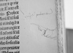
The symbol originates in scribal tradition of the medieval and Renaissance period, appearing in the margin of manuscripts to mark corrections or notes.
Manicules are first known to appear in the 12th century in handwritten manuscripts in Spain,[2] and became common in the 14th and 15th centuries in Italy with some very elaborate with shading and artful cuffs.[3] Some were playful and elaborate, but others were as simple as "two squiggly strokes suggesting the barest sketch of a pointing hand" and thus quick to draw.[4]
After the popularization of the printing press starting in the 1450s, the handwritten version continued in handwritten form as a means to annotate printed documents. Early printers using a type representing the manicule included Mathias Huss and Johannes Schabeler in Lyons in their 1484 edition of Paulus Florentinus' Breviarum totius juris canonici.[2]
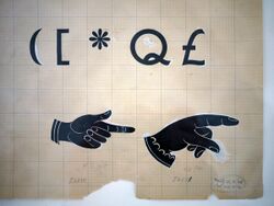
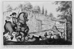
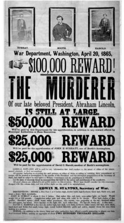
In the modern period, the pointing hand became more popular in publications, advertising, and directional signage.[5] Some fingerposts have relief-printed or even fully three-dimensional physical manifestations of pointing hands,[6] The United States Postal Service has also used a pointing hand as a graphical indicator for its "Return to Sender" stamp.
In modern printing, it was used as a standard typographical symbol marking notes. The American Dictionary of Printing and Bookmaking (1894) treats it as the seventh in the standard sequence of footnote markers, following the paragraph sign (pilcrow).[7]
Sherman (2005) argues that as the symbols became standardized, they were no longer reflective of individuality in comparison to other writing, and this explains their diminished popularity.[8]
The now-ubiquitous[citation needed] arrow symbol ➵ being easier to draw and recognize, has largely replaced the manicule in many contexts.[citation needed] The arrow symbol appears only in the 18th century,[citation needed] at first in technical diagrams. Its widespread use to indicate directions in signposts etc. does not develop before the early 20th century,[citation needed] and signposts of the 18th and 19th century would sometimes use a pointing hand in place of what would now be an arrow symbol.[citation needed]
Usage examples
The typical use of the pointing hand is as a bullet-like symbol to direct the reader's attention to important text, having roughly the same meaning as the word "attention" or "note". It is used this way both by annotators and printers. Even in the first few centuries of use, it can be seen used to draw attention to specific text, such as a title (in some cases in the form of a row of manicules), inserted text, noteworthy passage, or sententiae. In some cases, flower marks and asterisks were used for similar purposes. Less commonly, in earlier centuries the pointing hand acted as a section divider with a pilcrow as paragraph divider; or more rarely as the paragraph divider itself.[9]
Some encyclopedias use it in articles to cross-reference, as in ☞ other articles. It occasionally sees use in magazines and comic books to indicate to the reader that a story on the right-hand page continues onto the next.[citation needed]
In linguistics, the symbol is used in optimality theory tableaux to identify the optimal output in a candidate of generated possibilities from a given input.[10]
American science fiction writer Kurt Vonnegut used the symbol as a form of margin on the first line of every paragraph in his novel Breakfast of Champions. The literary effect of this was to create separation between each paragraph, reinforcing the stream of consciousness style of the text.
American essayist and cultural critic H.L. Mencken, often credited with having first coined the aphorism, "When you point one finger, there are three fingers pointing back to you," is also reported to have used this symbol to convey this sentiment in shorthand, seen first in his telegrams as early as the 1920s.
Thomas Pynchon parodies this punctuation mark in his novel Gravity's Rainbow by depicting a middle finger, rather than an index finger, pointing at a line of text.[11]
Computer cursor
An upward pointing hand is often used in the mouse cursor in graphical user interfaces (such as those in Adobe Acrobat and Photoshop) to indicate an object that can be manipulated. The first is believed to be the Xerox Star.[5] Many web browsers use an upward pointing hand cursor to indicate a clickable hyperlink. CSS 2.0 allows the "cursor" property to be set to "hand" or "pointer" to intentionally change the mouse cursor to this symbol when hovering over an object; "move" may produce a closed fisted hand. Many video games made in the 1980s and '90s, primarily text-based adventure games, also used these cursors.[citation needed]
Unicode
Unicode (version 1.0, 1991) introduced six "pointing index" characters in the Miscellaneous Symbols block:
- U+261A ☚ BLACK LEFT POINTING INDEX
- U+261B ☛ BLACK RIGHT POINTING INDEX
- U+261C ☜ WHITE LEFT POINTING INDEX
- U+261D ☝ WHITE UP POINTING INDEX (☝︎ in non-emoji form using Variant Selector 15)
- U+261E ☞ WHITE RIGHT POINTING INDEX
- U+261F ☟ WHITE DOWN POINTING INDEX
Unicode 6.0 (2010) included several emoji pointing hands:
- U+1F446 👆 WHITE UP POINTING BACKHAND INDEX
- U+1F447 👇 WHITE DOWN POINTING BACKHAND INDEX
- U+1F448 👈 WHITE LEFT POINTING BACKHAND INDEX
- U+1F449 👉 WHITE RIGHT POINTING BACKHAND INDEX
Unicode 7.0 (2014) incorporated several more indices, sourced from the Wingdings 2 font:
- U+1F598 🖘 SIDEWAYS WHITE LEFT POINTING INDEX
- U+1F599 🖙 SIDEWAYS WHITE RIGHT POINTING INDEX
- U+1F59A 🖚 SIDEWAYS BLACK LEFT POINTING INDEX
- U+1F59B 🖛 SIDEWAYS BLACK RIGHT POINTING INDEX
- U+1F59C 🖜 BLACK LEFT POINTING BACKHAND INDEX
- U+1F59D 🖝 BLACK RIGHT POINTING BACKHAND INDEX
- U+1F59E 🖞 SIDEWAYS WHITE UP POINTING INDEX
- U+1F59F 🖟 SIDEWAYS WHITE DOWN POINTING INDEX
- U+1F5A0 🖠 SIDEWAYS BLACK UP POINTING INDEX
- U+1F5A1 🖡 SIDEWAYS BLACK DOWN POINTING INDEX
- U+1F5A2 🖢 BLACK UP POINTING BACKHAND INDEX
- U+1F5A3 🖣 BLACK DOWN POINTING BACKHAND INDEX
Unicode 13.0 (2020) added a three-part index (🯁🯂🯃), for compatibility with legacy computing character sets:
- U+1FBC1 🯁 LEFT THIRD WHITE RIGHT POINTING INDEX
- U+1FBC2 🯂 MIDDLE THIRD WHITE RIGHT POINTING INDEX
- U+1FBC3 🯃 RIGHT THIRD WHITE RIGHT POINTING INDEX
See also
- V sign
- Obelus (historic text pointer)
Notes
- ↑ Sherman, p. 9-10
- ↑ 2.0 2.1 Geoffrey Ashall Glaister s.v. "digit 2.", Encyclopedia of the Book, 2nd Edition, 2001, p. 141. "This type ornament has a long history, the printed outline of a hand being used as a paragraph mark by, among other early printers, Huss at Lyons in 1484 in the edition of Paulus Florentinus's 'Breviarum totius juris canonici' he printed with Johannes Schabeler. As with other typographic conventions this was taken from scribal practice, carefully drawn hands pointing to a new paragraph being found in early 12th century (Spanish) manuscripts. It is also known as a fist, hand, or index."
- ↑ Sherman, p. 11
- ↑ Sherman, p. 12
- ↑ 5.0 5.1 Sherman, p. 13
- ↑ Pictures from an image search for "manicule fingerpost": [1], [2], [3]
- ↑ Hasler (1953:4). The standard sequence of reference marks was *, †, ‡, §, ‖, ¶, and ☞.
- ↑ Sherman, p. 20-21
- ↑ Sherman, p. 14-18
- ↑ Prince and Smolensky, p. 19
- ↑ Pynchon, Thomas (2012). Gravity's Rainbow. Penguin. ISBN 9781101594650. https://books.google.com/books?id=GGPm4I3BbxAC&pg=PT629. Retrieved 2012-12-18.
References
- Charles Hasler, "A Show of Hands", Typographica O. S. 8 (1953), 4–11.
- Prince, Alan and Paul Smolensky. (1993/2002/2004): Optimality Theory: Constraint Interaction in Generative Grammar. Blackwell Publishers (2004) [4](2002). Technical Report, Rutgers University Center for Cognitive Science and Computer Science Department, University of Colorado at Boulder (1993).
- Sherman, William. Toward a History of the Manicule, 2005.
External links


