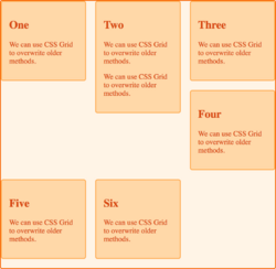
CSS grid layout
| CSS Grid Layout Module Level 1 | |
 A depiction of a typical webpage layout using CSS floats. | |
| Native name | CSS Grid Layout Module Level 1 |
|---|---|
| Status | W3C Candidate Recommendation Draft |
| First published | April 7, 2007[1] |
| Latest version | Level 1 December 18, 2020[2] |
| Preview version | Level 2 March 14, 2023[3] |
| Organization | W3C |
| Committee | CSS Working Group |
| Editors | |
| Base standards | CSS |
| Domain | CSS |
| Abbreviation | Grid, grid layout |
| Website | www |
| Cascading Style Sheets |
|---|
| Concepts |
| Philosophies |
| Tools |
| Comparisons |
In Cascading Style Sheets, CSS grid layout or CSS grid creates complex responsive web design grid layouts more easily and consistently across browsers.[6] Historically, there have been other methods for controlling web page layout methods, such as tables, floats, and more recently, CSS Flexible Box Layout (flexbox). CSS grid is currently not an official standard (it is a W3C Candidate Recommendation) although it has been adopted by the recent versions of all current major browsers.[7]
Motivation
CSS grid can create more robust and flexible layouts than the previous options like CSS floats. It also allows for more standardized code that works across browsers. This is in contrast to relying on specific browser hacks or complicated workarounds.[2]
One issue with exploiting floats in CSS is that if content gets added to one portion of the page it could disrupt the flow of the page and break the layout. This is due to the varying heights for layout elements.[2] Though flexbox supports flexible layouts and provides the flexibility of creating complex layouts, it fails when the need for creating responsive layouts in 2-dimensional space arises.
History
The first comprehensive draft of a grid layout for CSS was created by Phil Cupp, Markus Mielke and Alex Mogilevsky at Microsoft in 2011 and implemented in Internet Explorer 10 behind a -ms- vendor prefix. The syntax was restructured and further refined through several iterations in the CSS Working Group, led primarily by Elika Etemad and Tab Atkins Jr. The feature was widely adopted by web developers after evangelism led primarily by Rachel Andrew and Jen Simmons.[8]
Browser support
As of October 2017, Chrome, Firefox, Safari and Edge all support CSS grid without vendor prefixes.[9][10][11] IE 10 and 11 support CSS grid but with an outdated specification. On mobile, all modern browsers support CSS grid except for Opera Mini.[12] Web developers targeting older browsers can utilize Modernizr 3.5.0 to detect and gracefully degrade the webpage as needed.[13]
Utilization in frameworks
Tailwind CSS incorporates CSS grid into its utilities for controlling how elements are sized and placed.[14] However many other current web frameworks do not incorporate CSS grid, such as Bootstrap 4 and Foundation 6.[15]
The fr unit
The "fr" unit is often used with CSS grid layout.[16][17][18] The "fr" unit, part of the CSS grid layout specification, represents a fraction of the leftover space in the grid container.[2]
Examples
"Holy grail" layout
The following is an example of the "holy grail" layout:
| HTML | <html>
<style>
div { border: 1px solid; }
body {
display: grid;
grid-template-columns: 10em auto 10em;
grid-template-areas:
"header header header"
"left middle right"
"footer footer footer";
}
</style>
<body>
<div style="grid-area: header">The header</div>
<div style="grid-area: footer">The footer</div>
<div style="grid-area: left">The left panel</div>
<div style="grid-area: middle; height: 200px">The main content area</div>
<div style="grid-area: right">The right panel</div>
</body>
</html>
|
|---|---|
| Output | CSS Grid Holy Grail Layout |
Table of values
The following is an example of a table of values:
| HTML | <html>
<style>
.wrapper {
display: grid;
grid-template-columns: 1fr 1fr 1fr;
grid-gap: 0.5em;
}
div {
border: 1px solid;
}
</style>
<body>
<div class="wrapper">
<h3>Header1</h3><h3>Header2</h3><h3>Header3</h3>
<div>value11</div><div>value12</div><div>value13</div>
<div>value21</div><div>value22</div><div>value23</div>
<div>value31</div><div>value32</div><div>value33</div>
<div>value41</div><div>value42</div><div>value43</div>
<div>value51</div><div>value52</div><div>value53</div>
<div>value61</div><div>value62</div><div>value63</div>
<div>value71</div><div>value72</div><div>value73</div>
</div>
</body>
</html>
|
|---|---|
| Output | A simple implementation of the CSS Grid layout demonstrating a table layout |
References
- ↑ "CSS Grid Layout Module Level 1 Publication History - W3C". n.d.. https://www.w3.org/standards/history/css-grid-1.
- ↑ 2.0 2.1 2.2 2.3 "CSS Grid Layout Module Level 1". W3C Working Group. 2021-12-18. https://www.w3.org/TR/css-grid-1/.
- ↑ 3.0 3.1 "CSS Grid Layout Module Level 2". CSS Working Group. 2023-03-14. https://drafts.csswg.org/css-grid/.
- ↑ "Grid Layout". CSS Working Group. 2011-04-07. https://www.w3.org/TR/2011/WD-css3-grid-layout-20110407/.
- ↑ "CSS Grid Positioning Module Level 3". CSS Working Group. 2007-09-05. https://www.w3.org/TR/2007/WD-css3-grid-20070905/.
- ↑ "CSS Grid – Table layout is back. Be there and be square.". January 2017. https://developers.google.com/web/updates/2017/01/css-grid.
- ↑ "CSS Grid Layout (level 1) | Can I use... Support tables for HTML5, CSS3, etc". https://caniuse.com/css-grid.
- ↑ Gustafson, Aaron (2017-10-19). "The Story of CSS Grid, from Its Creators" (in en-US). https://alistapart.com/article/the-story-of-css-grid-from-its-creators/.
- ↑ Anderson, Kareem (13 September 2017). "Microsoft's newest browser gets a significant boost with EdgeHTML 16". https://www.onmsft.com/news/microsofts-newest-browser-gets-a-significant-boost-with-edgehtml-16.
- ↑ Protalinski, Emil (9 March 2017). "Chrome 57 arrives with CSS Grid Layout and API improvements | VentureBeat". VentureBeat. https://venturebeat.com/2017/03/09/chrome-57-arrives-with-css-grid-layout-and-api-improvements/.
- ↑ "CSS Grid Layout". n.d.. http://caniuse.com/#feat=css-grid.
- ↑ ""grid" | Can I use... Support tables for HTML5, CSS3, etc". https://caniuse.com/?search=grid.
- ↑ Ateş, Faruk (2017-04-13). "Modernizr 3.5.0". https://modernizr.com/news/modernizr-3-5-0.
- ↑ "Grid Column Start / End - Tailwind CSS". https://tailwindcss.com/docs/grid-column.
- ↑ "Flexbox grids and frameworks". 2017-02-16. https://gist.github.com/raphaelgoetter/722e4a5843a8598f72d8dd148bd20c18.
- ↑ Alligator.io (2020-09-03). "CSS Grid Layout: The Fr Unit". DigitalOcean. https://www.digitalocean.com/community/tutorials/css-css-grid-layout-fr-unit.
- ↑ "Fractional. — Ethan Marcotte". 2018-07-18. https://ethanmarcotte.com/wrote/fractional/.
- ↑ "An Introduction to the 'fr' CSS unit". 2017-06-12. https://css-tricks.com/introduction-fr-css-unit/.
External links
 |
