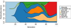
Muller plot
A Muller plot, also known as Muller diagram, combines information about the succession of different operational taxonomic units (OTUs)—such as genotypes, phenotypes, or species—and information about dynamics of their abundances (populations or frequencies) over time. Muller plots may be used to visualize evolutionary dynamics.[1][2] They may be also employed in the study of diversity and its dynamics; that is, how diversity emerges and how it changes over time.

They are named in honor of Hermann Joseph Muller, who used them to explain his idea of Muller's ratchet.[3]
In a Muller plot, the horizontal axis typically shows time or generations and the vertical axis represents relative abundances of OTUs. Different Operational Taxonomic Units (OTUs) are typically depicted using polygons or colored areas, with each OTU originating from the center of its parent area. This representation helps illustrate the evolutionary succession and relationships among different taxa.
One difference between Muller plots and normal bar plots of abundances is that a Muller plot depicts not only the relative abundances but also succession of OTUs based on their genealogy, phylogeny, or parental relation over time.
References
- ↑ Herron, Matthew D.; Doebeli, Michael (2013). "Parallel Evolutionary Dynamics of Adaptive Diversification in Escherichia coli". PLOS Biology 11 (2). doi:10.1371/journal.pbio.1001490. PMID 23431270.
- ↑ Maddamsetti, Rohan; Lenski, Richard E.; Barrick, Jeffrey E. (2015). "Adaptation, Clonal Interference, and Frequency Dependent Interactions in a Long Term Evolution Experiment with Escherichia coli". Genetics 200 (2): 619–631. doi:10.1534/genetics.115.176677. PMID 25911659. PMC 4492384. http://www.genetics.org/content/200/2/619.
- ↑ Muller, Hermann Joseph (1932). "Some Genetic Aspects of Sex". The American Naturalist 66 (703): 118–138. doi:10.1086/280418. Bibcode: 1932ANat...66..118M.
External links
- MullerPlot: A package for generating Muller plots in R
- GG Muller: Creates Muller plots of evolutionary dynamics
 |
