Computer Modern
 | |
| Category | Serif |
|---|---|
| Classification | Didone |
| Designer(s) | Donald Knuth |
| License | SIL Open Font License |
 | |
| Sample | |
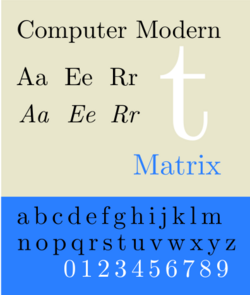
Computer Modern is the original family of typefaces used by the typesetting program TeX. It was created by Donald Knuth with his Metafont program, and was most recently updated in 1992.[1] Computer Modern, or variants of it, remains very widely used in scientific publishing, especially in disciplines that make frequent use of mathematical notation.
Design
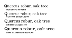
Computer Modern is a "Didone", or modern serif font, a genre that emerged in the late 18th century as a contrast to the more organic designs that preceded them. Didone fonts have high contrast between thick and thin elements, and their axis of "stress" or thickening is perfectly vertical. Computer Modern was specifically based on the 10 point size of the American Lanston Monotype Company's Modern Extended 8A, part of a family Monotype originally released in 1896.[2][3] This was one of many modern faces issued by typefounders and Monotype around this period, and the standard style for body text printing in the late nineteenth century.[4][5]
In creating the TeX publishing system, Knuth was influenced by the history of mathematics and a desire to achieve the "classic style" of books printed in metal type.[6][7] Modern faces were used extensively for printing mathematics, especially before Times New Roman became popular for mathematics printing from the 1950s.[8][9][10]
The most unusual characteristic of Computer Modern, however, is the fact that it is a complete type family designed with Knuth's Metafont system, one of the few typefaces developed in this way. The Computer Modern source files are governed by 62 distinct parameters, controlling the widths and heights of various elements, the presence of serifs or old-style numerals, whether dots such as the dot on the "i" are square or rounded, and the degree of "superness" in the bowls of lowercase letters such as "g" and "o". This allows Metafont designs to be processed in unusual ways; Knuth has shown effects such as morphing in demonstrations, where one font slowly transitions into another over the course of a text.[11] While it attracted attention for the concept, Metafont has been used by few other font designers; by 1996 Knuth commented "asking an artist to become enough of a mathematician to understand how to write a font with 60 parameters is too much"[12] while digital-period font designer Jonathan Hoefler commented in 2015 that "Knuth's idea that letters start with skeletal forms is flawed".[13]
Derived versions
Knuth produced his original Computer Modern fonts using Metafont, a program that reads stroke-based definitions of glyphs and outputs ready-to-use fonts as bitmap image files. He mostly left the font, as with other components of TeX (with the exception of the TeX and Metafont names themselves, a stipulation Knuth made to maintain quality control), in the public domain.[14][15]
The advance of publishing technology (PostScript, PDF, laser printers) has reduced the need for bitmap fonts. The preferred formats are now outline fonts such as Type 1, TrueType, or OpenType, which can be rendered efficiently at arbitrary resolution and using sophisticated anti-aliasing techniques by printer firmware or on-screen document viewers. Therefore, several other projects have ported the Computer Modern fonts into such formats. Some of these projects have also complemented Computer Modern with
- additional characters (euro, accented characters, Cyrillic and Greek script coverage)
- different font encodings (to overcome problems with Knuth's original 8-bit character sets)
- additional font style variants
Several such derivatives are now also widely used and included in TeX Live, a modern TeX distribution.
CMU
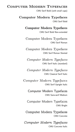
A current extended release of the Computer Modern family in the general-purpose OpenType format is the CMU distribution (for Computer Modern Unicode):
- CMU Serif, the main Computer Modern font family. This includes the four traditional styles of font (regular, italic, bold, bold italic), and also:
- CMU Serif upright italic, an upright italic style similar to cursive upright handwriting
- CMU Serif bold non-extended, a bold weight duplexed to have the same width as the regular style
- CMU Serif roman and bold slanted, two oblique styles
- CMU Classical Serif, an italic design with slightly simpler serif designs
- Concrete Roman, a slab serif font in the four standard styles
- CMU Typewriter, a typewriter-style slab serif font
- CMU Sans Serif, a complementary sans-serif font, and CMU Bright, a lighter style of the same design
- CMU Sans demi-condensed, a condensed style of the same design
CMU is released under the SIL Open Font License.
BlueSky
Computer Modern was first transformed to a PostScript Type 3 font format by BlueSky, Inc. in 1988, and then to Type 1 in 1992 to include font hinting.[16] The Type 1 version has since then been donated to the American Mathematical Society (AMS) which distributes them freely under the Open Font License.[17] It is found in most standard TeX distributions.
Latin Modern
The Latin Modern implementation, maintained by Bogusław Jackowski and Janusz M. Nowacki of TeX User Group Poland (GUST), is now standard in the TeX community and was made through a Metafont/MetaPost derivative called METATYPE1. It was derived from the BlueSky Type 1 fonts, which were converted back into outline-based METATYPE1 programs, from which then the extended Type 1 and OpenType Latin Modern fonts were developed. ConTeXt uses Latin Modern as default font, instead of Computer Modern.[18]
The Type 1 to METATYPE1 to Type 1 round-trip conversion process involved in the production of the Latin Modern fonts tried to preserve the hinting information of the BlueSky fonts; however, it introduced rounding errors that affect the quality of the hinting at low pixel sizes. As a result, on-screen display of the Latin Modern fonts can result in a less even display of kerning and character heights than with the BlueSky fonts.[19]
The same process was later extended to some free PostScript font clones under the umbrella project TeX Gyre.[20]
The Latin Modern font has also gained an OpenType math table.[21][22]
New Computer Modern
The New Computer Modern font family[23] is a large extension in terms of the number of additional glyphs of the Latin Modern fonts which adds support for several more languages such as Greek, Cyrillic, Hebrew, Cherokee and Coptic. This font family comes in two weights, “Regular” and “Book”. The book weight is supposed to look slightly heavier compared to the “Regular”. Both the weights include support for typesetting mathematics; complete coverage of unicode math blocks is provided, along with some more glyphs needed for mathematics.
MLModern
MLModern[24] is based on the Latin Modern font. It avoids the spindliness of most other Type 1 versions of Computer Modern and hence looks thicker in comparison to Latin Modern or Computer Modern.
A visual comparison of Computer Modern, Latin Modern, New Computer Modern Book and MLModern is shown here.
 alt=Generated with LuaLaTeX.|border|frameless|500x500pxalt=Generated with LuaLaTeX.|border|frameless|500x500px
Others
- EC fonts – look much like Computer Modern, but have slightly different metrics. These were the first TeX fonts to use the “Cork encoding” (in LaTeX also known as T1 encoding) that provides precomposed glyphs for West-European languages. The original EC fonts were only available as Metafont generated bitmaps.
- TC fonts – the TeX Companion fonts provide a number of additional symbols commonly used in text.
- BaKoMa fonts – another automatically generated Type1 version of Computer Modern by Basil K. Malyshev, dating to 1994. The fonts remain available for download after Malyshev's 2019 death.
- CM-super[25] – a very large extension of Computer Modern, available in a variety of encodings. These fonts were automatically vectorized from Computer Modern or EC font bitmaps and therefore lack the hinting information in the BlueSky fonts.
- CM-LGC – a Latin, Greek, Cyrillic extension.
See also
- STIX Fonts, a project to create Times New Roman-compatible mathematics fonts. Open-sourced under the SIL open font license.
References
- ↑ "Knuth: Message about TeX fonts". Cs-faculty.stanford.edu. http://www-cs-faculty.stanford.edu/~uno/cm.html.
- ↑ Donald Ervin Knuth (1986). Computer Modern Typefaces. Addison-Wesley Publishing Company. p. 10. ISBN 978-0-201-13446-9. https://books.google.com/books?id=CwdUAAAAMAAJ.
- ↑ The Monotype Specimen Book of Type Faces. Philadelphia: Lanston Monotype Machine Company. 1922. https://archive.org/details/monotypespecimen00lansrich. Retrieved 17 August 2018.
- ↑ Williamson, Hugh (1956). Methods of Book Design. Oxford: Oxford University Press. pp. 96–8. "Throughout the first half of the 19th century, modern faces held the typographic field against nearly all comers. Not all typefounders and punch-cutters were very enthusiastic about this kind of type-face, but the popular demand had to be met."
- ↑ McGrew, Mac (1993). American Metal Typefaces of the Twentieth Century (Seconde édition révisée. ed.). New Castle: Oak Knoll Press. pp. 220–221. ISBN 0-938768-39-5. "In the early 1900s Monotype adapted a number of modern roman text faces to its system, mostly in a few small sizes only; some of them differ from each other only in slight changes of their proportions."
- ↑ Knuth, Donald (1986). "Remarks to Celebrate the Publication of Computers & Typesetting". TUGboat 7 (2): 95–8. http://www.tug.org/TUGboat/Articles/tb07-2/tb15knut.pdf. Retrieved 24 September 2015.
- ↑ Knuth, Donald. "Commemorative lecture of the Kyoto Prize, 1996". Kyoto Prize. https://www.kyotoprize.org/wp/wp-content/uploads/2016/02/12kA_lct_EN.pdf.
- ↑ Rhatigan, Daniel. "Three typefaces for mathematics". University of Reading (MA thesis). http://ultrasparky.org/school/pdf/DanielRhatigan_Dissertation.pdf.
- ↑ Chaundy, T. W.; Barett, P. R.; Batey, Charles (1954). The Printing of Mathematics. Oxford University Press. https://archive.org/details/printingofmathem0000chau/.
- ↑ Rhatigan, Daniel. "The Monotype 4-Line System for Setting Mathematics". http://typeculture.com/academic-resource/articles-essays/the-monotype-4-line-system-for-setting-mathematics/.
- ↑ Knuth, Donald (1982). "The Concept of a Meta-Font". Visible Language 16 (1): 3–27. https://m-u-l-t-i-p-l-i-c-i-t-y.org/media/pdf/The-Concept-of-a-Meta-font.pdf. Retrieved 21 September 2023.
- ↑ CSTUG, Charles University, Prague, March 1996, Questions and Answers with Prof. Donald E. Knuth, reproduced in TUGboat 17 (4) (1996), 355–67. Citation is from page 361. Available online at http://www.tug.org/TUGboat/Articles/tb17-4/tb53knuc.pdf
- ↑ Hoefler, Jonathan. "Knuth's idea that letters start with skeletal forms is flawed. But his work is important and had lasting impact.". Twitter. https://twitter.com/HoeflerCo/status/655557339987226624.
- ↑ Bigelow, Charles; Day, Donald (1983). "Chapter 28". Digital Typography. 249. 560. doi:10.1038/scientificamerican0883-106. Bibcode: 1983SciAm.249b.106B. http://www.tug.org/TUGboat/Articles/tb07-2/tb15knut.pdf. "All of the methods described in these books are in the public domain; thus anybody can freely use any of the ideas. The only thing I'm retaining control of is the names, TeX and METAFONT(...) If any changes are made, I won't complain, as long as the changed systems are not called TEX or METAFONT."
- ↑ Knuth, Donald E (1986), "Computers and Typesettings", TUGboat 7: 95–98, http://www.tug.org/TUGboat/Articles/tb07-2/tb15gordon.pdf, "and which he (Leslie Lamport), like Don, placed in the public domain."
- ↑ "Blue Sky Research and Computer Modern fonts". Math.utah.edu. 1997-12-04. http://www.math.utah.edu/~beebe/fonts/bluesky.html.
- ↑ "The Adobe Type 1 fonts, previously known on CTAN archives as the "bluesky" fonts, are now distributed as part of the AMS fonts distribution, at CTAN:fonts/amsfonts". Ctan.org. http://www.ctan.org/tex-archive/fonts/cm/ps-type1/README.bluesky.
- ↑ "FAQ - ConTeXt wiki". Wiki.contextgarden.net. http://wiki.contextgarden.net/FAQ#Can_I_change_to_LaTeX.E2.80.99s_Computer_Modern_font.3F.
- ↑ "A E F and T sized differently in lmodern pacakge? • Fonts & Character Sets • LaTeX Community". Latex-community.org. http://www.latex-community.org/forum/viewtopic.php?f=48&t=11188.
- ↑ "The New Font Project : TEX Gyre". Tug.org. https://www.tug.org/TUGboat/tb27-2/tb87hagen-gyre.pdf.
- ↑ "The Latin Modern Math (LM Math) font — GUST" (in pl). Gust.org.pl. http://www.gust.org.pl/projects/e-foundry/lm-math.
- ↑ "Package lm-math". Ctan.org. 2014-09-05. http://www.ctan.org/pkg/lm-math.
- ↑ "NewComputerModern". ctan.org. https://www.ctan.org/pkg/newcomputermodern.
- ↑ "MLModern". ctan.org. https://www.ctan.org/pkg/mlmodern.
- ↑ "tex-archive/fonts/ps-type1/cm-super". Ctan.org. http://www.ctan.org/tex-archive/fonts/ps-type1/cm-super/.
Further reading
- Donald E. Knuth, Computers and Typesetting Volume E: The Computer Modern Fonts, Addison-Wesley, Reading, Mass. 1986 Hardcover: ISBN:0-201-13446-2, Softcover: ISBN:0-201-60660-7
External links
- Computer Modern Unicode fonts home page
- Newest 0.7 unicode version from Sourceforge - .ttf file compressed as .ttf.tar.gz
- Old 0.6 release - Computer Modern (CMU) release, for general use (select otf)
- Original Computer Modern fonts
 |


