Contour boxplot
In statistical graphics and scientific visualization, the contour boxplot[1] is an exploratory tool that has been proposed for visualizing ensembles of feature-sets determined by a threshold on some scalar function (e.g. level-sets, isocontours). Analogous to the classical boxplot and considered an expansion of the concepts defining functional boxplot,[2][3] the descriptive statistics of a contour boxplot are: the envelope of the 50% central region, the median curve and the maximum non-outlying envelope.
To construct a contour boxplot, data ordering is the first step. In functional data analysis, each observation is a real function, therefore data ordering is different from the classical boxplot where scalar data are simply ordered from the smallest sample value to the largest. More generally, data depth, gives a center-outward ordering of data points, and thereby provides a mechanism for constructing rank statistics of various kinds of multidimensional data. For instance, functional data examples can be ordered using the method of band depth or a modified band depth. In contour data analysis, each observation is a feature-set (a subset of the domain), and therefore not a function. Thus, the notion of band depth and modified band depth is further extended to accommodate features that can be expressed as sets but not necessarily as functions. Contour band depth allows for ordering feature-set data from the center outwards and, thus, introduces a measure to define functional quantiles and the centrality or outlyingness of an observation. Having the ranks of feature-set data, the contour boxplot is a natural extension of the classical boxplot which in special cases reduces back to the traditional functional boxplot.
Set/contour band depth
Set band depth (introduced in[1]), denoted as sBD, is a method for establishing a center-outward ordering of a collection of sets. As with other band depth, data ordering methods, set band depth, computes the probability of whether a sample lies in the band formed by j other samples from the distribution. We say that a set S ∈ E is an element of the band of a collection of j other sets S1, ..., Sj ∈ E if it is bounded by their union and intersection. That is:
The set band depth is the sum of probabilities of lying in bands formed by different numbers of samples (2, ..., J).
Set band depth is shown to be a generalization of function band depth. Set band depth has a modified form that is derived from a relaxed form of subset, which requires only a percentage of a set to be included in another.
Contour band depth (cBD) is a direct application of sBD, where the sets are derived from thresholded input functions, F(x) > q. In this way, an ensemble of scalar input functions and a threshold value, gives rise to a collection of contours, and sorting cBD gives a data-depth ordering (highest-to-lowest probability gives greatest-to-smallest depth) of those contours. By relying on the set formulation, contour boxplots avoid any explicit correspondence of points on different contours.
Contour boxplot construction
In the classical boxplot, the box itself represents the middle 50% of the data. Since the data ordering in the contour boxplot is from the center outwards, the 50% central region is defined by the band delimited by the 50% of deepest, or the most central observations. The border of the 50% central region is defined as the envelope representing the box in a classical boxplot. Thus, this 50% central region is the analog to the interquartile range (IQR) and gives a useful indication of the spread of the central 50% of the curves. This is a robust range for interpretation because the 50% central region is not affected by outliers or extreme values, and gives a less biased visualization of the curves' spread. The observation in the box indicates the median, or the most central observation which is also a robust statistic to measure centrality.
The "whiskers" of the boxplot are the vertical lines of the plot extending from the box and indicating the maximum envelope of the dataset except the outliers. In contour boxplots, this is formed by considering the difference of the union and intersection formed by all non-outlying samples. Outliers are determined as having a cBD value that is less than some multiplier (less than one) times the cBD of the 50% ranked samples.
Examples
The following example is an ensemble of data from 2D incompressible Navier–Stokes simulation consisting of 40 members, where each ensemble member is a simulation with Reynolds number and inlet velocity chosen randomly. The inlet velocity values are randomly drawn from a normal distribution with mean value of 1 and standard deviation of ±0.01 (in non-dimensionalized units); likewise, Reynolds numbers are generated from a normal distribution with mean value of 130 and standard deviation of ±3.
-
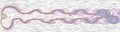
 A set of contours resulting from different parameter values of a 2D fluid simulation (flow past a cylinder, left to right)
 -
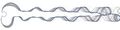
 Contour boxplots give a median, order statistics, and outliers (rendered over a line integral convolution visualization of the flow).
 -
 Averages and ±1 standard deviation of the fields gives results that are not geometrically correct (consistent with no simulation) and misestimates the possible positions of contours (rendered over a line integral convolution visualization of the flow).
The example below is from an ensemble of publicly available data from the National Oceanic and Atmospheric Administration (NOAA) [1]. The ensemble data are formed through different runs of a simulation model with different perturbations of the initial conditions to account for the errors in the initial conditions and/or model parameterizations. The ensemble consists of isocontours of the temperature field (isovalue −15C) at 500mb in altitude.
-
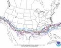 An ensemble of isocontours from the NOAA web site, shown as a "spaghetti plot".
 -
 Contour boxplots of the weather data ensemble give a median, order statistics, and outliers.
 -
 Averages and ±1 standard deviation of the temperature fields associate with the NOAA forecast weather ensemble.


See also
- Boxplot
- Functional boxplot
References
- ↑ 1.0 1.1 Whitaker, Ross T.; Mahsa Mirzargar; Robert M. Kirby (2013). "Contour Boxplots: A Method for Characterizing Uncertainty in Feature Sets from Simulation Ensembles". IEEE Transactions on Visualization and Computer Graphics 19 (12): 2713–2722. doi:10.1109/TVCG.2013.143. PMID 24051838.
- ↑ Hyndman, Rob J.; Han Lin (2010). "Rainbow Plots, Bagplots, and Boxplots for Functional Data". Journal of Computational and Graphical Statistics 19 (1): 29–45. doi:10.1198/jcgs.2009.08158. http://www.buseco.monash.edu.au/ebs/pubs/wpapers/2008/wp9-08.pdf.
- ↑ Sun, Y.; M.G. Genton (2011). "Functional boxplots". Journal of Computational and Graphical Statistics 20 (2): 316–334. doi:10.1198/jcgs.2011.09224.
 |  |
