Engineering:Color coding technology for visualization
Color coding technology for data visualization
Data visualization achieves its significance today[1] due to information technology: big data processed in computers with capable visualization software, combined with statistical techniques[2] and color coding on electronic displays. This article is about color coding technology for data visualization.
Origins of color coding include rubrics, the Four Color Theorem of cartography and Jacques Bertin's 1967 book, The Semiology of Graphics.[3] Contemporary color coding for data visualization is enabled by four technologies: statistics, color technology, displays and computing. Visualization of data[4] was proceduralized by statisticians John Tukey and Edward Tufte in their respective landmark books Exploratory Data Analysis[5] in 1977 and Visual Display of Quantitative Information[6] in 1982. They did not emphasize the use of color. Others demonstrated the superiority[7] of color coding to speed visual search of displayed information,[8] and to locate[9] and organize[10] information of interest. A third prerequisite for color-coded data visualization is high-resolution, high-contrast, high-luminance color electronic displays. Honeywell Corporation[11] and Boeing Corporation[12] assembled technical data that are still germane to use of color displays. More recently, the US Federal Aviation Administration has published technical guidance[13] for visualization of dynamic (air traffic) data on self-luminous color displays.
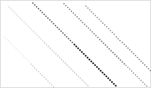
Humans have an innate ability to perform color-coded visual search. Without training or practice, the search time with color coding can be reduced by a factor of ten or more, compared to a search of the same information display without color coding. For example, Figure 1a illustrates prolonged search without color coding, while Figure 1b demonstrates color coding making data salient.
Figures 1a and b. Which category has the fewest stars: 32-, 24- or 16-pointed stars? Click the figure to see full-screen details.
Fundamentals of color coding for data search and grouping
Color-coded visualization
Color coding has diverse applications to data visualization. A general principle is to align salience of colors with relevance of displayed information.[14] The person searching might be given the color of the item to be found, or they may know the color of the sought category based on their experience. Alternatively, their task could require looking for an item that stands out as different, signified by color, with no target color given.
Salient colors might be used, for example, to highlight patterns or to enable rapid search:
- for a particular information-item or items on a geographic plot
- in scientific visualization of
- medical images
- mathematical images
- hyperspectral images
- along flow charts including
- input flows, output flows, reservoirs, mixing chambers and condensation towers etc. in an industrial-process flow
- project flow charts
- process flow charts
- sales flow charts
- organization charts
- financial flows, to follow the money
- cause-and-effect diagrams
- within statistical visualizations like
- scatter plots
- pie diagrams
- bar graphs
- function plots
- exploratory data analyses[20]
Another application of color coding is to show symmetries in visualized data.[21] Color coding can connect and untangle, e.g., trends on a plot, or the continuity of axons in the neural connectome. New applications of the innate skill to search, or group, based on color are still being invented, e.g., for networks,[22] the Road Coloring Theorem, heat maps,[23] the genome,[24] genomic structural variation,[25] genome browsers,[26] and spatial data like molecules.[27] Color coding has utility to visualize outliers and errors in unfamiliar data.
Color coding is used also for purposes other than visualization of displayed data. Data visualization complements, and does not substitute for or contradict, those other uses. Where conflict is possible, for example when there are established meanings of colors in other contexts such as signal lights, then those meanings should be given deference when choosing colors for a data-visualization color code.
Time required to find visualized information
Visual search is accomplished[28] through rapid involuntary and subconscious eye movements called saccades. The eye makes about three saccades per second during visual search. Such eye movements constrain human cognitive performance.[29] Search involves a neural network in the brain for processing motion and location, and controlling saccades.[30] This neural network is sensitive to color and to change; color and flash-coding (temporally-varying brightness) can complement each other to enhance search speed, without mutual interference.[31]
If there are N items to be searched in a display, N/2 saccades tend to be needed to locate a particular item.[32] Given three saccades per second, N/(2*3) = N/6 seconds is an estimate of search time to find one item among N. The estimate is improved by adding reaction time, perhaps a second; expected search time equals 1 + N/6 seconds to find a target item among N displayed items.[32] This estimate accords with empirical search times.[33][34] In such a situation, color-coded search time increases linearly with the number of information items on a display that share the distinct target color.[35] Furthermore, search is faster when the target-colored items are spatially organized, for instance in sinuous paths[34] or presentation layout[36] or design of data figures.[37]
Search time has an exponential statistical distribution.[38] In an exponential distribution, the variability (standard deviation) equals the expected value or average. As expected search time increases, so does the variability of search time. Longer expected search time implies a few very-long searches. For example, with 30 different search items (N=30) randomly distributed on the display, the expected search time is 6 seconds, but 5% of searches will last longer than 18 seconds. See Table 1 for similar results.
| Number of search items | 5 | 6 | 7 | 8 | 9 | 10 | 15 | 20 | 30 |
|---|---|---|---|---|---|---|---|---|---|
| Expected time to find target (sec) | 1.8 | 2.0 | 2.2 | 2.3 | 2.5 | 2.7 | 3.5 | 4.3 | 6.0 |
| 5% of searches longer than (sec) | 5.5 | 6.0 | 6.5 | 7.0 | 7.5 | 8.0 | 10.5 | 13 | 18 |
Short expected search time prevents unacceptably long searches associated with longer average search time. Based on the linear increase of search time with the number of potential targets, and the exponential distribution of search times (see Table 1), limiting displayed items sharing the target’s color to fewer than about 11 would keep search times to less than 10 seconds almost all of the time.[17] More items could share the target color if the objective were to group subsets (different colors) of dispersed items for some purpose other than search.[39]
Choosing salient colors for color coding
Color coding can make information salient[40] (see Figure 1b). Discriminable color codes reduce or eliminate interference with search by all items not sharing the salient target color.[41] Qualitative, subjective methods to choose distinct colors for coding are limited to a few colors.[42] Color engineering achieved 22 paint colors of maximum contrast,[43] before the advent of self-luminous color displays. Self-luminous devices, such as computer screens, are capable of higher luminances (wider color gamut), higher resolution (smaller symbols and image segments) and higher contrasts (more-salient distinctions from background) than are usually achievable with reflective materials like paint. These characteristics of self-luminous displays create color-coding opportunities and problems as discussed below.
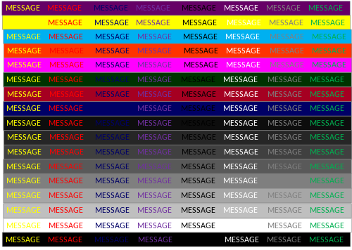
An objective method of choosing distinctive colors for color-coded visualization of electronically-displayed data is to consider the color coordinates[44] of the colors available within the display's gamut. Typically, a light-emitting display’s palette is described by three coordinates (R, G, B) each in the range 0 to 255. For instance, (255,0,0) should be a saturated red, (0,255,0) should be a green, (0,0,255) should be a deep blue, (255, 255, 255) should be a bright neutral and (0,0,0) should appear black. Choosing such extreme coordinate-triads for color coding is an approach to selecting distinct colors for color coding. Grays have equal R, G and B. Colors with nearly equal RGB coordinates are said to have low saturation.[44] High color-saturation (i.e., no white light mixed with the spectral color from the hue circle) tends to enhance color salience. If more colors are needed, add (255, 255, 0) bright yellow, (0, 255, 255) blue-green, and (255, 0, 255) purple. The 15-color code in Figure 2 also includes reduced-intensity R or G or B: (127, 0, 0) dark red, (0, 127, 0) dark green, (0, 0, 127) dark blue, and two shades of gray, not including the intermediate gray background. Reduced intensity of the binary combinations also might be considered: (127, 127, 0), (127, 0, 127) or (0, 127, 127) the last of which is included in Figure 2 too. The range of (R, G, B) coordinates, 0 to 255, reflects an 8-bit display (28 -1 = 255); other display technologies would have a different range of coordinates. The colors associated with RBG coordinates are particular to the display in use; they are not device-independent.


Optical measurements can be used to calculate the color difference between each pair of colors in the color code. This involves spectro-radiometrically measuring[44] the tristimulus values of colors available from the display. Tristimulus values (X, Y, Z) are device-independent color coordinates used to calculate color difference. Luminance, a correlate of grayscale, is the Y tristimulus value, for instance.[45] The CIEDE2000, or CIECAM02 UCS, color difference formulas are statistically superior as metrics of large-color-difference discriminability.[46] Generally, color difference calculations give more weight to red-green differences, and less to blue-yellow differences and luminance (i.e., gray scale) differences, in that order of efficacy.[44]
Code colors having small color differences from the target color make distractor items look similar to the target color, as measured in terms of search time[34] or in terms of eye movements.[46] Displayed items with large color differences from the target do not interfere with target salience.[34] Figure 3 summarizes this relationship between color similarity or salience during visualization and calculated color difference.[46] The discipline of identifying (and separating, in color difference) the most similar colors in the color code will be useful, whatever method is used to choose code colors.
In a code with n colors, there are n(n-1)/2 pairs of colors (see Figure 4), each pair having a color difference.[47] The proliferation of color differences, as the number of colors increases, necessitates a systematic, algorithmic and automated method of color selection.

Salience of many colors, seen in the context of each other, can be optimized. Because the smallest color differences interfere with search while large-enough color differences do not interfere (see Figure 3), the optimization objective[48] is to maximize the minimum calculated color-difference, among the n(n-1)/2 color differences in an n-color code, in order to derive a large number (n) of distinct colors for a color code custom-fit to a particular display’s gamut. This basic method was elaborated for industrial use.[49] The method has been applied to account for ambient illumination reflected from a display.[50] The optimization method has been extended to alternative objective functions.[51] It has been applied to complex display situations[52][53] and to small symbols.[54] Technical color measurement[44] and optimized color difference can generate several alternative equally-effective codes that exploit the full gamut of the display and human color discrimination capability. This availability of alternative coding choices enables use of apropos colors with pre-established meanings or avoidance of inappropriate colors.
Practical problems of color coding for information salience
Symbol size affects color salience
Apparent color difference between objects depends upon the visual angle of the objects that are viewed. Smaller symbols cause reduced color differences.[54] Calculated color difference assumes a 2-degree visual subtense. The thumb-nail joint (from thumb-tip to joint-by-the-nail) appears about two degrees of visual subtense at arm’s length for example. Typical display symbols might subtend only 7 minutes, or less than 1/16 of two degrees.[55] Consider this in the context of these facts[56]
- there are virtually no short-wavelength (blue) sensing cells on the retina within a 20-minute-diameter disk around the line of sight (LOS),
- they comprise only about 7% of all daylight receptors and
- the blue-sensing cells are about 4 minutes apart at their closest (within a degree of the LOS), increasing to about 8 minutes apart with greater eccentricity.
For these reasons, blue distinctions (involving colors on any tritan line,[56]) are lost for small symbols. This is called small-field tritanopia, which is a color deficiency for blueness-differences among small visual fields, to which everyone is subject. Hence, blueness differences should be discounted (or even eliminated from consideration) when selecting coding colors for small symbols, less than about 30 minutes of (i.e., the sun’s and moon’s) angular subtense.[57] Even color-differences not involving blueness appear to fade (however less than blue fades) when symbols diminish in size. For example, objects appear darker (less light) as they trend to a smaller visual subtense; larger areas with the same luminance appear lighter than smaller areas.[54] It is possible to estimate the effect of visual subtense on apparent color difference, including grayscale difference.[58] Smaller visual subtense of symbols implies fewer salient, or even discriminable, colors in the same display gamut.[54] Code colors will be salient if their color differences are at least 14 CIEDE2000 units for symbols having a two-degree visual subtense, or the equivalent color difference as estimated for smaller subtense.[58] For instance, salience of the 1.5-degree-by-0.75-degree visual-search targets used by Williams[32] improved for increases of their color differences to at least 21 CIEDE2000 units; beyond about 21 their salience did not improve further.[46] (The minimum color-difference values of salient colors given here correspond to the lower bound of the 95% confidence interval in the cited scientific literature.) The blue line and arrow in Figure 3 summarize the effect of small visual subtense (< 2 degrees of visual angle) on apparent color similarity, as a function of calculated color difference.[55] The visual angle subtended by a displayed symbol or other image segment can be precisely measured or calculated.
Deficiency of color vision can affect symbol salience
The most common forms of inherited color deficiency involve red-green confusions.[59] These color-perception confusions are due to a deficiency in retinal cells to sense long (e.g., red) or medium (e.g., green) wavelengths.[56] Red or green would look darker for people deficient in the corresponding cells. Small visual subtense of symbols, or a rarer form of color deficiency (tritanopia), deplete blueness differences (due to sparse sampling by short-wavelength-sensing cells in the retina). A color code for general use, where neither color deficiency nor small visual subtense (e.g., distant viewing) can be avoided, is white, black, orange, and grays discriminable in luminance from the other code colors and from the background luminance.[42] This assumes distant viewing by a person who retains the ability to sense either long or medium-wavelengths. Blue (but discriminably lighter than black) could be added, due to the rarity of deficient short-wavelength sensing cells, if viewing distances ensure visual subtense of color-coded symbols greater than 30 minutes. (See Figure 1b.)
Even grayscale perception can be affected by color deficiencies.[60] Red-green-color-deficient observers who retain long-wavelength-sensing cells (deuteranopes) are accurate judges of color differences near red.[60] Hence, the best color code for color-deficient observers would depend upon the type of color deficiency.
Images can be enhanced for viewing by color-deficient observers.[61] The recommended methods are edge enhancement, recoloring and pattern superposition to complement color. Three kinds of images are envisioned: natural scene, scientific visualization or an office document. No technique satisfies the requirements of all applications.
Legibility in the context of color coding
Legibility is different from salience, discussed above. Legibility is related to clearly and distinctly seeing edges, shapes and spatial details, and therefore to reading. Legibility of a symbol depends upon luminance difference (not color difference) between the symbol and the background upon which the symbol is presented. Figure 5, the concept of which was presented by Australian architect Paul Green-Armytage,[62] demonstrates this effect of luminance difference upon legibility. For this reason, yellow (a high-luminance color) is less legible on a bright white background, and conversely so are white symbols less legible on a yellow background. Dark blue (a low-luminance color) symbols are less legible on a black background, and conversely black letters are less legible on a dark blue background. This is despite yellow being salient on a white background and blue being conspicuous on a black background. Having adequate color difference among visualized items is complementary to, and compatible with, enabling legibility with adequate luminance difference between the items and their background. There are resources for quantifying the required luminance difference to enable legibility.
Grayscale, an important tool for visualization of data
In addition to its effect of on legibility, luminance also affects grayscale. Lightness and brightness differences are grayscale attributes of color difference, so they can affect conspicuousness of symbols. Grayscale is accessible to people with color-vision deficiencies,[60] and it is less susceptible (than chromatic differences) to fading due to small visual subtense.[58] Grayscale (rather than chromatic color difference) has been shown to be particularly apt for coding ordinal data such as temperature on a weather map.[16][63]
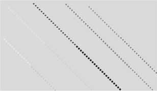
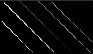
Changing the background luminance makes salient the difference between the (possibly color-coded) symbols having luminances just greater than, and just less than, each background luminance selected. The dotted gray line in Figure 3 summarizes this effect. Leon Williams,[64] observed this and suggested a data-visualization technique he called data slicing, as exemplified in Figure 6.
Figures 6a-d. Data slicing, or changing the background luminance of an image, can render different data more salient. There are four copies of the same data, each copy with a different background luminance. Click the figure to see full-screen details.
The Whittle logarithmic grayscale calculation[65] for self-luminous devices quantifies visual effects of luminance differences among displayed symbols. It enables calculation of any number of equal perceptible differences[66] (nEPD) as small as the threshold of visibility, or of any suprathreshold magnitude. The unit size of nEPD is three or four times the absolute threshold of visibility for luminance change. This nEPD unit is “just noticeable at a glance” with free viewing of an electronic display.[65]
The Whittle calculation is unusual (among grayscale formulae) in four ways.
- It includes the background luminance.[65]
- It applies to all photopic (i.e., daylight) luminances, based on data for thresholds[66] and matching.[67]
- Its derivatives are meaningful.[68]
- It can account for the spatial scale of the contrast.[65]
The derivative (slope) of nEPD with respect to background luminance implies an optimum background luminance.[69] White backgrounds are used for historical reasons related to legibility of small symbols. However, there is no symbol size or symbol-luminance range for which a white background is optimum, in the sense of maximizing the number of visibly-different gray shades that symbols can have in this luminance range. The optimum background can double the number of gray shades visible among larger symbols. The optimum background luminance is always less than 46% of the maximum of the symbol luminance range, for ranges including zero.[70]
Contrasts (e.g., displayed symbols) have a luminance difference from their background.[65] The contrast luminance would be less than the background luminance for negative contrasts and the contrast luminance exceeds the background luminance for positive contrasts. The derivative of nEPD with respect to contrast luminance predicts the threshold of contrast visibility (e.g., to prevent banding in a digital image) for any daylight combination of symbol and background luminance.[66][71] The Whittle calculation’s derivative with respect to contrast luminance also quantifies human suprathreshold sensitivity to luminance differences, or changes, for all combinations of daylight target and background luminance.[68] This derivative is germane to digital image processing, and particularly histogram specification,[72] suggesting applicability to medical-image windowing. The Whittle calculation shows the magnitude of positive contrast beyond which contrast brightness increases (with increasing contrast luminance) as fast against any background as against an unilluminated (black) background.[68] At lesser positive contrasts, and for negative contrasts, symbol lightness depends upon the background luminance of the symbol (in ways described by the Whittle calculation, and known as lightness constancy). Display luminance-contrast calibration[73] would be necessary in mission-critical applications.
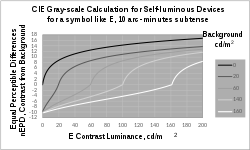
In Figure 7, there is a different nEPD curve for each background luminance. The steepest part of each curve (most change of grayscale per unit change of symbol luminance) is for symbol luminances almost equal to their background luminance. Another relatively steep part of each curve is at the extreme left, where symbol luminance is near zero.[68] Negative nEPD corresponds to negative contrasts and positive nEPD corresponds to positive contrasts. Symbols with equal nEPD from their respective backgrounds will appear the same shade of gray,[75] despite being on different backgrounds. (See Figure 8, which illustrates this matching of grays seen on different backgrounds.) The logarithmic curvature of the Whittle calculation has a rational basis.[76] An intermediate background luminance for Figure 7 itself increases the number of grayscale steps visible among the curves, making plausible an optimum background luminance.
The Whittle calculation for self-luminous devices has a parameter, k, relating to the spatial scale of the symbol.[68] It (k) is the proportion (between 0 and 100%) of image contrast (target luminance minus background luminance) lost to intraocular scattering on the way to becoming a retinal image.[65] Reducing the angular subtense of a symbol always reduces the physical luminance difference between the symbol and its background (due to intraocular scattering), hence reducing legibility and conspicuousness and increasing k.[65] This parameter, k, can be calculated from optical principles,[70] as it was for the gray scale of the 10-arc-minute (k=0.2) optotype E represented in Figure 7. When symbol angular subtense (represented by k) is reduced, the optimum background luminance also is reduced.[70] The Whittle calculation is unaffected by highlights remote from the contrast, as verified experimentally.[77] The effect of remote highlights on grayscale appearance is due to intraocular scattering.[68]

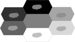
A grayscale phenomenon calculable with the Whittle calculation for self-luminous devices is matching grays having different background luminances.[67] Conversely, the calculation can be used to find the background luminances that will make specified contrast luminances match. According to the calculation (as can be seen in Figure 7), it is impossible to match negative contrasts with positive contrasts; negative contrasts always look darker than positive contrasts. Three matching (positive-contrast) clouds in Figure 8 have greater luminance than their respective background hexagons. Three (negative-contrast clouds) have less luminance than their background, and they match each other too.
According to the Whittle calculation, darker grays are achievable with a more-luminous background.[65] The effect is more pronounced for larger subtenses, but can be seen in the lower left of Figure 7 where more-negative nEPD is achieved when the background luminance is greater. Figure 9 exemplifies the effect; the same hexagonal visual target is seen as a darker gray (including black) when its background is more luminous, according to the Whittle calculation.
Ongoing research and development
Research and development continues on data visualization technologies. For instance, there is ongoing research and development to improve color difference calculations.[78] The primary motivation for this R&D is determination of minimum detectable thresholds of color difference, for quality control over industrial color processes (e.g., food, paint, textiles, plastics, print and self-luminous displays). As color difference calculations have been improved for threshold determination, they fortuitously have become better for the suprathreshold applications related to data visualization.[46] Ever since the relationship in Figure 3 was first shown,[41] there has been practical interest in more-precise determination of the (calculated color-difference) location of the knee of the curve for two-degree visual subtense and for smaller subtenses.[58] A general societal concern for inclusiveness, and particularly for accommodating disabilities, has stimulated research on color applications for people with color deficient vision.[61] A vibrant area of research (for instance by Brian Wandell and David Brainard,[79] and CIE[78]) is computational modelling to predict (e.g., color) appearance, including all factors such as intraocular optics, retinal cone-cell responses, effects of visual subtense, eccentricity from the line of sight[80], atmospheric optics, the illuminating light spectrum, context and color adaptation. There is research of methods to calibrate displays,[81] for example to make colors salient on a display located remote from the person programming the data visualization, and to more-accurately render color on displays.[82] High dynamic range (HDR) displays enable the most-salient colors for visualization; HDR is an active area of research.[83] Research continues on visual pathways and circuits in the brain;[30] some of this is relevant to data visualization and comprehension. Proprietary developments of color-display technology, computers and software improve data visualization, too. There is research to apply artistic color-coding techniques to visualization "to enable nonscientists to work with actual data to communicate issues that are critical to humanity."[84]
References
- ↑ Kirk, A (2019). Data Visualisation: A Handbook for Data Driven Design (2nd ed.). Thousand Oaks, CA: Sage.
- ↑ Yau, N (2011). Visualize This: The Flowing Data Guide to Design, Visualization, and Statistics. Hoboken, NJ: Wiley. ISBN 978-0-470-94488-2.
- ↑ Bertin, Jacques; Berg, William (translator to English) (1983). Semiology of Graphics (2nd ed.). London: University of Wisconsin Press. ISBN 0299090604.
- ↑ Wainer, Howard; Friendly, Michael (2020). Data Visualization: A History of Visual Thinking and Graphic Communication. Harvard University Press.
- ↑ Tukey, John Wilder (1977). Exploratory Data Analysis. Addison-Wesley. ISBN 978-0-201-07616-5.
- ↑ Tufte, ER (2001). The Visual Display of Quantitative Information (2nd ed.). Cheshire, CT: Graphics Press.
- ↑ Williams, LG (1966). "The Effect of Target Specification on Objects Fixated During Visual Search". Perception and Psychophysics 1 (5): 315–318. doi:10.3758/BF03207398.
- ↑ Christ (1975). "Review and Analysis of Color Coding Research for Visual Displays". Human Factors 17 (6): 542–570. doi:10.1177/001872087501700602.
- ↑ Folk, CL (2015). "The role of color in voluntary and involuntary guidance of selective attention, Chapter 23". in Elliot, AJ; Fairchild, MD; Franklin, A. Handbook of Color Psychology. Cambridge, GB: Cambridge University Press. pp. 481–501. ISBN 978-1-107-04323-7.
- ↑ Wong, B (2010). "Gestalt principles (Part II)". Nature Methods 7 (12): 941. doi:10.1038/nmeth1210-941.
- ↑ Krebs, MJ; Wolf, JD; Sandvig, JH (1978). Color Display Design Guide. Minneapolis, MN: Honeywell Systems and Research Center. https://apps.dtic.mil/sti/citations/ADA066630.
- ↑ Silverstein, LD; Merrifield, RM (1985). The development and evaluation of color systems for airborne applications (Report No. DOT/FAA/PM-85-19) (Defense Technical Information Center AD-A168563 1986 ed.). Washington DC: US Department of Transportation.
- ↑ US Department of Transportation, FAA-HF-STD-010B (24 March 2020). FAA Standard Practice, Color Use in Air Traffic Control System Displays. Washington DC: US Government.
- ↑ Wong, B (2011). "Salience to relevance". Nature Methods 8 (11): 889. doi:10.1038/nmeth.1762. PMID 22148153.
- ↑ Chipman, Susan F. (June 2007). Multimedia Visualisation of Massive Military Datasets (Report). Research and Technology Organisation of NATO. RTO-TR-IST-021. ISBN 978-92-837-0067-8. https://www.sto.nato.int/publications/STO%20Technical%20Reports/RTO-TR-IST-021/$$TR-IST-021-ALL.pdf.
- ↑ 16.0 16.1 Breslow, LA; Trafton, JG; McCurry, JM; Ratwani, RM (2010). "An algorithm for generating color scales for both categorical and ordinal coding". Color Research and Application 35: 18–28. doi:10.1002/col.20559.
- ↑ 17.0 17.1 Schontz, WD; Trumm, GA; Williams, LG (1971). "Color coding for information location". Human Factors 13 (3): 237–246. doi:10.1177/001872087101300304. PMID 5558217.
- ↑ Brewer, CA (1994). "Color Use Guidelines for Mapping and Visualization, Chapter 7". in MacEachren, AM; Taylor, DRF. Visualization in Modern Cartography. Tarrytown NY: Elsevier Science. pp. 123–147.
- ↑ Brewer, CA (1994). "Guidelines for Use of the Perceptual Dimensions of Color for Mapping and Visualization". in Bares, J. Color Hard Copy and Graphic Arts III. Proceedings of the International Society for Optical Engineering (SPIE) (Vol 2171 ed.). San Jose CA: SPIE. pp. 54–63.
- ↑ Wong, B; Shoresh, N (2012). "Data exploration". Nature Methods 9 (1): 5. doi:10.1038/nmeth.1829. PMID 22312636.
- ↑ Chipman, SF (2020). "Towards a synthetic eye: Psychological issues in data visualization". ResearchGate. doi:10.13140/RG.2.2.31920.99841.
- ↑ Gehlenborg, N; Wong, B (2012). "Networks". Nature Methods 9 (2): 115. doi:10.1038/nmeth.1862. PMID 22396963.
- ↑ Gehlenborg, N; Wong, B (2012). "Heat Maps". Nature Methods 9 (3): 213. doi:10.1038/nmeth.1902. PMID 27974286.
- ↑ Nielsen, C; Wong, B (2012). "Representing the genome". Nature Methods 9 (5): 423. doi:10.1038/nmeth.1992. PMID 22803197.
- ↑ Nielsen, C; Wong, B (2012). "Representing genomic structural variation". Nature Methods 9 (7): 631. doi:10.1038/nmeth.2018. PMID 22930825.
- ↑ Nielsen, C; Wong, B (2012). "Managing deep data in genome browsers". Nature Methods 9 (6): 521. doi:10.1038/nmeth.2049. PMID 22874978.
- ↑ Gehlenborg, N; Wong, B (2012). "Into the third dimension". Nature Methods 9 (9): 851. doi:10.1038/nmeth.2151. PMID 23097778.
- ↑ Kotowicz, Andreas; Rutishauser, Ueli; Koch, Christof (2010). "Time course of target recognition in visual search". Frontiers in Human Neuroscience 4 (Article 31): 31. doi:10.3389/fnhum.2010.00031. PMID 20428512.
- ↑ Kieras, DE (2017), "Chapter 2", written at The Oxford Handbook of Cognitive Science, in Chipman, SEF, A summary of the EPIC Cognitive Architecture., New York: Oxford University Press, pp. 27–48
- ↑ 30.0 30.1 Furman, M (2014), Faingold, CL; Blumenthal, H, eds., "Neuronal Networks in Brain Function, CNS Disorders, and Therapeutics; Chapter 19", Visual Network (New York: Elsevier): pp. 247–260
- ↑ Van Orden, Karl; DiVita, J; Shim, MJ (1993). "Redundant use of luminance and flashing with shape and color as highlighting codes in symbolic displays". Human Factors 35 (2): 195–204. doi:10.1177/001872089303500201. PMID 8349285.
- ↑ 32.0 32.1 32.2 Williams, LG (1966). "Target conspicuity and visual search". Human Factors 8 (1): 80–92. doi:10.1177/001872086600800109. PMID 5966605.
- ↑ Cahill, MC; Carter, RC (1976). "Color code size for searching displays of different density". Human Factors 18 (3): 273–280. doi:10.1177/001872087601800308.
- ↑ 34.0 34.1 34.2 34.3 Carter, RC (1982). "Visual search with color". Journal of Experimental Psychology: Human Perception and Performance 8 (1): 127–36. doi:10.1037/0096-1523.8.1.127. PMID 6460078.
- ↑ Carter, RC; Cahill, MC (1978). "Regression models of search time for color-coded information displays". Human Factors 20 (3): 293–302. doi:10.1177/001872087902100304. PMID 511182.
- ↑ Wong, B (2011). "Layout". Nature Methods 8 (10): 783. doi:10.1038/nmeth.1711. PMID 22053339.
- ↑ Wong, B (2010). "Design of data figures". Nature Methods 7 (9): 665. doi:10.1038/nmeth0910-665.
- ↑ Carter, RC (1982). "Search time with a color display: Analysis of distribution functions". Human Factors 24 (2): 203–12. doi:10.1177/001872088202400206. PMID 7095808.
- ↑ Wong, B (2010). "Gestalt principles (Part I)". Nature Methods 7 (11): 863. doi:10.1038/nmeth1110-863. PMID 21049588.
- ↑ Wong, B (2010). "Salience". Nature Methods 7 (10): 773. doi:10.1038/nmeth1010-773. PMID 20936751.
- ↑ 41.0 41.1 Carter, EC; Carter, RC (1981). "Color and Conspicuousness". Journal of the Optical Society of America 71 (6): 723–9. doi:10.1364/JOSA.71.000723. PMID 7252614. Bibcode: 1981JOSA...71..723C.
- ↑ 42.0 42.1 Wong, B (2010). "Color Coding". Nature Methods 7 (8): 573. doi:10.1038/nmeth0810-573. PMID 20704014.
- ↑ Kelly, KL (1965). "Twenty-two Colors of Maximum Contrast". Color Engineering 3: 26–27.
- ↑ 44.0 44.1 44.2 44.3 44.4 Berns, RS (2019). Billmeyer and Saltzman's Principles of Color Technology (4th ed.). New York: Wiley.
- ↑ Wyszecki, Gunter; Stiles, W.S. (1982). Color Science: Concepts and Methods, Quantitative Data and Formulae (2nd ed.). New York: John Wiley and Sons. p. 157.
- ↑ 46.0 46.1 46.2 46.3 46.4 Carter, RC; Huertas, R (2010). "Ultra-Large Color Difference and Small Subtense". Color Research and Application 35: 4–17. doi:10.1002/col.20557.
- ↑ Carter, RC (1983). "CIE L*u*v* equations for self-luminous displays". Color Research and Application 8: 252–253. doi:10.1002/col.5080080414.
- ↑ Carter, RC; Carter, EC (1982). "High-contrast sets of colors". Applied Optics 21 (16): 2936–9. doi:10.1364/AO.21.002936. PMID 20396153. Bibcode: 1982ApOpt..21.2936C.
- ↑ Silverstein, LD; Lepkowski, JS; Carter, RC; Carter, EC (1986). Schlam, Elliott. ed. "Modeling of display color parameters and algorithmic color selection". Proceedings of SPIE – the International Society for Optical Engineering, Advances in Display Technology VI. Advances in Display Technology VI 624: 26–34. doi:10.1117/12.961221. Bibcode: 1986SPIE..624...26S.
- ↑ DeCorte, W (1985). "High contrast sets of colours for colour CRTs under various conditions of illumination.". Displays 6 (2): 95–100. doi:10.1016/0141-9382(85)90034-4. Bibcode: 1985Displ...6...95D.
- ↑ DeCorte, W (1986). "Finding appropriate colors for color displays". Color Research and Application 11: 56–61. doi:10.1002/col.5080110111.
- ↑ DeCorte, W (1986). "Optimum colors, phosphors, and illuminant characteristics for CRT displays: the algorithmic approach". Human Factors 28 (1): 39–47. doi:10.1177/001872088602800105. PMID 3710484.
- ↑ DeCorte, W (1988). "Ergonomically optimal CRT colours for nonfixed ambient illumination conditions". Color Research and Application 13 (5): 327–331. doi:10.1002/col.5080130510.
- ↑ 54.0 54.1 54.2 54.3 Carter, RC; Silverstein, LD (2012). "Perceiving Color Across Scale: Great and Small, Discrete and Continuous". Journal of the Optical Society of America A 29 (7): 1346–55. doi:10.1364/JOSAA.29.001346. PMID 22751398. Bibcode: 2012JOSAA..29.1346C.
- ↑ 55.0 55.1 Carter, RC; Carter, EC (1988). "Color coding for rapid location of small symbols". Color Research and Application 13 (4): 226–234. doi:10.1002/col.5080130407.
- ↑ 56.0 56.1 56.2 Shevell, SK (2003). The Science of Color. Cambridge: Elsevier.
- ↑ Albrecht, M (2010). "Color blindness". Nature Methods 7 (10): 775. doi:10.1038/nmeth1010-775a. PMID 20885436.
- ↑ 58.0 58.1 58.2 58.3 Carter, RC; Silverstein, LD (2010). "Size Matters: Improved Color-Difference Estimation for Small Visual Targets". Journal of the Society for Information Display 18: 17–28. doi:10.1889/JSID18.1.17.
- ↑ Wong, B (2011). "Color blindness". Nature Methods 8 (6): 441. doi:10.1038/nmeth.1618. PMID 21774112.
- ↑ 60.0 60.1 60.2 Kvitle, AK; Oddløkken, H; Green, PJ; Nussbaum, P (2018). "Methods for psychophysical assessment of colour difference by observers with a colour vision deficiency". Colour and Visual Computing Symposium (CVCS); 19th and 20th September, 2018 Gjøvik Norway: 1–6. doi:10.1109/CVCS.2018.8496594. ISBN 978-1-5386-5645-7.
- ↑ 61.0 61.1 CIE, 240:2020 (2020). Enhancement of Images for Colour-Deficient Observers. Vienna: CIE. doi:10.25039/TR.240.2020. ISBN 978-3-902842-80-0.
- ↑ Green-Armytage, Paul (2017). "Oral Presentation , with visual slides; AIC Conference, OS05-5 Design & Communication II, Monday 16th October 3-5PM". Colour as Trademarks – Clarification and limitations. Seogwipo, Jeju Korea: AIC, International Colour Association.
- ↑ Gehlenborg, N; Wong, B (2012). "Mapping quantitative data to color". Nature Methods 9 (8): 769. doi:10.1038/nmeth.2134. PMID 23019685.
- ↑ Williams, Leon G (1967). A study of visual search using eye movement recordings, Honeywell Document 12009-1R2, Contract NONR 4774(00). Saint Paul MN: Honeywell Corporation.
- ↑ 65.0 65.1 65.2 65.3 65.4 65.5 65.6 65.7 Whittle, P (1992). "Brightness, discriminability and the 'Crispening Effect'". Vision Research 32 (8): 1493–1507. doi:10.1016/0042-6989(92)90205-W. PMID 1455722.
- ↑ 66.0 66.1 66.2 Carter, RC (2018). "Suprathreshold gray scale is implied by thresholds". Applied Optics 57 (29): 8751–8756. doi:10.1364/AO.57.008751. PMID 30461954. Bibcode: 2018ApOpt..57.8751C.
- ↑ 67.0 67.1 Carter, RC; Brill, MH (2014). "Calculation of Self-luminous Neutral Scale: How Many Neutral Steps Can You See on That Display?". Journal of the Society for Information Display 22 (4): 177–186. doi:10.1002/jsid.234.
- ↑ 68.0 68.1 68.2 68.3 68.4 68.5 Carter, RC (2020). "CIE self-luminous gray-scale calculation: inflections, parameters, and high-contrast limiting behavior". Journal of the Optical Society of America A 37 (1): 115–122. doi:10.1364/JOSAA.37.000115. PMID 32118888. Bibcode: 2020JOSAA..37..115C.
- ↑ Carter, RC (1997). "Gray-scale perceptions calculated: Optimum display background luminance". Applied Optics 36 (8): 1705–1717. doi:10.1364/AO.36.001705. PMID 18250856. Bibcode: 1997ApOpt..36.1705C.
- ↑ 70.0 70.1 70.2 Yoon, G; Carter, RC (2020). "Intraocular scattering effects on color appearance". Unpublished.
- ↑ Carter, RC (2019). "Suprathreshold gray scale is implied by thresholds: erratum". Applied Optics 58 (12): 3133. doi:10.1364/AO.58.003133. PMID 31044787. Bibcode: 2019ApOpt..58.3133C.
- ↑ Carter, RC (2005). "Biological Gray Scale for Digital Imagery". Journal of Electronic Imaging 14 (2): 023004-1–023004-10. doi:10.1117/1.1900135. ISSN 1017-9909. Bibcode: 2005JEI....14b3004C.
- ↑ Woods, RL; Goldstein, RB; Peli, E (2013). "Psychophysical contrast calibration". Vision Research 90: 15–24. doi:10.1016/j.visres.2013.04.011. PMID 23643843.
- ↑ CIE (2018). Grey-scale calculation for self-luminous devices, TR 228-2018. Vienna: International Commission on Illumination. ISBN 978-3-901906-97-8.
- ↑ Carter, RC (1993). "Gray scale and achromatic color difference". Journal of the Optical Society of America A 10 (6): 1380–1391. doi:10.1364/JOSAA.10.001380. Bibcode: 1993JOSAA..10.1380C.
- ↑ Brill, MH; Carter, RC (2014). "Does Lightness Obey a Log or Power Law? Or Is That The Right Question?". Color Research and Application 39: 99–101. doi:10.1002/col.21777.
- ↑ Carter, RC; Sibert, L; Templeman, J; Ballas, J (1999). "Luminous backgrounds and frames affect gray-scale lightness, thresholds and suprathreshold discriminations". Journal of Experimental Psychology: Applied 5 (2): 190–204. doi:10.1037/1076-898X.5.2.190.
- ↑ 78.0 78.1 Li, Changjun; Li, Zhiqiang; Wang, Zhifeng; Yang, Xu; Luo, Ming Ronnier; Cui, Guihua; Melgosa, Manuel; Brill, Michael H et al. (2017). "Comprehensive color solutions: CAM16, CAT16, and CAM16‐UCS". Color Research and Application 42 (6): 703–718. doi:10.1002/col.22131.
- ↑ Cottaris, NP; Jiang, H; Ding, X; Wandell, BA; Brainard, DH (2019). "A computational observer model of spatial contrast sensitivity: Effects of wave-front based optics, cone mosaic structure and inference engine". Journal of Vision 19 (4): 8. doi:10.1167/19.4.8. PMID 30943530.
- ↑ CIE (2014). Colour Appearance in Peripheral Vision, CIE 211:2014. Vienna: International Commission on Illumination. ISBN 978-3-902842-47-3.
- ↑ Karatzas, D; Wuerger, S (2007). "A hardware-independent color calibration technique". Annals of the BMVA 2007 (3): 1–11. https://www.academia.edu/2736877.
- ↑ Hao, Xie; Farnand, SP; Murdoch, MJ (2020). "Observer metamerism in commercial displays". Journal of the Optical Society of America A 37 (4): A61–A69. doi:10.1364/JOSAA.382228. PMID 32400517. Bibcode: 2020JOSAA..37A..61X.
- ↑ Hexley, Allie C; Ozgur Yontem, Ali; Spitschan, Manuel; Smithson, Hannah E; Mantiuk, Rafal (2020). "Demonstrating a multi-primary high dynamic range display system for vision experiments". JOSA A 37 (4): A271–A284. doi:10.1364/JOSAA.384022. PMID 32273669. Bibcode: 2020JOSAA..37A.271H.
- ↑ Frederick, Robert (2020). "A More Universal Language". American Scientist 108 (5): 272. doi:10.1511/2020.108.5.272.

