Fluent Design System


Fluent Design System (codenamed Project Neon)[1], officially unveiled as Microsoft Fluent Design System,[2] is a design language developed in 2017 by Microsoft. Fluent Design is a revamp of Microsoft Design Language 2 that includes guidelines for the designs and interactions used within software designed for all Windows 10 devices and platforms. The system is based on five key components: Light, Depth, Motion, Material, and Scale.[3] The new design language includes more prominent use of motion, depth, and translucency effects.[4]
The transition to Fluent is a long-term project; aspects of the designed started appearing in Windows 10 beginning with the "Fall Creators Update" released in October 2017, as well as an update to the Xbox One system software released alongside it.[5][6][7][8] It was later revealed to be designed in conjunction with Windows 10X,[9] in addition to a future Windows 10 update with a similar design.[10]
Current applications of Fluent
Light
Reveal highlight
The purpose of light is to draw attention and illuminate information. Upon hovering, the Reveal highlight illuminates nearby hidden borders on objects such as hamburger navigation menu lists and buttons. Upon selection, such as by clicking or tapping, a white circular illumination effect quickly appears.[11] Additionally, in the Windows Holographic environment, a rounded white pointer exists.
On 6 November 2017, Microsoft Employee David Haz stated that plans to apply the reveal highlight to the taskbar exist—but as of July 2019[update], it has not occurred.[12]
Reveal focus
Focusable items with border glow via the focus visual.[13]
Depth
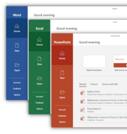
The addition of depth utilizes the z-axis and allows for content differentiation via layering. Depth is presented via drop shadows and Z-depth layering.[14][15] This is especially apparent in the redesigned Office app in 2019.
Motion
Motion establishes a relationship between UI elements and provides a continuity in experience.[16]
Add/delete animations
List animations for inserting and removing items from a collection.[17]
Connected animations
Connected animations are item transitions. During a content change, an element appears to continue by flying across the app.[18]
Content transition
Used when only a portion of content on a page will change.[19]
Drill
Drill is used when navigating deeper into an app. For example, displaying more information after an item is selected.[20]
Fade
Fade-in and fade-out to bring into and dismiss items from view.[21]
Parallax
Parallax moves objects at different rates. The background moves slower than the content above it. For example, a list will scroll faster than the background image, creating a depth effect in addition to motion.[22]
Press feedback
When an item is pressed, it momentarily recedes into the background and then restores to its original position. Examples of press feedback include the Start menu live tiles, Action Center quick actions, and Microsoft Edge address bar buttons.[23]
Material
Acrylic
New icons with Acrylic materials have been created for Microsoft programs, starting with the Office apps and the Chromium-based Microsoft Edge in 2018 and 2019, respectively.[24][25] Preliminary versions of the final icons were spotted in the "Meet the New icons for Office 365," video,[26] before more were spotted when Windows 10X was unveiled,[27] prior to being officially revealed on December 12, 2019.[28] These icons started appearing through Microsoft Store updates to those apps, beginning with Mail and Calendar.[29][30]
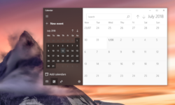
The Acrylic material creates a translucent, blurred effect with a slight noise effect. A visual hierarchy can be created by using different opacities. For example, in an app, primary content surfaces are often opaque (with the exception of widgets or lightweight apps such as Calculator), a secondary pane can have 80% background Acrylic, and the tertiary pane can have 60% background Acrylic. Background Acrylic blurs all items behind the active Acrylic material. In-app Acrylic blurs content within the app.
Acrylic is disabled in a specific window when the app is no longer selected. Both types of Acrylic are disabled system-wide when transparency is disabled, when Battery saver mode is enabled, or on low-end hardware. Background Acrylic is disabled when a window is de-selected or on Windows 10 Mobile, HoloLens, or tablet mode.[31]
Scale
Apps scale across different form factors, display sizes, and 0D to 3D. Elements adapt to their screen size and are available across multiple dimensions.[32][33] Conscious controls are also categorized within Scale (e.g. scrollbars and inputs that adapt to different methods of invocation)[34][35]
Undetermined
- Spatial sound[36]
Relation to previous iterations
Fluent's key principles, or "blocks" (Light, Depth, Motion, Material, and Scale) turn away from the flat concept Metro had defined, and while preserving the clean look and feel Metro introduced, Fluent renews the visuals of Aero, a design approach that was introduced in Windows Vista and Windows 7, including blurred translucency, parallax animated patterns, drop shadow, highlight effects following mouse pointer or input gesture movements, and "faux materials" Metro once dumped.
See also
References
- ↑ "Fluent Design is Microsoft's new modern UI for Windows and more". 2017-05-11. https://www.theverge.com/2017/5/11/15615812/microsoft-fluent-design-system-project-neon-features.
- ↑ "Windows Developer on Twitter" (in en). https://twitter.com/windowsdev/status/862698458469122049.
- ↑ "Fluent Design Language". http://fluent.microsoft.com.
- ↑ "New Windows look and feel, Neon, is officially the "Microsoft Fluent Design System"". https://arstechnica.com/information-technology/2017/05/new-windows-look-and-feel-neon-is-officially-the-microsoft-fluent-design-system/. Retrieved 11 May 2017.
- ↑ "Microsoft shows off its Fluent Design changes to Windows 10". The Verge. https://www.theverge.com/2017/10/16/16481202/microsoft-windows-10-fall-creators-update-fluent-design.
- ↑ "Microsoft's Fluent Design System threatens to make Windows look good" (in en-us). Ars Technica. https://arstechnica.com/information-technology/2017/05/taking-a-closer-look-at-microsofts-fluent-design-system/.
- ↑ "A major new Xbox One update overhauls the dashboard with Fluent Design". The Verge. https://www.theverge.com/2017/8/7/16105986/microsoft-xbox-one-dashboard-update-fluent-design.
- ↑ "The Xbox One is getting a major update today, including a faster dashboard". The Verge. https://www.theverge.com/2017/10/16/16481340/microsoft-xbox-one-fall-dashboard-update.
- ↑ "A first look at Microsoft’s new Windows 10X operating system for dual screens". The Verge. February 11, 2020. https://www.theverge.com/2020/2/11/21132826/microsoft-windows-10x-features-dual-screen-foldable-hands-on-developers.
- ↑ "Error: no
|title=specified when using {{Cite web}}". March 19, 2020. https://www.instagram.com/p/B97VqkXg0iN/. - ↑ mijacobs. "Reveal highlight - UWP app developer" (in en-us). https://docs.microsoft.com/windows/uwp/design/style/reveal.
- ↑ "No Fluent Design Reveal Highlight in Start Menu - Fall Creator's Update" (in en-US). https://answers.microsoft.com/en-us/windows/forum/windows_10-start-win_general/no-fluent-design-reveal-highlight-in-start-menu/106f29b6-2653-4f40-9514-1497e3474459.
- ↑ cphilippona. "Reveal focus - UWP app developer" (in en-us). https://docs.microsoft.com/en-us/windows/uwp/design/style/reveal-focus.
- ↑ "Microsoft shows off 'Z-depth layering' 3D feature in its Fluent Design System". Windows Central. https://www.windowscentral.com/microsoft-shows-plans-z-depth-layering-wave-2-fluent-design.
- ↑ "Microsoft Reveal Z-Depth Layering for Windows 10 Mixed Reality Devices" (in en-US). VRFocus. https://www.vrfocus.com/2017/05/microsoft-reveal-z-depth-layering-for-windows-10-mixed-reality-devices/.
- ↑ mijacobs. "Motion and animation in UWP apps - UWP app developer" (in en-us). https://docs.microsoft.com/windows/uwp/design/motion/.
- ↑ mijacobs. "Motion and animation in UWP apps - UWP app developer" (in en-us). https://docs.microsoft.com/windows/uwp/design/motion/.
- ↑ mijacobs. "Connected animation - UWP app developer" (in en-us). https://docs.microsoft.com/windows/uwp/design/motion/connected-animation.
- ↑ mijacobs. "Motion and animation in UWP apps - UWP app developer" (in en-us). https://docs.microsoft.com/windows/uwp/design/motion/.
- ↑ davidvkimball. "Page transitions in WUP apps - UWP apps" (in en-us). https://docs.microsoft.com/en-us/windows/uwp/design/motion/page-transitions.
- ↑ mijacobs. "Motion and animation in UWP apps - UWP app developer" (in en-us). https://docs.microsoft.com/windows/uwp/design/motion/.
- ↑ mijacobs. "How to use the ParallaxView control to add depth and movement to your app. - UWP app developer" (in en-us). https://docs.microsoft.com/windows/uwp/design/motion/parallax.
- ↑ mijacobs. "Pointer click animations in UWP apps - UWP app developer" (in en-us). https://docs.microsoft.com/windows/uwp/design/motion/motion-pointer.
- ↑ "Redesigning the Office App Icons to Embrace a New World of Work". November 29, 2018. https://medium.com/microsoft-design/redesigning-the-office-app-icons-to-embrace-a-new-world-of-work-91d72608ee8f.
- ↑ "Microsoft unveils new Edge browser logo that no longer looks like Internet Explorer". The Verge. November 2, 2019. https://www.theverge.com/2019/11/2/20944341/microsoft-edge-chromium-browser-logo-icon-wave-surf-new.
- ↑ "Meet the new icons for Office 365". November 29, 2018. https://youtube.com/YplAU5myNP4.
- ↑ "#MicrosoftEvent Live". October 2, 2019. https://youtube.com/dmaioTs0NH8.
- ↑ "The Icon Kaleidoscope". December 12, 2019. https://medium.com/microsoft-design/the-ripple-effect-expanding-our-icon-design-system-74b4d916b7a4.
- ↑ "Iconic Icons: Designing the World of Windows". February 20, 2020. https://medium.com/microsoft-design/iconic-icons-designing-the-world-of-windows-5e70e25e5416.
- ↑ "Microsoft rolls out colorful new Windows 10 icons". The Verge. February 20, 2020. https://www.theverge.com/2020/2/20/21145157/microsoft-windows-10-new-icons-modern-release-update-apps.
- ↑ mijacobs. "Acrylic material - UWP app developer" (in en-us). https://docs.microsoft.com/windows/uwp/design/style/acrylic.
- ↑ "Fluent Design System" (in en). https://fluent.microsoft.com/.
- ↑ Verma, Adarsh (2017-05-12). "What Is Fluent Design System? How Is Microsoft Building The Most Beautiful Operating System?" (in en-US). Fossbytes. https://fossbytes.com/fluent-design-system-microsoft-windows-10/.
- ↑ muhsinking. "Scroll viewer controls - UWP app developer" (in en-us). https://docs.microsoft.com/windows/uwp/design/controls-and-patterns/scroll-controls.
- ↑ "What's new with Microsoft Fluent Design System 'wave one' for Windows 10". Windows Central. 2017-06-29. https://www.windowscentral.com/whats-new-microsoft-fluent-design-system-wave-one-windows-10.
- ↑ "Spatial sound design" (in en-us). https://developer.microsoft.com/en-us/windows/mixed-reality/spatial_sound_design.
External links
- "Design and Code UWP apps". Microsoft. https://developer.microsoft.com/windows/apps/design.
- Gusmorino, Paul; Ostojic, Bojana (May 8, 2017). "Introducing Fluent Design". Channel 9. MSDN. https://channel9.msdn.com/events/Build/2017/B8066?term=introduction%20to%20fluent%20design.
 |
