Software:Fluent Design System
 The notepad and calculator application in Windows 11 | |||||||||||||||||
| Other names |
| ||||||||||||||||
|---|---|---|---|---|---|---|---|---|---|---|---|---|---|---|---|---|---|
| Original author(s) | Microsoft | ||||||||||||||||
| Developer(s) | Microsoft | ||||||||||||||||
| Initial release | 2017 | ||||||||||||||||
| |||||||||||||||||
| |||||||||||||||||
Fluent Design System (codenamed "Project Neon"),[7] officially unveiled as Microsoft Fluent Design System,[8] is a design language developed in 2017 by Microsoft. Fluent Design is a revamp of Microsoft Design Language (popularly known as "Metro") that includes guidelines for the designs and interactions used within software designed for all Windows 10 and Windows 11 devices and platforms. The system is based on five key components: light, depth, motion, material, and scale.[9] The new design language includes more prominent use of motion, depth, and translucency effects.[10]
The transition to Fluent is a long-term project; aspects of the design started appearing in Windows 10 beginning with the "Fall Creators Update" released in October 2017, as well as an update to the Xbox One system software released alongside it.[11][12][13][14] It was later revealed to be designed in conjunction with Windows 10X,[15] in addition to Windows 11 which has a similar design.[16]
Compared to Metro and Aero
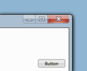
Fluent's key principles, or "blocks" (Light, Depth, Motion, Material, and Scale), turn away from the flat concept Metro had defined, and while preserving the clean look and feel Metro introduced, Fluent renews the visuals of Aero, a design approach that was introduced in Windows Vista and Windows 7, including blurred translucency, parallax animated patterns, drop shadows, highlight effects following mouse pointer or input gesture movements, and "faux materials" Metro once discarded.[17]
Design components
Light Reveal Highlight Reveal Focus |
Depth Example of the use of layering |
Motion Example of the use of motion and animations |
Material | |
Acrylic Mica Smoke Example of Acrylic, Mica and Smoke material |
Scale App resizing and replacing its elements depending on its size and scale |
Light
The purpose of light is to draw attention and illuminate information. Therefore, light establishes a relationship between the UI and the cursor or pointer.[18]
- Reveal highlight: Upon hovering, the reveal highlight illuminates nearby hidden borders on objects such as hamburger navigation menu lists and buttons. Upon selection, such as by clicking or tapping, a white circular illumination effect quickly appears.[18][19]
- Reveal focus: Focusable items with a border glow via the focus visual.[20]
With WinUI 2.6, Microsoft has discontinued reveal highlight to match their web and mobile offerings, which do not offer reveal highlight.[21] Furthermore, with the release of Windows 11, Microsoft has slowly been removing its use of light effects in general, instead providing intractability though animations.[21]
Depth
Depth is added to content through layering in the z-axis. Depth is presented via drop shadows and Z-depth layering.[22][23] This is especially apparent in the redesigned Office app in 2019. In Windows 11, the use of depth is expanded by overlapping different surfaces with different opacities of the Mica material.
- Layering: Layering divides an app into the base which is the "canvas" and the content which floats on top. The content can be presented as a continuous surface or as a card.[24]
- Elevation: Elevation is the use of separating elements from the app surface through the use of shadows. Examples include context menus, pop-ups or tooltips.[24]
Motion
Motion establishes a relationship between UI elements and provides a continuity in the experience.[25]
- Add/delete animations: List animations for inserting and removing items from a collection.[26]
- Connected animations: Connected animations are item transitions. During a content change, an element appears to continue by flying across the app.[27]
- Content transition: Used when only a portion of content on a page will change.[26]
- Drill: Drill is used when navigating deeper into an app. For example, displaying more information after an item is selected.[28]
- Fade: fade -in and fade-out to bring items into and dismiss them from view.[26]
- Parallax: Parallax moves objects at different rates. The background moves slower than the content above it. For example, a list will scroll faster than the background image, creating a depth effect in addition to motion.[29]
- Press feedback: When an item is pressed, it momentarily recedes into the background and then returns to its original position. Examples of press feedback include the Start menu live tiles, Action Center quick actions, and Microsoft Edge address bar buttons.[30]
Material
Materials are visual effects applied to UX surfaces. In fluent design there are two main kinds of materials: occluding and transparent. Occluding materials, such as acrylic and mica, form the base layers under interactive UI elements. Transparent materials like smoke are used to emphasize immersive surfaces:[31]
- Acrylic: The acrylic material creates a translucent, blurred effect with a slight noise effect. While in Windows 10, Acrylic was used in large surfaces (such as side panels). With Windows 11, primary surfaces have abandoned Acrylic in favor of Mica. Instead, Acrylic is used in transient surfaces such as context menus, tooltips or predictions in search boxes.
- Mica: Mica is a new opaque material introduced in Windows 11 that takes on the tint of the user's wallpaper.[32] Unlike acrylic, which was designed for transient surfaces (e.g., context menus), MMC is designed for use on long-lasting primary surfaces. By using different opacities, apps can create a visual hierarchy.
- Smoke: Smoke was introduced with Windows 11. It is a translucent black background, regardless of light or dark mode, in order to create a hierarchy between the main window and a pop-up.[31]
Both Acrylic and Mica are disabled in a specific window when the app is no longer selected. Furthermore, both are disabled system-wide when transparency is disabled, when battery saver mode is enabled, or on low-end hardware. Background Acrylic is disabled when a window is deselected or in Windows 10 Mobile, HoloLens, or tablet mode.[33]
Scale
Apps scale across different form factors, display sizes, and 0D to 3D. Elements adapt to their screen size and are available across multiple dimensions.[34][35] Conscious controls are also categorized within Scale (e.g. scrollbars and inputs that adapt to different methods of invocation)[36][37]
Iconography
App Icons
New icons with acrylic materials have been created for Microsoft programs, starting with the Office apps and the Chromium-based Microsoft Edge in 2018 and 2019, respectively.[38][39][40] Preliminary versions of the final icons were spotted in the "Meet the New Icons for Office 365" video,[41] before more were spotted when Windows 10X was unveiled,[42] prior to being officially revealed on December 12, 2019.[43] These icons started appearing through Microsoft Store updates to those apps, beginning with Mail and Calendar.[44][45]
Segoe Fluent Icons
Segoe Fluent Icons is a set of icons designed by Microsoft for use in its products and services alongside the redesign of the Segoe UI font (Segoe UI Variable).[46] The icons are rounded departing from the angular and straight Segoe MDL2 icons which were predominant during the "Metro" era.[47]
Fluent Emojis
On July 15, 2021, Microsoft announced a complete redesign of its emoji library in order to align with its Fluent Design.[48] Aiming to make Windows as consistent and accessible as possible, Microsoft made over 1,500 emoji open source on August 10, 2022.[49][50] These new Fluent emojis depart from the flat and outlined style of the previous emoji library used in Windows 10 and instead embrace a 3d Play-Doh feel.[48] Furthermore, Microsoft has stated their plans to animate most of them.[51] While the 3d animated emojis can be seen in apps such as Microsoft Teams and Skype, Windows 11 uses flat variants.
Implementation
Fluent design guidelines are cross-platform and can be implemented with different frameworks.[52] Fluent UI React is a set of React components that implement Microsoft's Fluent Design System. It provides a set of pre-built components that can be used to build applications for Windows, iOS, Android, macOS and the web. Furthermore, WinUI is a native user interface framework for building Windows apps. It is built on top of Fluent Design System and provides a set of pre-built controls.[53]
| WinUI 2 | WinUI 3 | Fluent UI React v9 | Web Components | |
|---|---|---|---|---|
| UWP | UWP | Win32 | React | Blazor |
| WinUI 2 is a library of controls and styles for building modern Windows apps. It is available for use in any UWP app and offers exciting, flexible, modern controls such as NavigationView and TeachingTip.[7] | WinUI 3 is the next generation of the WinUI framework. It ships with the Windows App SDK. WinUI 3 expands WinUI into a full UX framework and provides a unified set of APIs and tools.[8] | Fluent UI React v9 is the latest stable release of Fluent UI React and offers a collection of utilities, React components, and web components for building web applications.[54] Fluent UI React v9 tries to streamline itself to its WinUI counterpart.[55] | Web components are a set of web platform APIs that allow you to create new custom, reusable, encapsulated HTML tags to use in web pages and web apps.[56][57] | |
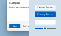
 UI Elements using WinUI
|
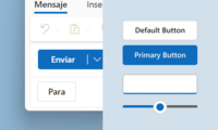
 UI Elements using Fluent UI React v9'
|
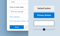
 UI Elements using web components
| ||
See also
References
- ↑ "@fluentui/react - npm". 2021-04-01. https://www.npmjs.com/package/@fluentui/react/v/8.8.0.
- ↑ "Release Microsoft.UI.Xaml v2.5.0 · microsoft/microsoft-ui-xaml". 2020-04-12. https://github.com/microsoft/microsoft-ui-xaml/releases/tag/v2.5.0.
- ↑ Microsoft 365 Team (2020-03-12). "UI Fabric is evolving into Fluent UI - Microsoft 365 Developer Blog". https://developer.microsoft.com/en-us/office/blogs/ui-fabric-is-evolving-into-fluent-ui/.
- ↑ Lewkowicz, Jakub (2020-03-16). "Microsoft transforms UI Fabric to Fluent UI - SD Times". https://sdtimes.com/msft/microsoft-transforms-ui-fabric-to-fluent-ui/.
- ↑ Office Dev (2015-08-15). "Introducing Office UI Fabric—your key to designing add-ins for Office - Microsoft 365 Blog". https://www.microsoft.com/en-us/microsoft-365/blog/2015/08/31/introducing-office-ui-fabric-your-key-to-designing-add-ins-for-office/.
- ↑ Tung, Liam (2020-03-16). "Microsoft's big Fluent design push: Web developers get a new Office UI Fabric | ZDNet". https://www.zdnet.com/article/microsofts-big-fluent-design-push-web-developers-get-a-new-office-ui-fabric/.
- ↑ 7.0 7.1 "Fluent Design is Microsoft's new modern UI for Windows and more". 2017-05-11. https://www.theverge.com/2017/5/11/15615812/microsoft-fluent-design-system-project-neon-features.
- ↑ 8.0 8.1 "Windows Developer on Twitter" (in en). https://twitter.com/windowsdev/status/862698458469122049.
- ↑ "Fluent Design Language". http://fluent.microsoft.com.
- ↑ "New Windows look and feel, Neon, is officially the "Microsoft Fluent Design System"". 11 May 2017. https://arstechnica.com/information-technology/2017/05/new-windows-look-and-feel-neon-is-officially-the-microsoft-fluent-design-system/. Retrieved 11 May 2017.
- ↑ "Microsoft shows off its Fluent Design changes to Windows 10". The Verge. https://www.theverge.com/2017/10/16/16481202/microsoft-windows-10-fall-creators-update-fluent-design.
- ↑ "Microsoft's Fluent Design System threatens to make Windows look good" (in en-us). Ars Technica. https://arstechnica.com/information-technology/2017/05/taking-a-closer-look-at-microsofts-fluent-design-system/.
- ↑ "A major new Xbox One update overhauls the dashboard with Fluent Design". The Verge. https://www.theverge.com/2017/8/7/16105986/microsoft-xbox-one-dashboard-update-fluent-design.
- ↑ "The Xbox One is getting a major update today, including a faster dashboard". The Verge. https://www.theverge.com/2017/10/16/16481340/microsoft-xbox-one-fall-dashboard-update.
- ↑ "A first look at Microsoft's new Windows 10X operating system for dual screens". The Verge. February 11, 2020. https://www.theverge.com/2020/2/11/21132826/microsoft-windows-10x-features-dual-screen-foldable-hands-on-developers.
- ↑ "Panos Panay on Instagram: "The team made this video to celebrate making it to 1 billion MAD on Windows 10 and I wanted to share it with all of you. Now at a time when…"". March 19, 2020. https://www.instagram.com/p/B97VqkXg0iN/.
- ↑ Parmar, Mayank (2022-02-13). "Microsoft teases Windows 7 Aero-like design for Windows 11" (in en-US). https://www.windowslatest.com/2022/02/14/microsoft-teases-windows-7-aero-like-design-for-windows-11/.
- ↑ 18.0 18.1 mijacobs. "Reveal highlight - UWP applications | Microsoft Docs" (in en-us). https://docs.microsoft.com/windows/uwp/design/style/reveal.
- ↑ Blog, Windows Developer (2017-08-04). "Creating Materials and Lights in the Visual Layer" (in en-US). https://blogs.windows.com/windowsdeveloper/2017/08/04/creating-materials-lights-visual-layer/.
- ↑ cphilippona (2020-09-24). "Reveal focus - UWP applications | Microsoft Docs" (in en-us). https://docs.microsoft.com/en-us/windows/uwp/design/style/reveal-focus.
- ↑ 21.0 21.1 "Question: Is reveal possible to return? · Issue #4011 · microsoft/microsoft-ui-xaml" (in en). https://github.com/microsoft/microsoft-ui-xaml/issues/4011.
- ↑ Bowden, Zac (2017-05-19). "Microsoft shows off 'Z-depth layering' 3D feature in its Fluent Design System". Windows Central. https://www.windowscentral.com/microsoft-shows-plans-z-depth-layering-wave-2-fluent-design.
- ↑ Joyce, Kevin (2017-05-20). "Microsoft Reveal Z-Depth Layering for Windows 10 Mixed Reality Devices" (in en-US). VRFocus. https://www.vrfocus.com/2017/05/microsoft-reveal-z-depth-layering-for-windows-10-mixed-reality-devices/.
- ↑ 24.0 24.1 hickeys. "Layering and elevation in Windows 11 - Windows apps" (in en-us). https://learn.microsoft.com/en-us/windows/apps/design/signature-experiences/layering.
- ↑ mijacobs (2020-09-24). "Motion and animation in UWP apps - UWP applications | Microsoft Docs" (in en-us). https://docs.microsoft.com/windows/uwp/design/motion/.
- ↑ 26.0 26.1 26.2 mijacobs (2020-09-24). "Motion and animation in UWP apps - UWP applications | Microsoft Docs" (in en-us). https://docs.microsoft.com/windows/uwp/design/motion/.
- ↑ mijacobs (2020-09-24). "Connected animation - UWP applications | Microsoft Docs" (in en-us). https://docs.microsoft.com/windows/uwp/design/motion/connected-animation.
- ↑ davidvkimball (2020-09-24). "Page transitions in WUP apps - UWP apps" (in en-us). https://docs.microsoft.com/en-us/windows/uwp/design/motion/page-transitions.
- ↑ mijacobs (2020-09-24). "How to use the ParallaxView control to add depth and movement to your app. - UWP applications | Microsoft Docs" (in en-us). https://docs.microsoft.com/windows/uwp/design/motion/parallax.
- ↑ mijacobs (2020-09-24). "Pointer click animations in UWP apps - UWP applications | Microsoft Docs" (in en-us). https://docs.microsoft.com/windows/uwp/design/motion/motion-pointer.
- ↑ 31.0 31.1 hickeys. "Materials used in Windows 11 apps - Windows apps" (in en-us). https://learn.microsoft.com/en-us/windows/apps/design/signature-experiences/materials.
- ↑ "Materials used in Windows 11 apps - Windows apps" (in en-us). https://docs.microsoft.com/en-us/windows/apps/design/signature-experiences/materials.
- ↑ mijacobs. "Acrylic material - UWP applications | Microsoft Docs" (in en-us). https://docs.microsoft.com/windows/uwp/design/style/acrylic.
- ↑ "Fluent Design System" (in en). https://fluent.microsoft.com/.
- ↑ Verma, Adarsh (2017-05-12). "What Is Fluent Design System? How Is Microsoft Building The Most Beautiful Operating System?" (in en-US). Fossbytes. https://fossbytes.com/fluent-design-system-microsoft-windows-10/.
- ↑ muhsinking. "Scroll viewer controls - UWP applications | Microsoft Docs" (in en-us). https://docs.microsoft.com/windows/uwp/design/controls-and-patterns/scroll-controls.
- ↑ "What's new with Microsoft Fluent Design System 'wave one' for Windows 10". Windows Central. 2017-06-29. https://www.windowscentral.com/whats-new-microsoft-fluent-design-system-wave-one-windows-10.
- ↑ "Redesigning the Office App Icons to Embrace a New World of Work". November 29, 2018. https://medium.com/microsoft-design/redesigning-the-office-app-icons-to-embrace-a-new-world-of-work-91d72608ee8f.
- ↑ "Microsoft unveils new Edge browser logo that no longer looks like Internet Explorer". The Verge. November 2, 2019. https://www.theverge.com/2019/11/2/20944341/microsoft-edge-chromium-browser-logo-icon-wave-surf-new.
- ↑ hickeys. "Design guidelines for Windows app icons - Windows apps" (in en-us). https://learn.microsoft.com/en-us/windows/apps/design/style/iconography/app-icon-design.
- ↑ "Meet the new icons for Office 365". November 29, 2018. https://youtube.com/watch?v=YplAU5myNP4.
- ↑ "#MicrosoftEvent Live". October 2, 2019. https://youtube.com/watch?v=dmaioTs0NH8.
- ↑ "The Icon Kaleidoscope". December 12, 2019. https://medium.com/microsoft-design/the-ripple-effect-expanding-our-icon-design-system-74b4d916b7a4.
- ↑ "Iconic Icons: Designing the World of Windows". February 20, 2020. https://medium.com/microsoft-design/iconic-icons-designing-the-world-of-windows-5e70e25e5416.
- ↑ "Microsoft rolls out colorful new Windows 10 icons". The Verge. February 20, 2020. https://www.theverge.com/2020/2/20/21145157/microsoft-windows-10-new-icons-modern-release-update-apps.
- ↑ hickeys. "Iconography in Windows 11 - Windows apps" (in en-us). https://learn.microsoft.com/en-us/windows/apps/design/signature-experiences/iconography.
- ↑ hickeys. "Segoe MDL2 Assets icons - Windows apps" (in en-us). https://learn.microsoft.com/en-us/windows/apps/design/style/segoe-ui-symbol-font.
- ↑ 48.0 48.1 "New Fluent Emoji Designs From Microsoft" (in en). 2021-07-15. https://blog.emojipedia.org/new-fluent-emoji-designs-from-microsoft/.
- ↑ Carrasqueira, João (2022-08-10). "Microsoft open sources its Windows 11 emoji for everyone to use" (in en). https://www.xda-developers.com/microsoft-open-source-fluent-emoji/.
- ↑ Design, Microsoft (2022-08-10). "Designing in the Open(Source)" (in en). https://medium.com/microsoft-design/designing-in-the-open-source-5c62be73a599.
- ↑ Design, Microsoft (2021-11-22). "Emotionality at work" (in en). https://medium.com/microsoft-design/emotionality-at-work-398182387adc.
- ↑ "Home - Fluent UI" (in en-US). https://developer.microsoft.com/en-us/fluentui#/.
- ↑ Bridge, Karl. "Windows UI Library (WinUI) 3 - Windows apps" (in en-US). https://learn.microsoft.com/en-us/windows/apps/winui/winui3/.
- ↑ "Fluent UI React" (in en-US). https://react.fluentui.dev/.
- ↑ VitaRox. "Fluent UI React v9: what's new and different" (in en-US). https://learn.microsoft.com/en-us/shows/open-at-microsoft/fluent-ui-react-v9-whats-new-and-different#time=00m21s.
- ↑ "fluentui/packages/web-components at master · microsoft/fluentui" (in en). https://github.com/microsoft/fluentui.
- ↑ brookdozer. "Fluent UI Web Components Overview" (in en-US). https://learn.microsoft.com/en-us/fluent-ui/web-components/.
External links
- "Design and Code UWP apps". Microsoft. https://developer.microsoft.com/windows/apps/design.
- Gusmorino, Paul; Ostojic, Bojana (May 8, 2017). "Introducing Fluent Design". Channel 9. MSDN. https://channel9.msdn.com/events/Build/2017/B8066?term=introduction%20to%20fluent%20design.
 |


