Color chart


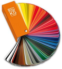
A color chart or color reference card is a flat, physical object that has many different color samples present. They can be available as a single-page chart, or in the form of swatchbooks or color-matching fans.
Typically there are two different types of color charts:
- Color reference charts are intended for color comparisons and measurements. Typical tasks for such charts are checking the color reproduction of an imaging system, aiding in color management or visually determining the hue of color. Examples are the IT8 and ColorChecker charts.
- Color selection charts present a palette of available colors to aid the selection of spot colors, process colors, paints, pens, crayons, and so on – usually the colors are from a manufacturers product range. Examples are the Pantone and RAL systems.
Color reference charts
Color reference charts are used for color comparisons and measurements such as checking the color reproduction of an imaging system, and calibration and/or profiling of digital input devices such as digital cameras, and scanners and output display systems like printers, monitors and projectors. They are also used by traditional photographers and cinematographers to calibrate cameras that use film and to check the color temperature of the lighting.
Color reference cards can also be used to assess light quality, as in the color rendering index, where reflectance from a set of Munsell samples are evaluated.
Shirley cards
Shirley cards are color reference cards that are used to perform skin-color balance in still photography printing. The industry standard for these cards in North American photography laboratories in the 1940s and 1950s depicted a solitary "Caucasian" female dressed in brightly colored clothes. Very few of these color reference cards showed an adult male as the reference image.[1] Light skin tones therefore served as the recognized skin ideal standard. Stock color film chemistry for still cameras was designed originally with a positive bias toward "Caucasian" skin tones, because of their high levels of reflectivity.[1]
By the mid-1990s, Japanese companies redesigned their Shirley cards using data from their own color preference tests. The new reference card featured Japanese women with light, East Asian skin tones.[1]
In 1995, Kodak designed a multiracial norm reference card. This card showed three women (Caucasian, Asian, African) with different skin colors and brightly contrasted clothing.[1]
A similar cinematic calibration technique is known as the China Girl.
ColorChecker charts

The ColorChecker, first produced as the "Macbeth ColorChecker" in 1976, is a cardboard-framed arrangement of twenty-four squares of painted samples based on Munsell colors. Its previous maker Gretag–Macbeth was acquired in 2006 by X-Rite.
A ColorChecker chart can be used to manually adjust color parameters (e.g. color temperature) to achieve a desired color rendition. ColorChecker charts are available in different sizes and forms.
IT8 charts

Standardized IT8 charts, also called IT8 targets, are made by several companies, including Coloraid.de, Fujifilm, Kodak, LaserSoft Imaging.[2] Unlike ColorChecker charts, IT8 charts are supplied with measurement values and can be used to create ICC color profiles by software, e.g., for digital cameras, to create reproducible color management.
Other


Pier Andrea Saccardo proposed this "chromotaxy scale" in 1894, to standardize the naming of colors of plant specimens.
Color charts can take custom forms, as for example the calibration target used by the Curiosity rover for its Mars Hand Lens Imager (MAHLI).
The European Pharmacopoeia monograph 2.2.2 is a method to determine the degree of coloration in liquids, applied to pharmacological compounds, drug substances and finished product. It consist in 3 stock solutions, yellow, red, and blue. These are prepared by dissolving in hydrochloride acid ferric chloride, cobalt chloride, or copper sulfate, respectively. The stock solutions are then used in different proportions to prepare five standard solutions, termed B (brown), BY (brownish-yellow), Y (yellow), GY (greenish-yellow), and R (red). Results are given by observation of the test material against the standard solutions, and expressed as less intensely colored as the next color standard (for example, "color of solution colorless to slightly brown-yellow liquid, <BY4").[3] This method has been updated in Ph.Eur. release version 10 to include a digital method that eliminates the errors inherent in visual methods due to differences in human perception, while providing a quantitative color value.
Color selection charts

Because paints and inks depend for their color on pigments and dyes, a reference is needed to match specific combinations of coloring substances in a given matrix against the resulting color. One of the earliest attempts to achieve this goal was the 1692 manuscript Klaer Lightende Spiegel der Verfkonst. It presented a range of watercolor mixtures, but remained relatively unknown, because only one manuscript was produced. Due to the development of the paint and ink industry, the requirement for this kind of chart intensified, and a number of systems are now available, including:
- "DIC Color System Guide" and "Toyo Color Finder," commonly used for spot color matching, mostly in Japan[4]
- NCS Palette (Natural Color System)
- Pantone, used for printing and sometimes for paint, fabric, and plastics
- RAL (Reichsausschuß für Lieferbedingungen) "Classic[5]", "Effect", and "Design," used for varnish and powder coating
See also
- Color calibration
- Colour Index International
- Color management
- Color mapping
- ICC profile
- IT8
- Lenna
- Lists of colors
- Test film
- China Girl
Further reading
- Varichon, Anne (2024). Color Charts: A History. Princeton University Press. ISBN 978-0-691-25517-0.
References
- ↑ 1.0 1.1 1.2 1.3 Roth, Lorna (March 28, 2009). "Looking at Shirley, the Ultimate Norm: Colour Balance, Image Technologies, and Cognitive Equity". Canadian Journal of Communication (Canadian Journal of Communication/CCSP Press) 34 (1): 111–136. doi:10.22230/cjc.2009v34n1a2196. http://www.cjc-online.ca/index.php/journal/article/view/2196. Retrieved November 4, 2013.
- ↑ Ian Lyons. "IT8 Calibration Targets: Does cost really make a difference?". Computer Darkroom. http://www.computer-darkroom.com/it8cal/it8_page_1.htm.
- ↑ European Pharmacopoeia 7.0. "2.2.2. DEGREE OF COLORATION OF LIQUIDS". https://extranet.edqm.eu/4DLink1/4DCGI/Web_View/mono/20202.
- ↑ William E. Kasdorf (2003). The Columbia Guide to Digital Publishing. Columbia University Press. ISBN 978-0-231-12498-0. https://books.google.com/books?id=fobHSO6GlZAC&q=dic+color+guide&pg=PA268.
- ↑ "Online RAL Classic Color Table" (in en). https://colors.watch/color-tables/ral-classic.
Template:Color classifications
 |

