Datasaurus dozen
| Part of a series on Statistics |
| Data visualization |
|---|
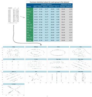
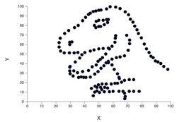
The Datasaurus dozen comprises thirteen data sets that have nearly identical simple descriptive statistics to two decimal places, yet have very different distributions and appear very different when graphed.[1] It was inspired by the smaller Anscombe's quartet that was created in 1973.
Data
The following table contains summary statistics for all thirteen data sets.
| Property | Value | Accuracy |
|---|---|---|
| Number of elements | 142 | exact |
| Mean of x | 54.26 | to 2 decimal places |
| Sample variance of x: s2x | 16.76 | to 2 decimal places |
| Mean of y | 47.83 | to 2 decimal places |
| Sample variance of y: s2y | 26.93 | to 2 decimal places |
| Correlation between x and y | −0.06 | to 3 decimal places |
| Linear regression line | y = 53 − 0.1x | to 0 and 1 decimal places, respectively |
| Coefficient of determination of the linear regression: | 0.004 | to 3 decimal places |

The thirteen data sets were labeled as the following:
- away
- bullseye
- circle
- dino
- dots
- h_lines
- high_lines
- slant_down
- slant_up
- star
- v_line
- wide_lines
- x_shape
Similar to Anscombe's quartet, the Datasaurus dozen was designed to further illustrate the importance of looking at a set of data graphically before starting to analyze according to a particular type of relationship, and the inadequacy of basic statistic properties for describing realistic data sets.[2][3][4][5][1][6]
Creation

The first data set, in the shape of a Tyrannosaurus, that inspired the rest of the "datasaurus" data set was constructed in 2016 by Alberto Cairo.[7][8] It was proposed by Maarten Lambrechts that this data set also be called "Anscombosaurus".[7]
This data set was then accompanied by twelve other data sets that were created by Justin Matejka and George Fitzmaurice at Autodesk. Unlike the Anscombe's quartet, where it is not known how the data set was generated,[9] the authors used simulated annealing to make these data sets. They made small, random, and biased changes to each point towards the desired shape. Each shape took 200,000 iterations of perturbations to complete.[1]
The pseudocode for this algorithm is as follows:
current_ds ← initial_ds
for x iterations, do:
    test_ds ← perturb(current_ds, temp)
    if similar_enough(test_ds, initial_ds):
        current_ds ← test_ds

function perturb(ds, temp):
    loop:
        test ← move_random_points(ds)
        if fit(test) > fit(ds) or temp > random():
            return test
where
initial_dsis the seed data setcurrent_dsis the latest version of the data setfit()is a function used to check whether moving the points gets closer to the desired shapetempis the temperature of the simulated annealing algorithmsimilar_enough()is a function that checks whether the statistics for the two given data sets are similar enoughmove_random_points()is a function that randomly moves data points
See also
- Exploratory data analysis
- Goodness of fit
- Regression validation
- Simpson's paradox
- Statistical model validation
- Anscombe's quartet
References
- ↑ 1.0 1.1 1.2 Matejka, Justin; Fitzmaurice, George (2017-05-02). "Same Stats, Different Graphs: Generating Datasets with Varied Appearance and Identical Statistics through Simulated Annealing". Proceedings of the 2017 CHI Conference on Human Factors in Computing Systems. CHI '17. New York, NY, USA: Association for Computing Machinery. pp. 1290–1294. doi:10.1145/3025453.3025912. ISBN 978-1-4503-4655-9. https://doi.org/10.1145/3025453.3025912.
- ↑ Elert, Glenn (2021). "Linear Regression - Practice". The Physics Hypertextbook. http://physics.info/linear-regression/practice.shtml#4.
- ↑ Janert, Philipp K. (2010). Data Analysis with Open Source Tools. O'Reilly Media. pp. 65–66. ISBN 978-0-596-80235-6. https://archive.org/details/isbn_9780596802356/page/65.
- ↑ Chatterjee, Samprit; Hadi, Ali S. (2006). Regression Analysis by Example. John Wiley and Sons. p. 91. ISBN 0-471-74696-7.
- ↑ Saville, David J.; Wood, Graham R. (1991). Statistical Methods: The geometric approach. Springer. p. 418. ISBN 0-387-97517-9.
- ↑ Tufte, Edward R. (2001). The Visual Display of Quantitative Information (2nd ed.). Cheshire, CT: Graphics Press. ISBN 0-9613921-4-2. https://archive.org/details/visualdisplayofq00tuft.
- ↑ 7.0 7.1 Cairo, Alberto. "Download the Datasaurus: Never trust summary statistics alone; always visualize your data". http://www.thefunctionalart.com/2016/08/download-datasaurus-never-trust-summary.html.
- ↑ Murtagh, Jack (2024-02-01). "What This Graph of a Dinosaur Can Teach Us about Doing Better Science" (in en). https://www.scientificamerican.com/article/what-this-graph-of-a-dinosaur-can-teach-us-about-doing-better-science/.
- ↑ Chatterjee, Sangit; Firat, Aykut (2007). "Generating Data with Identical Statistics but Dissimilar Graphics: A follow up to the Anscombe dataset". The American Statistician 61 (3): 248–254. doi:10.1198/000313007X220057.
External links
- Animated examples from Autodesk for the Datasaurus Dozen datasets
- datasauRus, datasets from the Datasaurus Dozen in R
- The Datasaurus Dozen in CSV and tab-delimited files https://www.openintro.org/data/index.php?data=datasaurus
 |
