Cerulean
blue
|
cerulean
|
teal
|
| Cerulean | |
|---|---|
| Hex triplet | #007BA7 |
| Source | Maerz and Paul[1] |
| ISCC–NBS descriptor | Strong greenish blue |
| Cerulean (RGB) | |
|---|---|
| Hex triplet | #0040FF |
| Source | [Unsourced] |
| ISCC–NBS descriptor | Vivid blue |
Cerulean (/səˈruːliən/), also spelled caerulean, is a shade of blue ranging between azure and a darker sky blue. The first recorded use of cerulean as a colour name in English was in 1590.[1] The word is derived from the Latin word caeruleus, "dark blue, blue, or blue-green", which in turn probably derives from caerulum, diminutive of caelum, "heaven, sky".[2]
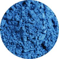
"Cerulean blue" is the name of a blue-green pigment consisting of cobalt stannate (Co2SnO4). The pigment was first synthesized in the late eighteenth century by Albrecht Höpfner, a Swiss chemist, and it was known as Höpfner blue during the first half of the nineteenth century. Art suppliers began referring to cobalt stannate as cerulean in the second half of the nineteenth century. It was not widely used by artists until the 1870s when it became available in oil paint.[3]
| Cerulean Blue | |
|---|---|
| Hex triplet | #2A52BE |
| Source | Maerz and Paul[4] |
| ISCC–NBS descriptor | Vivid blue |
Pigment characteristics
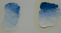
The primary chemical constituent of the pigment is cobalt(II) stannate (Co2SnO4).[5][6][7] The pigment is a greenish-blue color. In watercolor, it has a slight chalkiness. When used in oil paint, it loses this quality.[8]
Today, cobalt chromate is sometimes marketed under the cerulean blue name but is darker and greener[lower-alpha 1] than the cobalt stannate version.[lower-alpha 2] The chromate makes excellent turquoise colours and is identified by Rex Art and some other manufacturers as "cobalt turquoise".[9][10]
Cerulean is inert with good light resistance, and it exhibits a high degree of stability in both watercolor and acrylic.[11]
History
Cobalt stannate pigment was first synthesized in 1789 by the Swiss chemist Albrecht Höpfner by heating roasted cobalt and tin oxides together.[12][13] Subsequently, there was limited German production under the name of Cölinblau.[citation needed] It was generally known as Höpfner blue from the late eighteenth century until the middle of the nineteenth century.[3]
In the late 1850s, art suppliers begin referring to the pigment as "ceruleum" blue. The London Times of 28 December 1859 had an advertisement for "Caeruleum, a new permanent colour prepared for the use of artists." Ure's Dictionary of Arts from 1875 describes the pigment as "Caeruleum . . . consisting of stannate of protoxide of cobalt, mixed with stannic acid and sulphate of lime." Cerulean was also referred to as coeurleum, cerulium, bleu céleste (celestial blue). Other nineteenth century English pigment names included "ceruleum blue" and "corruleum blue". By 1935, Max Doerner referred to the pigment as cerulean, as do most modern sources, through ceruleum is still used.[3]
Some sources claim that cerulean blue was first marketed in the United Kingdom by colourman George Rowney, as "coeruleum" in the early 1860s. However, the British firm of Roberson was buying "Blue No. 58 (Cerulium)" from a German firm of Frauenknecht and Stotz prior to Rowney.[3] Cerulean blue was only available as a watercolor in the 1860s and was not widely adopted until the 1870s when it was used in oil paint. It was popular with artists including Claude Monet, Paul Signac, and Picasso. Van Gogh created his own approximation of cerulean blue using a mixture of cobalt blue, cadmium yellow, and white.[14]
Notable occurrences
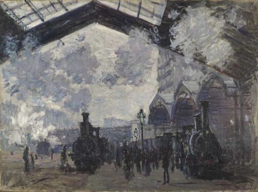
In 1877, Monet had added the pigment to his palette, using it in a painting from his series La Gare Saint-Lazare (now in the National Gallery, London). The blues in the painting include cobalt and cerulean blue, with some areas of ultramarine. Laboratory analysis conducted by the National Gallery identified a relatively pure example of cerulean blue pigment in the shadows of the station's canopy. Researchers at the National Gallery suggested that "cerulean probably offered a pigment of sufficiently greenish tone to displace Prussian blue, which may not have been popular by this time."[15]
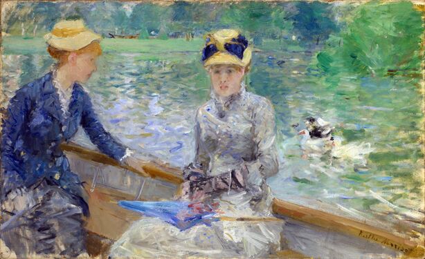
Berthe Morisot painted the blue coat of the woman in her Summer's Day, 1879 in cerulean blue in conjunction with artificial ultramarine and cobalt blue.[16]
When the United Nations was formed at the end of World War II, they adopted cerulean blue for their emblem. The designer Oliver Lundquist stated that he chose the color because it was "the opposite of red, the color of war."[17]
In the Catholic Church, cerulean vestments are permitted on certain Marian feast days, primarily the Immaculate Conception in diocese currently or formerly under the Spanish Crown.[18]
Other colour variations
Pale cerulean
| Cerulean (Pantone) | |
|---|---|
| Hex triplet | #98B4D4 |
| Source | Pantone TPX[19] |
| ISCC–NBS descriptor | Pale blue |
Pantone, in a press release, declared the pale hue of cerulean at right, which they call cerulean, as the "colour of the millennium".[20]
The source of this colour is the "Pantone Textile Paper eXtended (TPX)" colour list, colour #15-4020 TPX—Cerulean.[21]
Cerulean (Crayola)
| Cerulean (Crayola) | |
|---|---|
| Hex triplet | #1DACD6 |
| Source | Crayola |
| ISCC–NBS descriptor | Brilliant greenish blue |
This bright tone of cerulean is the colour called cerulean by Crayola crayons.
Cerulean frost
| Cerulean Frost | |
|---|---|
| Hex triplet | #6D9BC3 |
| Source | Crayola |
| ISCC–NBS descriptor | Light blue |
At right is displayed the colour cerulean frost.
Cerulean frost is one of the colours in the special set of metallic coloured Crayola crayons called Silver Swirls, the colours of which were formulated by Crayola in 1990.
Curious Blue
| Curious Blue | |
|---|---|
| Hex triplet | #269DCE |
| Source | [1] |
| ISCC–NBS descriptor | Moderate cerulean |
Curious Blue is one of the brighter-toned colors of cerulean.
In nature
- Cerulean cuckooshrike
- Cerulean kingfisher
- Cerulean flycatcher
- Cerulean warbler
- Cerulean-capped manakin
See also
- The Devil Wears Prada (film) § Cerulean sweater speech
- Pusher (The X-Files episode) § "Cerulean blue is a gentle breeze"
- List of colors
- Pigment
- Blue pigments
Explanatory notes
References
- ↑ 1.0 1.1 Maerz, Aloys John; Paul, M. Rea (1930). A Dictionary of Color. McGraw-Hill Book Company. p. 190; Colour Sample of Cerulean: Page 89 Plate 33 Colour Sample E6. https://books.google.com/books?id=jnQ0AAAAIAAJ.
- ↑ "cerulean - Search Online Etymology Dictionary". http://www.etymonline.com/index.php?search=cerulean&searchmode=none.
- ↑ 3.0 3.1 3.2 3.3 Eastlaugh, Nicholas (2004) (in English). The pigment compendium: a dictionary of historical pigments. Amsterdam; Boston: Elsevier Butterworth-Heinemann. pp. 90. ISBN 9780750657495.
- ↑ Maerz, Aloys John; Paul, M. Rea (1930). A Dictionary of Color. McGraw-Hill Book Company. p. 190; Colour Sample of Cerulean: Page 89 Plate 33 Colour Sample L9. https://books.google.com/books?id=jnQ0AAAAIAAJ.
- ↑ "Cerulean blue - Overview". http://webexhibits.org/pigments/indiv/overview/ceruleanblue.html.
- ↑ "Cerulean blue - History". http://www.webexhibits.org/pigments/indiv/history/ceruleanblue.html.
- ↑ "cerulean blue". Museum of Fine Arts. http://cameo.mfa.org/materials/record.asp?key=2170&subkey=1977&MaterialName=cobalt&Search=Search.
- ↑ St. Clair, Kassia (2017). The Secret Lives of Color. Penguin Publishing Group. pp. 182–183. ISBN 9780143131144.
- ↑ "Blue". http://www.paintmaking.com/blue.htm.
- ↑ "Colormaking attributes". http://www.handprint.com/HP/WCL/waterb.html.
- ↑ Patterson, Steven. 2020. "The history of blue pigments in the Fine Arts — painting, from the perspective of a paint maker". Journal & Proceedings of the Royal Society of New South Wales 153:164-179. https://royalsoc.org.au/images/pdf/journal/153-2-04Patterson.pdf . 172.
- ↑ Siddal, Ruth (2004) (in English). The pigment compendium: a dictionary of historical pigments. Amsterdam; Boston: Elsevier Butterworth-Heinemann. pp. 90. ISBN 9780750657495.
- ↑ Höpfner, Albrecht (1789). "Einige kleine Chymische Versuche vom Herausgeber". Magazin für die Naturkunde Helvetiens 4: 41–47.
- ↑ St. Clair, Kassia (2017). The Secret Lives of Color. Penguin Publishing Group. pp. 182–183. ISBN 9780143131144.
- ↑ Roy, Ashok. "The Palettes of Three Impressionist Paintings". National Gallery Technical Bulletin 9 (1985): 13. JSTOR 42616026.
- ↑ Bomford, D.; Kirby, J.; Leighton, J.; Roy, A. (1990). Impressionism. Art in the Making. London, UK: National Gallery Publications. pp. 176–181.
- ↑ St. Clair, Kassia (2017). The Secret Lives of Color. Penguin Publishing Group. pp. 182–183. ISBN 9780143131144.
- ↑ Shawn Tribe. "The Spanish Privilege: Cerulean Blue and the Immaculate Conception". https://www.liturgicalartsjournal.com/2021/12/the-spanish-privilege-cerulean-blue-and.html. Retrieved 2023-07-31.
- ↑ Type the word "Cerulean" into the indicated window on the Pantone Colour Finder and the colour will appear.
- ↑ PANTONE. "About Us - Color the Millennium Cerulean Blue". https://www.pantone.com/.
- ↑ "- Find a Pantone Color - Quick Online Color Tool". http://www.pantone.com/pages/pantone/colorfinder.aspx.
External links
- A page on Cerulean Blue
- Cerulean blue at ColourLex
 |


