ISO 7001
| Graphical symbols — Public information symbols | |
 The ISO symbol for "information". | |
| Year started | October 1980 |
|---|---|
| First published | October 1980 |
| Latest version | 4 2023 |
| Organization | International Organization for Standardization |
| Committee | ISO/TC 145/SC 1 Public information symbols |
| Domain | Public information symbol design |
| Abbreviation | ISO 7010 |
| Website | www |
ISO 7001 ("public information symbols") is a standard published by the International Organization for Standardization that defines a set of pictograms and symbols for public information. The latest version, ISO 7001:2023, was published in February 2023.[1]
The set is the result of extensive testing in several countries and different cultures and have met the criteria for comprehensibility set up by the ISO.[1] The design process and testing of ISO 7001 symbols is governed by ISO 22727:2007, Graphical symbols — Creation and design of public information symbols — Requirements.[2] Common examples of public information symbols include those representing toilets, car parking, and information, and the International Symbol of Access.
History
ISO 7001 was first released in October 1980, with a single amendment in 1985. The second edition was released in February 1990, with one amendment in 1993. The third edition, the latest edition was released in November 2007, and has received four amendments in 2013, 2015, 2016 and 2017. The use of the symbols of ISO 7001 is recommended by the European standard EN 17210.[3]
Implementation

ISO 7001 sets out some general guidelines for how symbols should be utilized, though large aspects are left up to the decision of the individual or entity designing signage for their facility. Symbols were created with the goal of being able to stand alone, without any accompanying text. However, text can be used to further aid in communicating the message, particularly in a situation where a custom symbol has been designed for a unique situation not covered by standard ISO 7001 symbols. Specific sizes for symbols are not provided in ISO 7001, though symbols are designed with the goal of being clearly understood regardless placed on something as small as a floor plan of a building or as a large as a giant sign hanging from a ceiling in a large open space.[2]
While symbols are intended and recommended to be reproduced as presented in ISO 7001, the ISO acknowledges that situations may exist where a symbol should be modified due to national or cultural needs of a particular situation. Though key elements and the intent of the original symbol design must be retained to ensure it will be effective.[2]
No colours are specified in ISO 7001, with the only guidance being to ensure clear contrast between the symbol and the sign background, as well as the environment the sign is in. There is a clear recommendation against using colors specified in ISO 3864, due to possible confusion with safety signage using those colors. Of explicit concern is green and white, due to the risk of confusing a green and white 'PI PF 030' direction arrow symbol, for an ISO 7010 evacuation route arrow.[2]
To avoid possible confusion with similar safety symbols of ISO 7010, symbols in ISO 7001 do not use the standard prohibition symbol consisting of a red circle with a red slash. Instead, either a red 'slash' or red 'cross' is used. A slash is used when an object is prohibited, and covers the entire symbol. A cross is used in situations where a behavior is prohibited, with the cross placed over the portion of the symbol depicting the behavior that is being prohibited rather than the entire symbol.[2]
-
Example of the 'slash' on its own, positioned according to ISO 22727:2007.
-
Example of the 'cross' on its own.[lower-alpha 1]
-
Example of a 'slash' on BP 015: 'No headwear'. Note how the red slash is centered on the entire symbol.
-
Example of a 'cross' on BP 014: 'Do not smile'. Note how the red cross is specifically centered on the smile.
-
Example of a 'cross' on BP 019: 'Single person'. Note how the red cross is specifically centered on the two people in the background
The slash and cross can be added to other symbols, such as a baggage cart to indicate 'no baggage carts'. ISO 7001 states that when symbols are designed, they should not have key elements that would be obstructed by the slash as positioned on the template provided in ISO 22727:2007. The slash or cross must be on top of the symbol, and should be red in color.[2]
Symbols
The standard consists of 177 symbols, divided into seven categories: accessibility, public facilities, transport facilities, behaviour of the public, commercial facilities, tourism, cultural and heritage and sporting activities.[1]
Accessibility
All symbol reference numbers in this category are prefixed with "AC", for Accessibility.
-
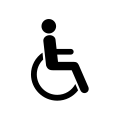
AC 001: Full accessibility or toilets - accessible
-
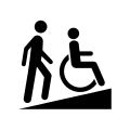
AC 002: Slope or ramped access
-
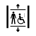
AC 003: Accessible elevator or lift
-
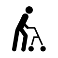
AC 004: Accessibility, limited walking capability
-
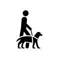
AC 005: Accessibility, assistance dog
-
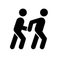
AC 006: Accessibility, personal assistant available
-
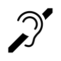
AC 007: Accessibility, hard of hearing
-
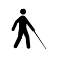
AC 008: Accessibility, vision impaired
-
AC 009: Accessibility, blind or low vision
-
AC 010: Priority access for elderly people
-
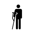
AC 011: Priority access for injured people
-
AC 012: Priority access for people with internal medical conditions
-
AC 013: Priority access for people with small children
-
AC 014 Priority access for expecting mothers
-
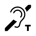
AC 015: Loop for the hearing impaired
-
AC 016: Priority facilities for obese people
-
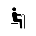
AC 017: Priority seats for elderly people
-
AC 018: Priority seats for injured people
-
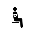
AC 019: Priority seats for people with internal medical conditions
-
AC 020: Priority seats for people with small children
-
AC 021: Priority seats for expecting mothers
-
AC 022: Priority seats for obese people
Public facilities
All symbol reference numbers in this category are prefixed with "PF", for Public Facilities.
-
PF 001: Information
-
PF 002: Hospital
-
PF 003: Toilets - unisex
-
PF 004: Toilets - male
-
PF 005: Toilets - female
-
PF 007: Drinking water
-
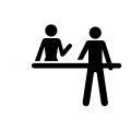
PF 008: Check-in or reception
-
PF 009: Lost and found or lost property
-
PF 010: Tickets or ticket sales
-
PF 011: Ticket validation
-
PF 012: Baggage storage or left baggage
-
PF 013: Baggage lockers or coin lockers
-
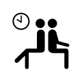
PF 014: Lounge or waiting area
-
PF 015: Smoking area or smoking allowed
-
PF 016: Post or Post office or mail box
-
PF 017: Telephone
-
PF 018: Baggage trolleys or carts
-
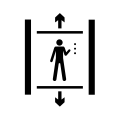
PF 019: Elevator or lift
-
PF 020: Escalator
-
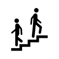
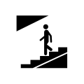
PF 021: Stairs
-
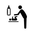
PF 023: Nursery or baby care
-
PF 024: Cloakroom
-
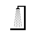
PF 025: Shower
-
PF 026: Bath
-
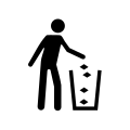
PF 027: Trash box or Litter bin or Rubbish bin
-
PF 028: Way in or Entrance
-
PF 029: Way out or Exit
-
PF 030: Direction arrow
-
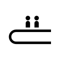
PF 032: Moving walkway
-
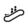
PF 033: Escalator, down
-
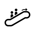
PF 034: Escalator, up
-
PF 036: Child health care centre
-
PF 037: Library
-
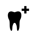
PF 043: Dentist
-
PF 044: Health care centre or Doctor
-
PF 050: Vegetarian food
-
PF 054: Museum
-
PF 062: Communication in the specified language
-
PF 063: Recycling – cans
-
PF 064: Recycling – magnetic type of steel
-
PF 065: Recycling – glass
-
PF 066: Recycling
-
PF 067: Pedestrian underpass
-
PF 068: Baggage delivery
-
PF 069: Baggage assistant
-
PF 070: Embassy
-
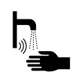
PF 074: Automatic sensor faucet or tap
-
PF 075: Hand Dryer
-
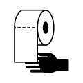
PF 076: Toilet paper
-
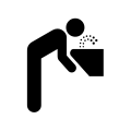
PF 077: Drinking water fountain
-
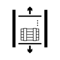
PF 078: Elevator for goods
-
PF 079: Men’s changing room
-
PF 080: Pedestrian overpass or footbridge
-
PF 081: Women’s changing room
-
PF 082: Recycling – plastics
Transportation facilities
All symbol reference numbers in this category are prefixed with "TF", for Transport Facilities.
-
TF 001: Airport, or Aircraft
-
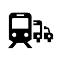
TF 002: Railway station, or Railways, or Trains
-
TF 003: Underground, or Metro railway station, or Trains
-
TF 004: Port, or Ships, or Ferries, or Boats
-
TF 005: Heliport, or Helicopters
-
TF 006: Bus station, or Bus stop, or Buses
-
TF 007: Tram, or Streetcar stop, or Trams, or Streetcars
-
TF 008: Taxi stop, or Taxis
-
TF 009: Rent-a-car, or Car rental/hire
-
TF 010: Bicycle, or Cycle facility
-
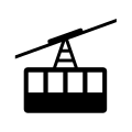
TF 011: Cable car
-
TF 012: Funicular, or Cable railway
-
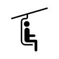
TF 013: Chair lift
-
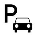
TF 014: Parking, or Car parking
-
TF 015: Flight departures
-
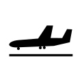
TF 016: Flight arrivals
-
TF 017: Flight connections
-
TF 018: Customs, or Baggage check
-
TF 019: Immigration, or Passport control/inspection
-
TF 020: Baggage reclaim
-
TF 021: Bicycle or cycle parking
-
TF 027: Airport bus
-
TF 028: Transportation Centre
-
TF 029: Rental bicycle
-
TF 030: Baggage weighing
-
TF 031: Quarantine
-
TF 032: Quarantine, animal
-
TF 033: Quarantine, people
-
TF 034: Quarantine, plant
-
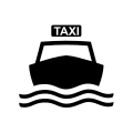
TF 035: Water taxi, or Water taxis
-
TF 036: Self-contained camper van
-
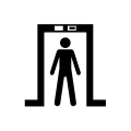
TF 037: Security check
-
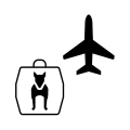
TF 038: Animal transportation
-
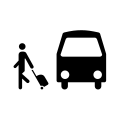
TF 039: Bus disembarkation
-
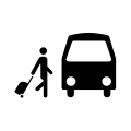
TF 040: Bus embarkation
-
TF 042: Meeting point
-
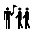
TF 043: Tour group meeting point
-
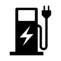
TF 044: Electric vehicle charging station or point
Behaviour of the public
All symbol reference numbers in this category are prefixed with "BP", for Behaviour of the Public.[lower-alpha 2]
-
BP 001: Quiet please or Silence
-
BP 002: Stand on the left (or Right)
-
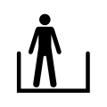
BP 003: Line up or queue in single file
-
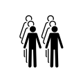
BP 004: Line up or queue in twos
-
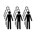
BP 005: Line up or queue in threes
-
BP 006: Dogs should be carried
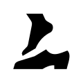
-
BP 007: Take off your shoes
-
BP 008: Surveillance camera
-
BP 009: Biometric facial recognition facility
-
BP 010: Look to a point
-
BP 011: Manual passport control
-
BP 012: Move hair
-
BP 013: Open passport and place on scanning device
-
BP 014: Do not smile
-
BP 015: No headwear
-
BP 016: Wait
-
BP 017: No sunglasses
-
BP 018: Single person
-
BP 019: Proceed forward
Commercial facilities
All symbol reference numbers in this category are prefixed with "CF", for Commercial Facilities.
-
CF 001: Restaurant
-
CF 002: Refreshments, coffee shop or café or buffet
-
CF 003: Hotel or Accommodation
-
CF 004: Money/currency exchange or Bureau-de-change
-
CF 005: Cash service or Cash dispenser or ATM
-
CF 006: Shops or Shopping
-
CF 007: Pharmacy
-
CF 008: Bar
-
CF 009: Filling station
-
CF 010: Conference facilities or Meeting room
-
CF 011: Internet café
-
CF 012: Foot care or Podiatry
-
CF 014: News stand or News kiosk or Newsagent
-
CF 015: Barber or Hair salon
-
CF 016: Cinema
-
CF 017: Car repair workshop
-
CF 018: Wireless LAN
-
CF 019: Shoeshine
-
CF 020: Snack machine
-
CF 021: Dance hall or ballroom
-
CF 022: Laundry service
Tourism, culture and heritage
All symbol reference numbers in this category are prefixed with "TC", for Tourism, Culture and heritage.
-
TC 001: Viewpoint or panorama
-
TC 002: Campsite or Camping
-
TC 003: Caravan park or Caravans
-
TC 004: Picnic area
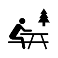
-
TC 005: Play area
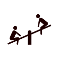
-
TC 006: Park, recreational
-
TC 007: Zoo
-
TC 008: Natural area with public access
-
TC 009: Hiking trail
-
TC 010: Location for Campfires
-
TC 011: Bird sanctuary
-
TC 012: Wetland reserve
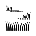
-
TC 013: Hot spring or Hot tub
-
TC 014: Audio tour
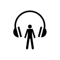
-
TC 015: Indoor play area
-
TC 016: Packed lunch room
-
TC 017: Beach
-
TC 018: Planetarium
Sporting activities
All symbol reference numbers in this category are prefixed with "SA", for Sports Activities.
-
SA 001: Sporting activities or general sports
-
SA 002: Stadium
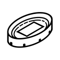
-
SA 003: Indoor swimming pool
-
SA 004: Sports hall
See also
- DOT pictograms - United States version of this standard.
- ISO 7010 - ISO Standard for safety symbols.
Notes
References
- ↑ 1.0 1.1 1.2 ISO 7001:2023 - Graphical symbols — Registered public information symbols, https://www.iso.org/standard/77442.html
- ↑ 2.0 2.1 2.2 2.3 2.4 2.5 International Organization for Standardization (November 2011). ISO 7001 - Graphical symbols - Public information symbols (Third ed.). International Organization for Standardization.
- ↑ EN 17210:2021 - Accessibility and usability of the built environment. 30 November 2020. 6.6.2.
External links
- The international language of ISO graphical symbols - A 2010 document published by the ISO educate about ISO graphical symbol standards ISO 7000 (Symbols for equipment), ISO 7001 (Symbols for public information), ISO 7010 (Symbols for safety signs).
 |

![Example of the 'cross' on its own.[lower-alpha 1]](/wiki/images/thumb/4/43/ISO_7001_-_Red_Cross.svg/120px-ISO_7001_-_Red_Cross.svg.png)


