Mobile web
This article needs to be updated. (January 2017) |
The mobile web comprises mobile browser-based World Wide Web services accessed from mobile devices, such as laptops,tablets, mobile phones, smartwatches, smartglasses, handheld devices like fitness trackers, PDAs and so on through a mobile or other wireless network.
History and development
Prior to 2014, the World Wide Web was primarily accessed via fixed-line services by laptops and desktop computers. However, the convenience offered by (personal) mobile devices saw an aggressive shift in the user mix favoring mobile devices since then. In early 2010, ITU (International Telecommunication Union) reported that with current growth rates, web access by people on the go – via laptops and smart mobile devices – was likely to exceed web access from desktop computers within the following five years.[1] Since 2017, the mobile web has transitioned from simple, mobile-optimized webpages to faster, more powerful Progressive Web Apps (PWAs) based webpages that deliver nearly-app-like experiences and features like offline support, push engagement, and rich interactivity — all within mobile browsers themselves. Modern standards and 5G connectivity have played a crucial role in this transition[2]. As of an April 2015 report by the "Newframedigital" website, mobile devices contributed to 63.3% of all global web traffic, leaving desktop devices far behind at just 37.7%.[3] This trend can be expected to continue in 2026 and beyond because mobile devices are becoming smaller, faster, more accessible, and convenient than desktops by the day. GSMA estimated that 4.7 billion users (almost 60% of the world population) would be subscribed to the mobile web by the end of 2024 – an increase of 2.2 billion users since 2015.[4] As of 2025, this figure was reportedly 5.34 billion users.[5]
The distinction between mobile web applications and native applications is anticipated to become increasingly blurred[6], as mobile browsers gain direct access to the hardware of mobile devices (including accelerometers and GPS chips), and the speed and abilities of browser-based applications improve. Persistent storage and access to sophisticated user interface graphics functions may further reduce the need for the development of platform-specific native applications.
The mobile web has also been called Web 3.0, drawing parallels to the changes users were experiencing as Web 2.0 websites proliferated.[7][8][9]

The mobile web was first popularized by the Silicon Valley company, Unwired Planet.[10] In 1997, Unwired Planet, Nokia, Ericsson, and Motorola started the WAP Forum to create and harmonize the standards to ease the transition to bandwidth networks and small display devices. The WAP standard was built on a three-layer, middleware architecture that fueled the early growth of the mobile web. It was made virtually irrelevant after the development and adoption of faster networks, larger displays, and advanced smartphones based on Apple's iOS and Google's Android software.
Mobile points of access
Mobile Internet refers to Internet access and mainly usage of Internet using a cellular telephone service provider or mobile wireless network. This wireless access can easily change to use a different wireless Internet (radio) tower as a mobile device user moves across the service area. Cellular base stations that connect through the telephone system are more expensive to provide compared to a wireless base station that connects directly to the network of an internet service provider. A mobile broadband modem may "tethers" the smartphone to one or more devices to provide access to the Internet via the protocols that cellular telephone service providers offer.
Mobile standards
The Mobile Web Initiative (MWI) was set up by the W3C to develop the best practices and technologies relevant to the mobile web. The goal of the initiative is to make browsing the web from mobile devices more reliable and accessible. The main aim is to evolve standards of data formats from Internet providers that are tailored to the specifications of particular mobile devices. The W3C has published guidelines for mobile content, and aimed to address the problem of device diversity by establishing a technology to support a repository of device descriptions.
W3C developed a validating scheme to assess the readiness of content for the mobile web, through its mobileOK Scheme, which aims to help content developers to determine if their content is web-ready.[11] The W3C guidelines and mobileOK approach have faced criticism. mTLD, the registry for .mobi, released a free testing tool called the MobiReady Report (see mobiForge) to analyze the mobile readiness of website.
Development
Access to the mobile web was first commercially offered in 1996, in Finland, on the Nokia 9000 Communicator phone via the Sonera and Radiolinja networks. The first commercial launch of a mobile-specific browser-based web service was in 1999 in Japan when i-mode was launched by NTT DoCoMo.

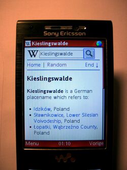
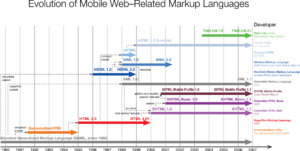
The mobile web primarily utilizes lightweight pages like this one written in Extensible Hypertext Markup Language (XHTML) or Wireless Markup Language (WML) to deliver content to mobile devices. Many new mobile browsers are moving beyond these limits by supporting a wider range of Web formats, including variants of HTML commonly found on the desktop web.
Growth

At one time, half the world had mobile phones.[12] The articles in 2007-2008 were slightly misleading because the real story at the time was that the number of mobile phone subscriptions had reached half the population of the world. In reality, many people have more than one subscription. For example, in Hong Kong, Italy and Ukraine, the mobile phone penetration rate had passed 140% by 2009 . In 2009, the number of unique users of mobile phones had reached half the population of the planet when the ITU reported that the subscriber number was to reach 4.6 billion users which means 3.8 billion activated mobile phones in use, and 3.4 billion unique users of mobile phones.[clarification needed] Mobile Internet data connections are following the growth of mobile phone connections, albeit at a lower rate. In 2009 Yankee Group reported that 29% of all mobile phone users globally were accessing browser-based internet content on their phones. According to the BBC, in 2020 there were over 5 billion mobile phone users in the world.[13] According to Statista there were 1.57 billion smartphone owners in 2014 and 2.32 billion in 2017.[14]
Many users in Europe and the United States are already users of the fixed internet when they first try the same experience on a mobile phone. Meanwhile, in other parts of the world, such as India, their first usage of the internet is on a mobile phone. Growth is fastest in parts of the world where the personal computer (PC) is not the first user experience of the internet. India, South Africa, Indonesia, and Saudi Arabia are seeing the fastest growth in mobile internet usage.[when?] To a great extent, this is due to the rapid adoption of mobile phones themselves. For example, Morgan Stanley reports that the highest mobile phone adoption growth in 2006 was in Pakistan and India. Mobile internet has also been adopted in West Africa,[15] and China had 155 million mobile internet users as of June 2009.[16][irrelevant citation]
Top-level domain
The .mobi sponsored top-level domain was launched specifically for the mobile Internet by a consortium of companies including Google, Microsoft, Nokia, Samsung, and Vodafone. By forcing sites to comply with mobile web standards, .mobi tries to ensure visitors a consistent and optimized experience on their mobile device. However, this domain has been criticized by several big names, including Tim Berners-Lee of the W3C, who said that providing different content to different devices "breaks the Web in a fundamental way".[17]
Accelerated Mobile Pages
In the fall of 2015, Google announced it would be rolling out an open source initiative called "Accelerated Mobile Pages" or AMP. The goal of this project is to improve the speed and performance of content-rich pages which include video, animations, and graphics. Since the majority of the population now consumes the web through tablets and smartphones, having web pages that are optimized for these products is the primary need to AMP.[18][19]
The three main types of AMP are AMP HTML, AMP JS, and Google AMP Cache.[20]
As of February 2018, Google requires the canonical page content to match the content on accelerated mobile pages.[21]
Limitations

Mobile web access may suffer from interoperability and usability problems. Interoperability issues stem from the platform fragmentation of mobile devices, mobile operating systems, and browsers. Usability problems are centered on the small physical size of the mobile phone form factors, which limit display resolution and user input). Limitations vary, depending on the device, and newer smartphones overcome some of these restrictions, but problems which may be encountered include:
- Small screen size – This makes it difficult or impossible to see text and graphics dependent on the standard size of a desktop computer screen. To display more information, smartphone screen sizes have been getting bigger.
- Lack of windows – On a desktop computer, the ability to open more than one window at a time allows for multi-tasking and easy revert to a previous page. Historically on mobile web, only one page could be displayed at a time, and pages could only be viewed in the sequence they were originally accessed. Opera Mini was among the first allowing multiple windows,[22] and browser tabs have become commonplace but few mobile browsers allow overlapping windows on the screen.
- Navigation – Navigation is a problem for websites not optimized for mobile devices as the content area is large, the screen size is small, and there is no scroll wheel or hover box feature.
- Lack of JavaScript and cookies – Most devices do not support client-side scripting and storage of cookies (smartphones excluded), which are now widely used in most web sites to enhance the user experience, facilitating the validation of data entered by the page visitor, etc. This also results in web analytics tools being unable to uniquely identify visitors using mobile devices.
- Types of pages accessible – Many sites that can be accessed on a desktop cannot on a mobile device. Many devices cannot access pages with a secured connection, Flash, or other similar software, PDFs, or video sites, although as of 2011, this has been changing.
- Speed – On most mobile devices, the speed of service is slow, sometimes slower than dial-up Internet access.
- Broken pages – On many devices, a single page as viewed on a desktop is broken into segments, each treated as a separate page. This further slows navigation.
- Compressed pages – Many pages, in their conversion to mobile format, are squeezed into an order different from how they would customarily be viewed on a desktop computer.
- Size of messages – Many devices have limits on the number of characters that can be sent in an email message.
- Cost – The access and bandwidth charges levied by cellphone networks can be high if there is no flat fee per month.
- Location of mobile user – If the user is abroad the flat fee per month usually does not apply
- Access to device capabilities – The inability of mobile web applications to access the local capabilities on the mobile device can limit their ability to provide the same features as native applications.
See also
- .mobi
- Mobile app
- Mobile application server
- Mobile browser
- Mobile dating
- Mobile content
- Mobile advertising
- Responsive web design
- Wireless Application Protocol
References
- ↑ "Press Release: ITU sees 5 billion mobile subscriptions globally in 2010". http://www.itu.int/newsroom/press_releases/2010/06.html.
- ↑ "Trends in Web Development | 2026". https://blog.implevista.com/trends-in-web-development/.
- ↑ "2025 Website Traffic Trends: Why Mobile Rules The Internet Now". https://newframedigital.com/mobile-vs-desktop-traffic-trends/#:~:text=Mobile%20Vs.%20Desktop%20Website%20Breakdown%20*%20Mobile,devices%20comprise%2036.7%25%20of%20global%20web%20traffic..
- ↑ "The Mobile Economy 2025". https://www.gsma.com/solutions-and-impact/connectivity-for-good/mobile-economy/wp-content/uploads/2025/04/030325-The-Mobile-Economy-2025.pdf.
- ↑ "Mobile vs Desktop Internet Usage in 2025: Statistics, Trends and Strategies - Marketing Scoop". https://www.marketingscoop.com/blog/mobile-vs-desktop-usage/.
- ↑ cswebsol (2018-10-19). "Exploring Upcoming Mobile App Development Innovations" (in en-US). https://www.cswebsolutions.ca/blog/what-are-the-future-mobile-app-development-technologies/.
- ↑ "Web 3.0: The Mobile Era". TechCrunch. 2012-08-11. https://techcrunch.com/2012/08/11/analysis-web-3-0-the-mobile-era/.
- ↑ "Web 3.0 to Merge the Physical and the Virtual – Technorati Business". Technorati.com. 2012-09-26. http://technorati.com/business/article/web-30-to-merge-the-physical/.
- ↑ Kevin Tea (2012-08-28). "Web 3.0 Is Here And It's Mobile | BCW". Businesscomputingworld.co.uk. http://www.businesscomputingworld.co.uk/web-3-is-here-and-its-mobile/.
- ↑ Glave, James (3 November 1997). "Handheld Internet Will Be Huge - Really!". Wired. https://www.wired.com/1997/11/handheld-internet-will-be-huge-really/.
- ↑ "W3C mobileOK Basic Tests 1.0". https://www.w3.org/TR/mobileOK-basic10-tests/Overview.html.
- ↑ "Archived copy". http://investing.reuters.co.uk/news/articleinvesting.aspx?type=media&storyID=nL29172095.
- ↑ "Over 5 billion mobiles worldwide". BBC News. 9 July 2010. https://www.bbc.com/news/10569081.
- ↑ "Smartphone users worldwide 2020". https://www.statista.com/statistics/330695/number-of-smartphone-users-worldwide/.
- ↑ Granguillhome Ochoa, Rogelio; Lach, Samantha; Masaki, Takaaki; Rodríguez-Castelán, Carlos (2022-02-01). "Mobile internet adoption in West Africa" (in en). Technology in Society 68. doi:10.1016/j.techsoc.2021.101845. ISSN 0160-791X. https://econpapers.repec.org/scripts/redir.pf?u=https%3A%2F%2Fdocs.iza.org%2Fdp14151.pdf;h=repec:iza:izadps:dp14151.
- ↑ "chinanewswrap.com". http://ww5.chinanewswrap.com/?&.
- ↑ Berners-Lee, Tim (April 2004). "New Top Level Domains Considered Harmful". https://www.w3.org/DesignIssues/TLD. "Dividing the Web into information destined for different devices, or different classes of user, or different classes of information, breaks the Web in a fundamental way."
- ↑ "Introducing the Accelerated Mobile Pages Project, for a faster, open mobile web". 7 October 2015. https://googleblog.blogspot.com/2015/10/introducing-accelerated-mobile-pages.html.
- ↑ Bhawani, Chetan (2015-10-07). "Google introduces AMP Project to help speed up mobile web" (in en-US). Gizmo Times. https://www.gizmotimes.com/news/google-amp-project-speed-up-mobile-web/4258.
- ↑ "Accelerated Mobile Pages Project". https://amp.dev/about/how-amp-works/.
- ↑ Mehta, Ashish; Manager, Product. "Engaging users through high quality AMP pages | Google Search Central Blog" (in en). https://developers.google.com/search/blog/2017/11/engaging-users-through-high-quality-amp.
- ↑ "Download Opera browser for mobile devices – Opera Software". Opera.com. http://www.opera.com/mini/next/.
External links
 |
