Fan chart (statistics)
thumb|400px|A dispersion fan diagram (left) in comparison with a box plot
A fan chart is made of a group of dispersion fan diagrams, which may be positioned according to two categorising dimensions. A dispersion fan diagram is a circular diagram which reports the same information about a dispersion as a box plot: namely median, quartiles, and two extreme values.
Elements
The elements of a dispersion fan diagram[1] are:
- a circular line as scale
- a diameter which indicates the median
- a fan (a segment of a circle) which indicates the quartiles
- two feathers which indicate the extreme values.
The scale on the circular line begins at the left with the starting value (e. g. with zero). The following values are applicated clockwise. The white tail of diameter indicates the median. The dark fan indicates the dispersion of the middle half of the observed values; thus it encompasses the values from the first to the third quartile. The white feathers indicate the dispersion of the middle 90% of the observed values.
The length of the white part of the diameter corresponds with the number of observations.
Application
A fan chart gives a quick summary of observed values which depend from two variables. This is possible thanks of a dense representation and a constant size which does not depend on the size of the single dispersion fan diagrams.
An essential advantage compared to a sequence of box plots is the possibility to compare dispersion fan diagrams not only within one direction but within two directions (horizontally and vertically).
Example
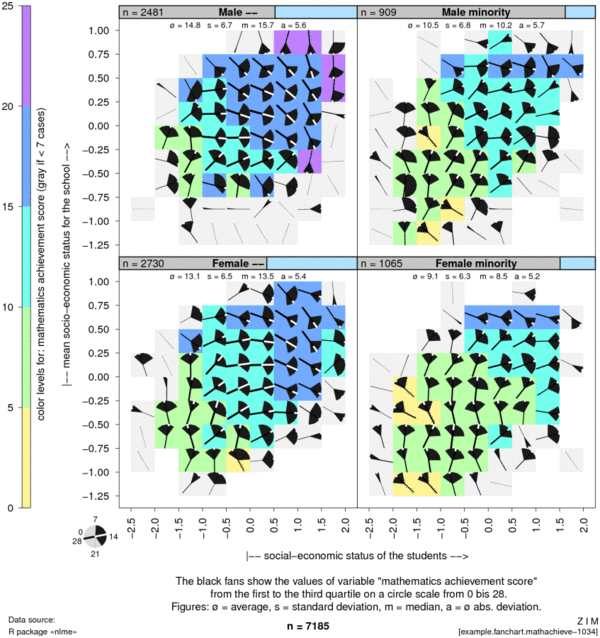
The following example presents data from the data set MathAchieve which is part of the R package nlme of José Pinheiro et al.[2] It contains mathematics achievement scores of 7185 students. The students are categorised according to sex and membership of a minority ethnic group.
The graphics show the mathematics achievement scores in dependency on the socio-economic status of the students (x axis) and on the average socio-economic status of all students at the same school (y axis). The four graphic panels differentiate the students according to sex and membership of a minority ethnic group.
The fan charts reveals clearly how the median value is partially following a big main tendency while the values of the single subgroups (with the cells) scatter largely what could lead to doubts about a possible correlation.
See also
References
- ↑ Fischer, Wolfram (2010). Neue Grafiken zur Datenvisualisierung. Band 1. Speichengrafiken, Streuungsfächerkarten, Differenz-, Sequenz- und Wechseldiagramme. Wolfertswil: ZIM. ISBN 978-3-905764-06-2. http://www.fischer-zim.ch/studien/Neue-Grafiken-I-1003-Info.htm.
- ↑ Pinheiro, José; Bates, Douglas (2013). "nlme: Linear and Nonlinear Mixed Effects Models". CRAN (The Comprehensive R Archive Network). https://cran.r-project.org/web/packages/nlme/.
External links
- Fischer, Wolfram (2012): Streuungsfächerkarten und pseudogeografische Anordnungen. Mit Beispielen zum verfügbaren Einkommen und zu Krankenkassenprämien in der Schweiz. Swiss Days of Official Statistics, Vaduz LI, 2012.
- Fischer, Wolfram (2010): Visualising Twofold Dependencies by Fan Charts. ZIM.
 |


