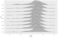
Ridgeline plot
From HandWiki
Short description: Data graphic
A ridgeline plot (also known as a joyplot[1][note 1]) is a series of line plots that are combined by vertical stacking to allow the easy visualization of changes through space or time. The plots are often overlapped slightly to allow the changes to be more clearly contrasted.[2][3][4][5]

Notes
References
- ↑ Wilke, Claus O. (2017-09-15). "Goodbye joyplots" (in en-us). https://clauswilke.com/blog/2017/09/15/goodbye-joyplots/.
- ↑ Wilke, C. O.(2019). Fundamentals of data visualization: a primer on making informative and compelling figures. O'Reilly Media.(See pages, 39, 43 88-91, 196)
- ↑ https://cran.r-project.org/web/packages/ggridges/vignettes/introduction.html#:~:text=Ridgeline%20plots%20are%20partially%20overlapping,distributions%20over%20time%20or%20space.
- ↑ Naqvi, S.A.A., 2022. JOYPLOT: Stata module to produce joyplots or ridgeline plots.
- ↑ https://r-graph-gallery.com/294-basic-ridgeline-plot.html
 |
