Q–Q plot


In statistics, a Q–Q plot (quantile–quantile plot) is a probability plot, a graphical method for comparing two probability distributions by plotting their quantiles against each other.[1] A point (x, y) on the plot corresponds to one of the quantiles of the second distribution (y-coordinate) plotted against the same quantile of the first distribution (x-coordinate). This defines a parametric curve where the parameter is the index of the quantile interval.
If the two distributions being compared are similar, the points in the Q–Q plot will approximately lie on the identity line y = x. If the distributions are linearly related, the points in the Q–Q plot will approximately lie on a line, but not necessarily on the line y = x. Q–Q plots can also be used as a graphical means of estimating parameters in a location-scale family of distributions.
A Q–Q plot is used to compare the shapes of distributions, providing a graphical view of how properties such as location, scale, and skewness are similar or different in the two distributions. Q–Q plots can be used to compare collections of data, or theoretical distributions. The use of Q–Q plots to compare two samples of data can be viewed as a non-parametric approach to comparing their underlying distributions. A Q–Q plot is generally more diagnostic than comparing the samples' histograms, but is less widely known. Q–Q plots are commonly used to compare a data set to a theoretical model.[2][3] This can provide an assessment of goodness of fit that is graphical, rather than reducing to a numerical summary statistic. Q–Q plots are also used to compare two theoretical distributions to each other.[4] Since Q–Q plots compare distributions, there is no need for the values to be observed as pairs, as in a scatter plot, or even for the numbers of values in the two groups being compared to be equal.
The term "probability plot" sometimes refers specifically to a Q–Q plot, sometimes to a more general class of plots, and sometimes to the less commonly used P–P plot. The probability plot correlation coefficient plot (PPCC plot) is a quantity derived from the idea of Q–Q plots, which measures the agreement of a fitted distribution with observed data and which is sometimes used as a means of fitting a distribution to data.
Definition and construction

A Q–Q plot is a plot of the quantiles of two distributions against each other, or a plot based on estimates of the quantiles. The pattern of points in the plot is used to compare the two distributions.
The main step in constructing a Q–Q plot is calculating or estimating the quantiles to be plotted. If one or both of the axes in a Q–Q plot is based on a theoretical distribution with a continuous cumulative distribution function (CDF), all quantiles are uniquely defined and can be obtained by inverting the CDF. If a theoretical probability distribution with a discontinuous CDF is one of the two distributions being compared, some of the quantiles may not be defined, so an interpolated quantile may be plotted. If the Q–Q plot is based on data, there are multiple quantile estimators in use. Rules for forming Q–Q plots when quantiles must be estimated or interpolated are called plotting positions.
A simple case is where one has two data sets of the same size. In that case, to make the Q–Q plot, one orders each set in increasing order, then pairs off and plots the corresponding values. A more complicated construction is the case where two data sets of different sizes are being compared. To construct the Q–Q plot in this case, it is necessary to use an interpolated quantile estimate so that quantiles corresponding to the same underlying probability can be constructed.
More abstractly,[4] given two cumulative probability distribution functions F and G, with associated quantile functions F−1 and G−1 (the inverse function of the CDF is the quantile function), the Q–Q plot draws the q-th quantile of F against the q-th quantile of G for a range of values of q. Thus, the Q–Q plot is a parametric curve indexed over [0,1] with values in the real plane R2.
Typically for an analysis of normality, the vertical axis shows the values of the variable of interest, say x with CDF F(x), and the horizontal axis represents N−1(F(x)), where N−1(.) represents the inverse cumulative normal distribution function.
Interpretation
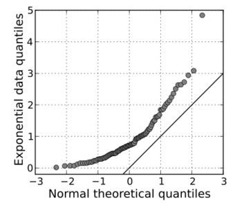
The points plotted in a Q–Q plot are always non-decreasing when viewed from left to right. If the two distributions being compared are identical, the Q–Q plot follows the 45° line y = x. If the two distributions agree after linearly transforming the values in one of the distributions, then the Q–Q plot follows some line, but not necessarily the line y = x. If the general trend of the Q–Q plot is flatter than the line y = x, the distribution plotted on the horizontal axis is more dispersed than the distribution plotted on the vertical axis. Conversely, if the general trend of the Q–Q plot is steeper than the line y = x, the distribution plotted on the vertical axis is more dispersed than the distribution plotted on the horizontal axis. Q–Q plots are often arced, or S-shaped, indicating that one of the distributions is more skewed than the other, or that one of the distributions has heavier tails than the other.
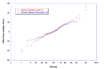
Although a Q–Q plot is based on quantiles, in a standard Q–Q plot it is not possible to determine which point in the Q–Q plot determines a given quantile. For example, it is not possible to determine the median of either of the two distributions being compared by inspecting the Q–Q plot. Some Q–Q plots indicate the deciles to make determinations such as this possible.
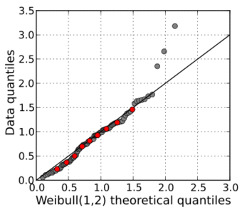
The intercept and slope of a linear regression between the quantiles gives a measure of the relative location and relative scale of the samples. If the median of the distribution plotted on the horizontal axis is 0, the intercept of a regression line is a measure of location, and the slope is a measure of scale. The distance between medians is another measure of relative location reflected in a Q–Q plot. The "probability plot correlation coefficient" (PPCC plot) is the correlation coefficient between the paired sample quantiles. The closer the correlation coefficient is to one, the closer the distributions are to being shifted, scaled versions of each other. For distributions with a single shape parameter, the probability plot correlation coefficient plot provides a method for estimating the shape parameter – one simply computes the correlation coefficient for different values of the shape parameter, and uses the one with the best fit, just as if one were comparing distributions of different types.
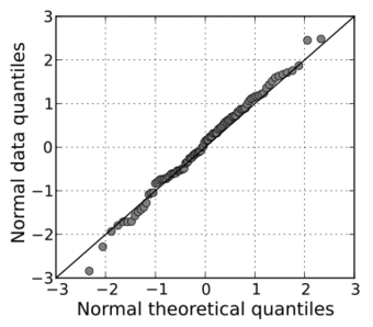
Another common use of Q–Q plots is to compare the distribution of a sample to a theoretical distribution, such as the standard normal distribution N(0,1), as in a normal probability plot. As in the case when comparing two samples of data, one orders the data (formally, computes the order statistics), then plots them against certain quantiles of the theoretical distribution.[3]
Plotting positions
The choice of quantiles from a theoretical distribution can depend upon context and purpose. One choice, given a sample of size n, is k / n for k = 1, …, n, as these are the quantiles that the sampling distribution realizes. The last of these, n / n, corresponds to the 100th percentile – the maximum value of the theoretical distribution, which is sometimes infinite. Other choices are the use of (k − 0.5) / n, or instead to space the n points such that there is an equal distance between all of them and also between the two outermost points and the edges of the interval, using k / (n + 1).[6]
Many other choices have been suggested, both formal and heuristic, based on theory or simulations relevant in context. The following subsections discuss some of these. A narrower question is choosing a maximum (estimation of a population maximum), known as the German tank problem, for which similar "sample maximum, plus a gap" solutions exist, most simply m + m/n − 1. A more formal application of this uniformization of spacing occurs in maximum spacing estimation of parameters.
Expected value of the order statistic for a uniform distribution
The k / (n + 1) approach equals that of plotting the points according to the probability that the last of (n + 1) randomly drawn values will not exceed the k-th smallest of the first n randomly drawn values.[7][8]
Expected value of the order statistic for a standard normal distribution
In using a normal probability plot, the quantiles one uses are the rankits, the quantile of the expected value of the order statistic of a standard normal distribution.
More generally, Shapiro–Wilk test uses the expected values of the order statistics of the given distribution; the resulting plot and line yields the generalized least squares estimate for location and scale (from the intercept and slope of the fitted line).[9] Although this is not too important for the normal distribution (the location and scale are estimated by the mean and standard deviation, respectively), it can be useful for many other distributions.
However, this requires calculating the expected values of the order statistic, which may be difficult if the distribution is not normal.
Median of the order statistics
Alternatively, one may use estimates of the median of the order statistics, which one can compute based on estimates of the median of the order statistics of a uniform distribution and the quantile function of the distribution; this was suggested by Filliben (1975).[9]
This can be easily generated for any distribution for which the quantile function can be computed, but conversely the resulting estimates of location and scale are no longer precisely the least squares estimates, though these only differ significantly for n small.
Heuristics
Several different formulas have been used or proposed as affine symmetrical plotting positions. Such formulas have the form (k − a) / (n + 1 − 2a) for some value of a in the range from 0 to 1, which gives a range between k / (n + 1) and (k − 1) / (n − 1).
Expressions include:
- k / (n + 1)
- (k − 0.3) / (n + 0.4).[10]
- (k − 0.3175) / (n + 0.365).[11][note 1]
- (k − 0.326) / (n + 0.348).[12]
- (k − ⅓) / (n + ⅓).[note 2]
- (k − 0.375) / (n + 0.25).[note 3]
- (k − 0.4) / (n + 0.2).[citation needed]
- (k − 0.44) / (n + 0.12).[note 4]
- (k − 0.5) / n.[14]
- (k − 0.567) / (n − 0.134).[citation needed]
- (k − 1) / (n − 1).[note 5]
For large sample size, n, there is little difference between these various expressions.
Filliben's estimate
The order statistic medians are the medians of the order statistics of the distribution. These can be expressed in terms of the quantile function and the order statistic medians for the continuous uniform distribution by: where U(i) are the uniform order statistic medians and G is the quantile function for the desired distribution. The quantile function is the inverse of the cumulative distribution function (probability that X is less than or equal to some value). That is, given a probability, we want the corresponding quantile of the cumulative distribution function.
James J. Filliben uses the following estimates for the uniform order statistic medians:[15] The reason for this estimate is that the order statistic medians do not have a simple form.
Software
The R programming language comes with functions to make Q–Q plots, namely qqnorm and qqplot from the stats package. The fastqq package implements faster plotting for large number of data points.
See also
- Empirical distribution function
- Probit analysis was developed by Chester Ittner Bliss in 1934.
Notes
- ↑ Note that this also uses a different expression for the first & last points. [1] cites the original work by Filliben (1975). This expression is an estimate of the medians of U(k).
- ↑ A simple (and easy to remember) formula for plotting positions; used in BMDP statistical package.
- ↑ This is Blom (1958)'s earlier approximation and is the expression used in MINITAB.
- ↑ This plotting position was used by Irving I. Gringorten[13] to plot points in tests for the Gumbel distribution.
- ↑ Used by Filliben (1975), these plotting points are equal to the modes of U(k).
References
Citations
- ↑ Wilk, M.B.; Gnanadesikan, R. (1968), "Probability plotting methods for the analysis of data", Biometrika (Biometrika Trust) 55 (1): 1–17, doi:10.1093/biomet/55.1.1, PMID 5661047.
- ↑ Gnanadesikan (1977), p. 199.
- ↑ 3.0 3.1 Thode (2002), Section 2.2.2, Quantile-Quantile Plots, p. 21
- ↑ 4.0 4.1 Gibbons & Chakraborti (2003), p. 144
- ↑ "SR 20 – North Cascades Highway – Opening and Closing History". North Cascades Passes. Washington State Department of Transportation. October 2009. http://www.wsdot.wa.gov/Traffic/Passes/NorthCascades/closurehistory.htm.
- ↑ Weibull, Waloddi (1939), "The Statistical Theory of the Strength of Materials", IVA Handlingar, Royal Swedish Academy of Engineering Sciences (151)
- ↑ Madsen, H.O. (1986), Methods of Structural Safety
- ↑ Makkonen, L. (2008), "Bringing closure to the plotting position controversy", Communications in Statistics – Theory and Methods 37 (3): 460–467, doi:10.1080/03610920701653094
- ↑ 9.0 9.1 Testing for Normality, by Henry C. Thode, CRC Press, 2002, ISBN 978-0-8247-9613-6, p. 31
- ↑ Benard, A.; Bos-Levenbach, E. C. (September 1953). "The plotting of observations on probability paper" (in nl). Statistica Neerlandica 7: 163–173. doi:10.1111/j.1467-9574.1953.tb00821.x. https://ir.cwi.nl/pub/8243.
- ↑ "1.3.3.21. Normal Probability Plot". https://www.itl.nist.gov/div898/handbook/eda/section3/normprpl.htm.
- ↑ Distribution free plotting position, Yu & Huang
- ↑ Gringorten, Irving I. (1963). "A plotting rule for extreme probability paper" (in en). Journal of Geophysical Research 68 (3): 813–814. doi:10.1029/JZ068i003p00813. ISSN 2156-2202. Bibcode: 1963JGR....68..813G. https://agupubs.onlinelibrary.wiley.com/doi/abs/10.1029/JZ068i003p00813.
- ↑ Hazen, Allen (1914), "Storage to be provided in the impounding reservoirs for municipal water supply", Transactions of the American Society of Civil Engineers (77): 1547–1550
- ↑ Filliben (1975).
Sources
 This article incorporates public domain material from the National Institute of Standards and Technology website https://www.nist.gov.
- Blom, G. (1958), Statistical estimates and transformed beta variables, New York: John Wiley and Sons
- Chambers, John; Cleveland, William; Kleiner, Beat; Tukey, Paul (1983), Graphical methods for data analysis, Wadsworth
- Cleveland, W.S. (1994) The Elements of Graphing Data, Hobart Press ISBN 0-9634884-1-4
- Filliben, J. J. (February 1975), "The Probability Plot Correlation Coefficient Test for Normality", Technometrics (American Society for Quality) 17 (1): 111–117, doi:10.2307/1268008.
- Nonparametric statistical inference (4th ed.), CRC Press, 2003, ISBN 978-0-8247-4052-8, https://books.google.com/books?id=kJbVO2G6VicC
- Gnanadesikan, R. (1977). Methods for Statistical Analysis of Multivariate Observations. Wiley. ISBN 0-471-30845-5.
- Thode, Henry C. (2002), Testing for normality, New York: Marcel Dekker, ISBN 0-8247-9613-6, https://books.google.com/books?id=gbegXB4SdosC
External links
 |
